Classics become new – by new colors: „Chauffeuse“ by Living Divani. Photo © Martina Metzner, Stylepark
Colorful dishes, perfectly seasoned
|
|
by Martina Metzner
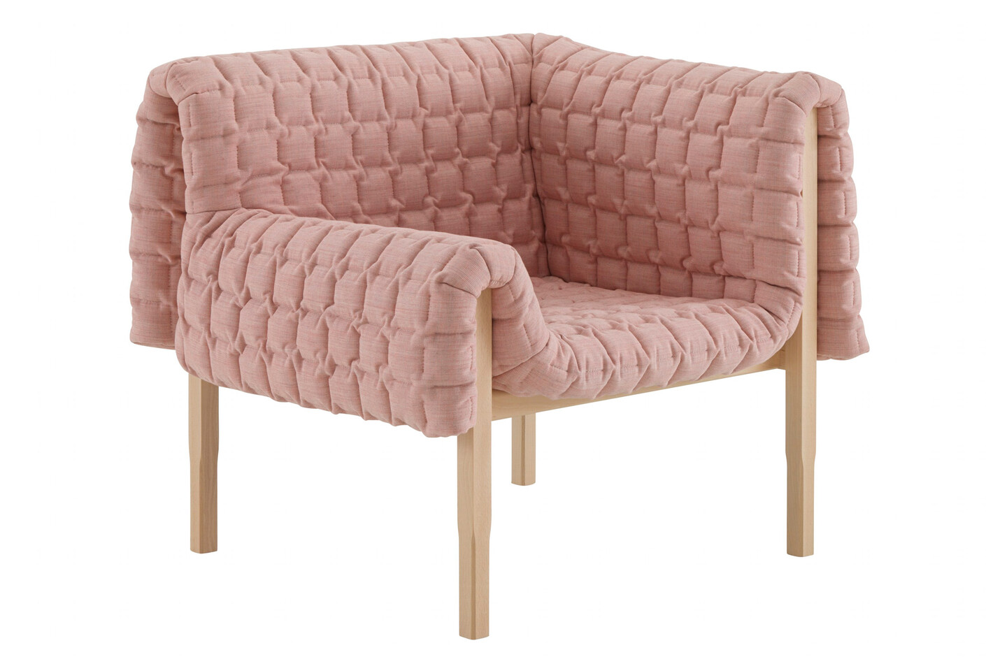
Jan 20, 2014 So how much color would you like? Or how many colors? In the bedroom, the bathroom or the kitchen? On the walls, on the floor, or on the furniture? Many designers have racked their brains over how to apply color most skilfully. For example, Le Corbusier opted for strict compositions based on a system of 62 colors only, while Sauerbruch Hutton prefer polychrome frontage designs, and designers like Sebastian Herkner address the colors at the very beginning of the design process. What is clear is that anyone deploying color must have a fine feel for tonal gradations, luminescence and the harmony of the different tones. Color is at present being used in various ways in furniture design. Not that this will come as a particular surprise to all that many of you. The trend commenced about two years ago and has since spread by the day. People continue to thirst for colorful living quarters. And at the imm cologne all kinds of furniture were on display in a new light thanks to the colors – and appeared decidedly refreshed for the effort. So how exactly do the new color flows come about, how have they been advanced and mixed? It’s all so colorful, above all in Hall 3.2. at Pure Editions. Where Nordic manufacturers such as Gubi, Muuto and &tradition, have created high-grade, cheerful and above all colorful booths. Sets of seats are on display in canary yellow (“Mayor Sofa AJS” by Arne Jacobsen and Flemming Lassen at &tradition), pink (“Oslo” sofa by Andersson & Voll for Muuto) or orange (“Swell” sofa by Jonas Wagell, Normann Copenhagen). Allowing striking highlights in interiors that now seem to have been composed end-to-end in color, with white not even putting in an appearance even on a minute scale. Things are less colorful among the more conservative makers in Hall 11.2. There, the mood remains subdued, albeit no longer just in gray and brown. Here and there a seat sets sparkles in Bordeaux, in dark pine-green or navy blue. Meaning color has made inroads here, if discretely and as befits the higher-end materials such as are preferred for hotels and the like. As was easily discernible in Cologne, at the moment there are at least six different color worlds that live easily alongside one another. Color world # 1: well-established models and series offered in new color. This seems sensible if you bear in mind that real innovations are few and far between and not a few manufacturers do a good trade in so-called modern classics. For example, last season Vitra started giving furniture classics such as Charles & Ray Eames’ “Hang it all” and Jean Prouvé’s “Standard Chair” a new lick of color. And this caught on: at the imm cologne Thonet for instance showcased Mart Stam’s famed “S 43” with lacquered tubular steel in seven different colors. And Classicon presented Konstantin Grcic’ “Pallas” and his “Diana” side-table in a new palette. Color world # 2: colors culled from an Oriental bazaar or spice market. Curry, saffron, pepper, paprika – even Konstantin Grcic couldn’t resist these ingredients and has dipped his “Pallas” and “Diana” tables for Classicon in seven colors that are reminiscent of spice pigments. Danish carpet maker Kasthall is likewise reveling in an Oriental mood, with ocher, claret, orange-cum-petrol and brown. And at Vitra, the Bouroullec brothers’ “Alcove” sofa would seem to whisk us away to a vendor of Indian saris, with its sunny curry-yellow and strong magenta. Color world # 3: mid-tones characteristic of the 1950s now omnipresent given the reliance on the styles of that epoch. Color tones that are rarely pure and instead the product of refined mixes calm the senses and lay the foundation for interiors boasting discrete color accents. A subdued pistachio green, a milky mid-blue, an orange that has been toned down. For example in the case of “Cosse”, the new soft two-seater by Philippe Nigro, which stands in a gray-beige-greenish yellow on its fragile little wooden feet. Color world # 4: the natural colors of Nordic landscapes. Eyes are increasingly gazing northwards not only when it comes to shapes, but also colors. Danes, Swedes and Norwegians enjoy a lot of pristine nature and vast expanses of open water. So this trend is defined by greens and blues, not to mention stone gray and beige. At Tolix, for example, the chairs come in medium blue and reed green, or even with a satin finish as if they were autos. Eric Degenhardt has done a magnificent job of using these Nordic colors for Böwer. Even if he still has a “mad urge for gray”, as he revealed to us, he has also chosen underlying blue tones, albeit in the case of a few items setting a fresh note with a green or petrol-colored table. Color world # 5: Girlhood dreams in pastel tones. The haute couturiers such as Chanel, Chloé, Dior and Celiné have in recent seasons really driven these pastel compositions and they have since evolved into a firm interior design concept. Complete rooms in soft baby-skin rose, tender sky blue, fresh pastel green or choice vanilla. Such has been the flavor of products (in part for some seasons now) launched by the likes of Zeitraum (with a refined use of dots of lemon yellow on table edges or stools), GAN/Gandia Blasco, where Patricia Urquiola has left her dreamy trace of color, and not least in Louise Campbell’s “House”, which with its soft hues and nuances of white and rosé seems to have stepped out of a fairytale. Color world # 6: flashes of garish neon colors persist, albeit they no longer seem anywhere near so young, sporty and dynamic. When the new “Y” chair at Tom Dixon or the wooden “Container” at Böwer boast a highlighter yellow and stand out in a room, they somewhat resemble those bright sneakers worn with a dark business suit. Anyone wishing to stand out from gray-in-gray of city slicker life needs such luminescent colors. In retrospect, the 1990s may seem pretty gray, while the new millennium, by contrast, started out with fresh and unsullied white. Now, or so it would seem, we are entering a colorful phase. What mostly applies elsewhere is also true here: What counts is getting the mixture right. Be the preference for surprising color compositions or distilled, “impure” nuances or simply for clear primary colors. Or signal colors that symbolize the dynamism of technology. The trip into different color worlds certainly doesn’t stop here, as the textile trade fairs are already announcing the colors chosen for the day after the day after tomorrow. And if furniture follows fashion, then we will soon be seeing a uniform monochrome color palette. Meaning we can look forward to a red room with red furniture, lamps and tables in finely staggered nuances. Who knows, perhaps the concept of monotony will suddenly be given a positive spin. MORE on Stylepark: A brighter Modernism: Instead of going for the new, they’ve updated the tried-and-true. And revitalized Modernism. |

Colors, also at the Italian booth: „Febo“ bei Maxalto. Photo © Sabrina Spee, Stylepark

Monochromic mood: at the Vitra booth. Photo © Martina Metzner, Stylepark

Citron pimped: „E8 Bank“ by Mathias Hahn for Zeitraum. Photo © Martina Metzner, Stylepark

Powder dream at Cor: “Conseta”. Photo © Martina Metzner, Stylepark
|

Young designer Joa Herrenknecht presented the carpet „Isla" in sorbet colors.
Photo © Martina Metzner, Stylepark 
Pastels in vanilla ice style: at Cor. Photo © Sabrina Spee, Stylepark
|

Chez Mademoiselle: at the booth of Wogg. Right: at the booth of &tradition.
Photos © Martina Metzner, Stylepark 
Corten finish Husk side table: at B&B Italia Outdoor. Photo © Martina Metzner, Stylepark
|
Philippe Nigro on his „Cosse” for Ligne Roset. Photo © Martina Metzner, Stylepark

Midtones also at Pulpo. Photo © Leyla Basaran, Stylepark
|

Left: "Coral" by Softline. Right: “In Between SK” by Sami Kallio für &tradition. Photo © Sabrina Spee, Stylepark

Spiced: ”Sharky” von Kristalia. Photo © Martina Metzner, Stylepark
|


Ice blue: at Piure. Photo © Sabrina Spee, Stylepark

”Starbuck M” by Supergrau – the name is program.
Photo © Sabrina Spee, Stylepark |

Scandinavian Blue: at Acoustic Pearls and Tribù.
Photos © Martina Metzner, Sabrina Spee, Stylepark 
Blue seating wonder: “Cut” von Lapalma. Photo © Sabrina Spee, Stylepark
|