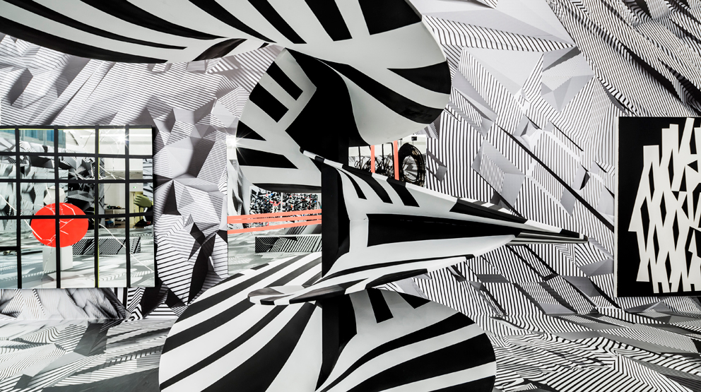
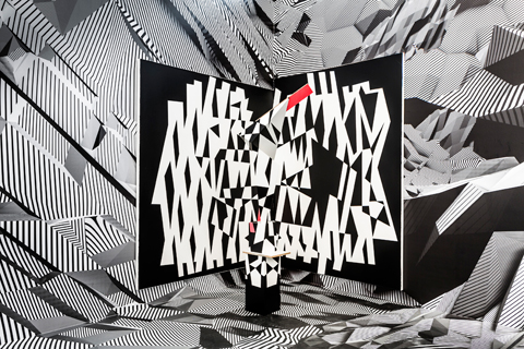
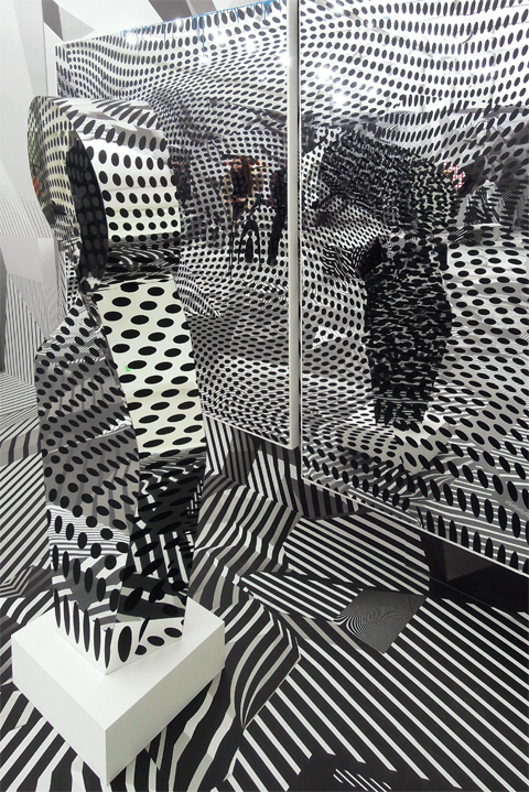
A confusing game, a shimmering kaleidoscope – we’re right in the middle and are as astonished as kids in a cabinet of mirrors. What Tobias Rehberger celebrates with joy and fun, is an art that wraps you up, confuses you, unsettles you. In the first room of his show in Frankfurt’s Schirn Kunsthalle, which is entitled “Home and Away and Outside”, the floor and walls are completely covered with fragments of black-and-white camouflage patterns. It’s hard to term this a retrospective, as Rehberger has after all opted for re-staging or “upcycling” of his works as his paramount principle.
Dazzle painting as camo for subs
Such visual effects were first dreamed up during World War I in order to trick German submarine captains. The Royal Navy commissioned artists to devise shimmering patterns derived from Cubism which, if painted on the hull of ships, made it harder for the enemy’s submarine commanders to determine the ship’s exact position, course, and speed. In order to fire a torpedo at the ship, the enemy had to be able to calculate the precise position it was going to be on impact. If the torpedo was at the location too soon or too late it missed its target. The camouflage was thus not intended to make the ship invisible, but to mask its exact position. As contemporary photos of such ships show, it was indeed difficult to decide in what direction the bows of such a camouflaged ship pointed. The Brits called this form of camouflage “dazzle painting”, while the Yanks preferred “razzle dazzle”. Of late, similar patterns have come back into fashion – in the automobile industry in an effort to disguise models not yet on the market.
Tobias Rehberger has on several occasions used such patterns, and we are familiar with them from Op Art, destined to unsettle and question the position of the viewer. Meaning that his approach has little to do with a wish to create some gesamtkunstwerk or other. And more with the up-market version of a ghost train and the Baroque question of which is the background and which the theme. Or quite specifically with whether and in what way our eyes are able to discern a three-dimensional shape dressed in the same black-and-white pattern from the identically patterned background.
A world of unfathomable patterns
Be that as it may, the result is a cheerful game of perceptual deception with colors and patterns, images and mirror images, identity and difference. It is noticeable that compared to the cafeteria that Rehberger designed for the 2010 Biennale in the Padiglione Centrale in the Giardini in Venice, for which he won the Golden Lion, the unsettling pattern on the floor and walls has since been refined. Instead of simple, flat bold stripes, Rehberger now uses ones that are computer-generated, that fold inwards, are compressed, rotated, bent or cross-hatched. Which renders the intangible depths of the space as a whole more tectonic, modulated, elegant, and thus less harsh. Proximity and distance, figure and background, surface and space, not to mention all the works presented in the space, all seem embedded in a seemingly endless game of deception and camouflage: the world as camouflage and unfathomable pattern. Now and again there’s a tondo hanging from the patterned walls, which turns out to be a hybrid version of a cuckoo clock.
All manner of hide-and-seek
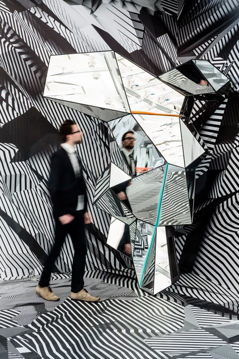
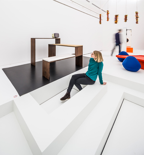
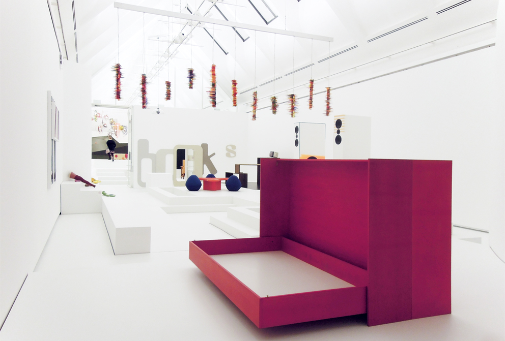
Only visually speaking does one leave the camouflage pattern behind when moving on to other rooms in the show. Games of mirrors and hide-and-seek persist, even if without dazzle patterns. If the first room functions as a kind of pattern for displays, where the presentation and the items presented meld in an all-over staging, in the second room Rehberger opts for a different kind of display. Works such as portraits of artists who are his friends in the form of flower vases (1995 – 1998), pieces that refer to social processes such as “Cutting, preparing, without missing anything and being happy about what comes next” (1999) and the emphatically unsettling “Prosthetics” (2000), designed to fit Rehberger’s own body, and rather than to supplement missing body parts be swapped for existing ones; here they are presented on white, only seemingly neutral platforms, ramps and surfaces. Since the white swathe of plinths was not a pre-given but again designed by Rehberger, it has the feel of a functional display, a multiply coded installation that places the viewer on the same level as the art. The surfeit of the dazzle setting is offset by this sparing, minimalistic neutrality that emphasizes individual pieces instead of concealing them in a wealth of stimuli, as in the first room.
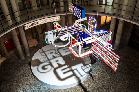
If one includes “Regret”, the purpose-made sculpture that floats from a lofty height in the middle of the rotunda in front of the Schirn entrance, then you get an idea of how the exhibition’s title came about. “Home” combines somewhat more personal pieces that reference a possible interior, while “Away” refers to the dazzle ensemble with pieces such as “Untitled (Stay)”, “Remember me” or “Joyless news from Diskobay”, while “Outside” addresses the outdoor piece “Regret”. Semblance and essence thus oscillate in constantly changing ways. For example, in “Sculpture and separate bedroom for 1-room apartment” (1995) a foldaway bed is disguised as a sculpture and a sculpture as a foldaway bed.
What is crucial hides from sight
In Ludwig Wittgenstein’s “Philosophical Investigations” we can read that “the aspects of things that are most important for us” are “hidden because of their simplicity and familiarity. (One is unable to notice something – because it is always before one’s eyes.)” And he adds by way of explanation: “The real foundations of his enquiry do not strike man at all. Unless that fact has at some time struck him.”
Tobias Rehberger likewise loves the simple and familiar – furniture, rooms, luminaires and the memories that bond him with these things. And he loves playing hide-and-seek. However, since he had noticed how the game that the things play with us goes, he reveals how it is played. To this end, he shifts the things into a context that is not the customary one and immunizes them with a certain strangeness by virtue of which the hidden and the revealed alternate.
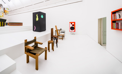
People have often suggested that Rehberger’s pieces are actually design. The only truth in this is that some of them make use of elements of furniture design to transform standardized products back into individual items. This adaptation of use value upends the illusion of individual mass production, as can be clearly seen in works such as “Untitled (Breuer)” or “Untitled (Rietveld)”, where Rehberger draws design classics form memory (originally for a show in Cameroon) and then had the respective items built locally by carpenters. Now the chairs, armchairs and tables (readily recognizable at first sight) are standing in the middle of a minimalist exhibition design that itself exaggerates the theme of design. Twisting the screw one more turn each time is evidently something Rehberger enjoys doing.
Nothing is quite whole
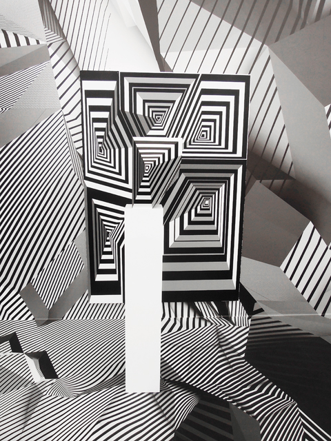
In Rehberger’s oeuvre things are simply never what they seem to be. Be it a volume covered with a black-and-white pattern, placed in front of a surface boasting the same pattern that then dissolves before our eyes or a kind of 3D exploded drawing, with parts and colors reminiscent of the Stars n’ Stripes on a circular white plinth that casts a shadow that reads “Regret”. Nothing is quite hale and whole in Rehberger’s world, and many of the items have a “Handicap”, and not just the sculptures that have this as their name – which is why the artist expresses his regret that nothing of what he shows us is unequivocal.
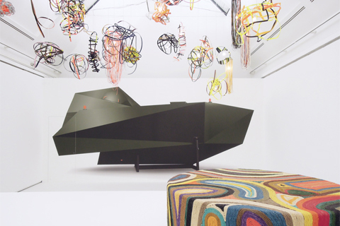
We’ve known at the very latest since Rehberger’s show “the chicken-and-egg-no-problem wall-painting” at Amsterdam’s Stedelijk Museum (where he used projections, the silhouettes of his own works and painted surfaces to create a very special kind of mural) the zest he brings to bear, the skill in tangling seeing and thinking up in contradictions. Is a design classic drawn and then rebuilt from memory still a design classic? When is exhibition architecture itself art? Which is the pattern, which the wall, which the art? The surface of things is only seemingly taut. It all looks orderly and well arranged, and yet our powers of judgment are sent reeling the closer one studies the objects. Like the ship at the end of the show. Is it a ship or the image of a ship? Or a phantasmagoria of a ship bearing refugees, vacillating between camouflage and armor, image and object, reconstructed by Danh Vo, another artist using plans his father drew from memory, who first designed and built it to flee Vietnam.
MORE on Stylepark:
The drunken bar: Venetian Wanderings brings us to the bar designed by Tobias Rehberger
(28 July 2009)
Four days of watching in wonder: an installation at Frankfurt's Festhalle by Tobias Rehberger and Claus Richter
(10 July 2008)