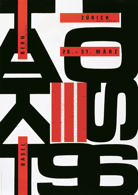
The typographical raster grid, the use of sans serif typefaces in body copy, unjustified type even in longish texts, fonts that have proven their worth down through the decades, such as the two designed at the end of the 1950s ("Helvetica" and "Univers"): all of this is common knowledge in the graphic language of today the world over, and all of this originated in Switzerland. Now, an exhibition at Züricher Museum für Gestaltung, whose posters and publications have themselves made history in graphic design and are continuing to do so, is now throwing light upon how it came about that a small country, which, until around 1930 had been known in the field of graphics primarily for its tourism and consumer goods posters, suddenly became a global player in graphic design.
The reason for this survey is not so much that any important event took place in 1912, for instance, the standardization of the Swiss poster format, but instead that Museum für Gestaltung itself is on the threshold of change. The museum is moving out of its current premises, which it has occupied since 1930-1, together with the former College of Applied Arts. The Zurich University of the Arts is on the point of moving to the Toni grounds (this used to be home to a dairy whose product advertising was also noteworthy) and the Museum is moving with it. This will mean more exhibition space and, above all, that the collections, which have, to date, been spread across different locations, will be brought together.
The time is thus ripe to take stock of the Museum's activities as a collector, to display its gradually accumulated wealth of banknotes and corporate gifts, stickers and packaging, writing paper and books, brochures and posters. There is no catalogue but, seemingly, a series of talks by two graphic designers that mark the boundaries of Swiss graphic design. These are, firstly, Ernst Hiestand, a typical advocate of design as a continuance of the classic Modernism of the 1920s in Switzerland – made famous by such prominent figures as Anton Stankowski, Max Bill and Richard Paul Lohse. And secondly, Wolfgang Weingart, whose technique of layering surfaces, whose combination of mechanical and hand-made graphics anticipated Mac design, before such computers even found their way into design studios. Both have made important contributions to the exhibition, Hiestand, for example, with the advertising for a chain of department stores, ABM, dating from the early 1960s where minimalist graphics wonderfully realized the texts of the founder of concrete poetry Eugen Gomringer, texts that operate with only a few words. With Wolfgang Weingart the curators have focused on titles from the "Typographischen Monatsblätter", but unfortunately have failed to take account of Weingart the teacher.
This also sums up a possible shortcoming of this visually stunning show whose exhibits are also impressive due to the fact that most of them are outstandingly well-preserved. Because as correct as it is to present Ernst Keller, Armin Hofmann, Josef Müller-Brockmann, Emil Ruder, Hans-Rudolf Lutz and the above-mentioned Weingart as the designers of important posters and publications, it would have been equally important to make some reference to their teaching activities in Basle, Zurich and Lucerne – at least by showing a number of their pupils' works or by pointing out other exhibits. After all, Swiss graphic design really is not only a product but also an international teaching export; just think of Lars Müller in New York or Sandra Hoffmann in Darmstadt. The graphic work from the Ticino region also deserved more attention; indeed, in the 1940s and 1950s Studio Boggeri in Milan was an important place for Swiss designers and made a fundamental contribution to the establishment of "precision graphic design".
Nonetheless, there are considerably more positive aspects to the show. There are amusing things to discover such as Swissair's cigar tubes whose shape references the Boeing Stratoliner or a miniature IBM ball head as a trinket from GGK, an advertising agency that is still very much underrated. Something that can also be followed is the influence of Richard Paul Lohse's poster "Wie wohnen" (1943) on post-War graphic language. Also, the comprehensive presentation of work by Georg Staehelin – including, for example, its influence on Andreas Christen's "Lehni" furniture – really should be seen as a discovery within the international context. Moreover, the fact that graphic design in Switzerland does not follow short-lived trends can, for example, be seen in the presentation of the four generations of banknotes, all there has been between Ferdinand Hodler in 1911 and those currently in circulation, designed by Jörg Zintzmeyer.
As is to be expected of an overview exhibition, current-day and the latest trends are also in evidence. Accordingly, the assemblage of adverts for Toni yoghurt can be seen as an anthology of the possibilities available from Photoshop that are, at the moment, being replaced by a retro design trends – and the poster for the 2011 Montreux Jazz Festival by Nicolas Eigenheer in the special French show may go some way to proving this. For their most recent poster to display this particular exhibition the curators, Karin Gimmi and Barbara Junod, choose work by a young bureau, Norm, which also produced the redesign for the Museum in 2008. A clever decision because it unites historical symbols, current combination techniques and the technology of precision printing.
100 Jahre Schweizer Grafik
From February 10 thru June 3, 2012
Museum für Gestaltung Zürich
www.museum-gestaltung.ch


