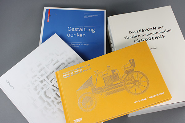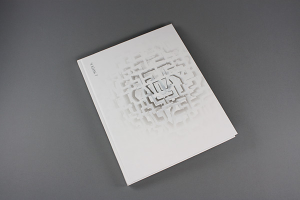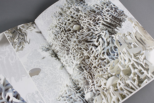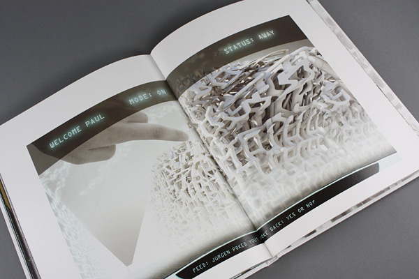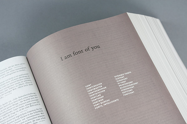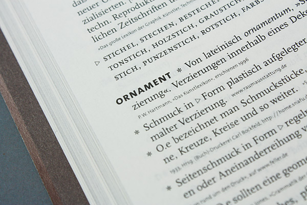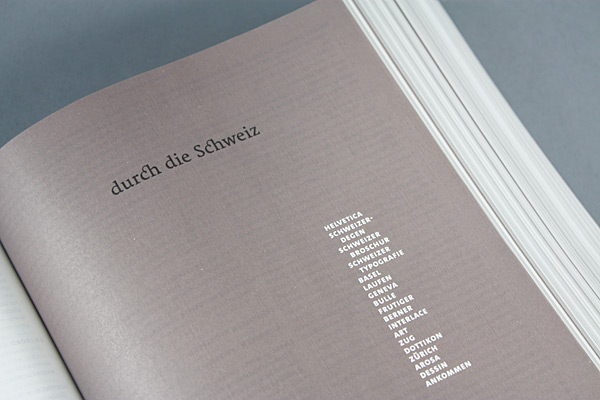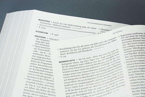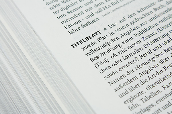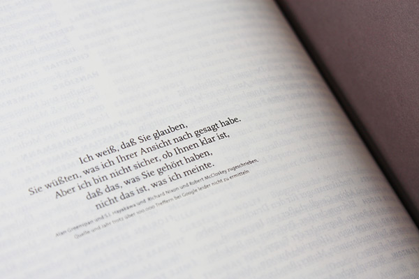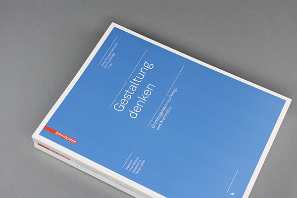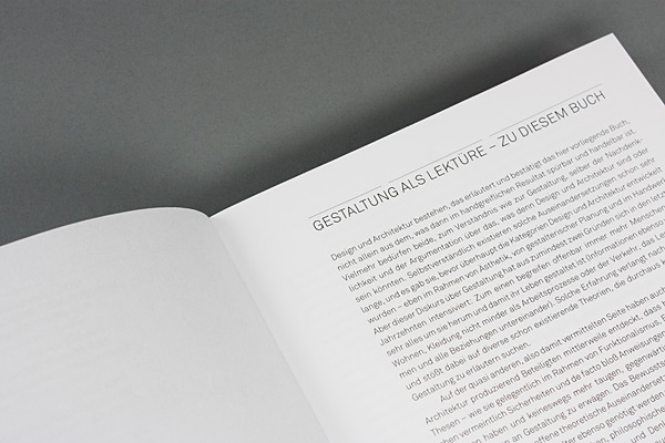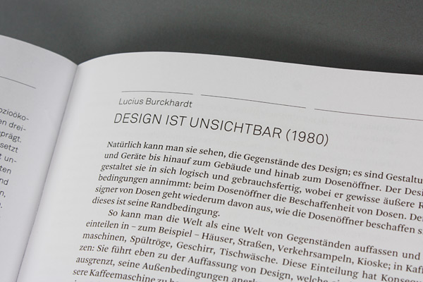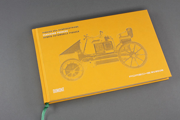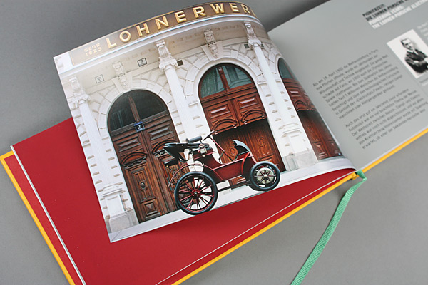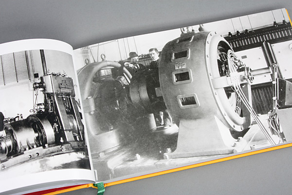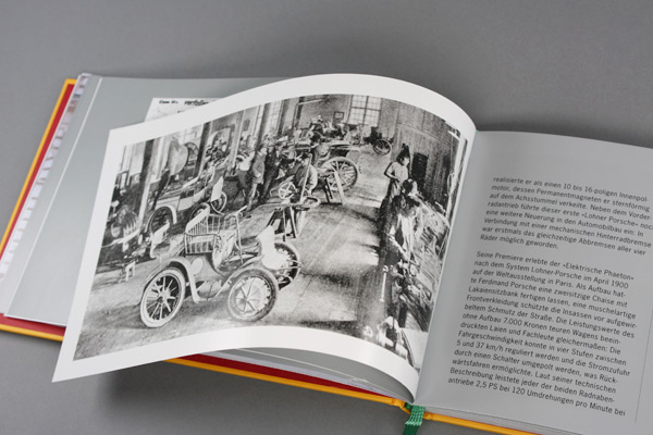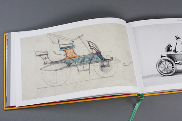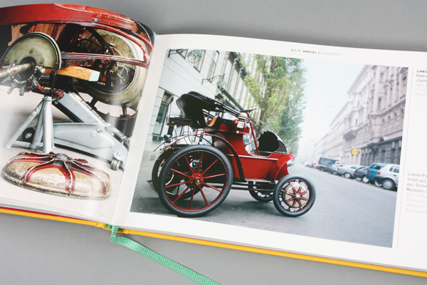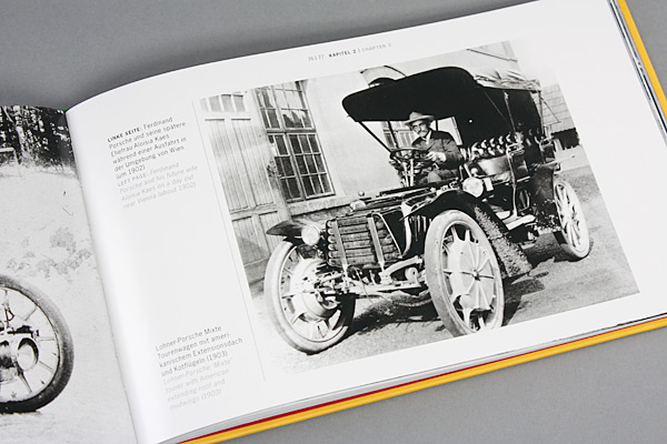
That's the thing with design. A lot of people think it has already become "total" and that our present day is dominated by an unbridled desire to design. Others are of the opinion that only with the help of process-oriented thinking is it possible to cope with a complexity of a world no longer characterized by imperial communication. Yet regardless of whether it is about the good or appropriate shape of a products or society as a whole, about changing existing hierarchies or successful branding, whether the fundamentals of design and architecture are up for debate or terms fanned out, in the world of design everything appears twice - once as an object and once as text, as product and theory. We do not and cannot know what came first; like the question of what came first, the chicken or the egg. So let's begin in the middle of things and clear a few books from the pre-Christmas table. In "Lesikon der visuellen Kommunikation", one of the most unusual books to appear this year, we certainly do not learn what we expect under the term "brand". There is initially no talk whatever of brands. Rather, we read: "a dark red to brown mark that looks burned" - and: "a dark place on the deer's stomach during the mating season". For those familiar with the battles between major global companies and their brands, the on-heat world of the woods will nonetheless not seem too foreign. Or, to give another example from the Lesikon, did you know that branding tools are nothing other than tools for branding? Believe it or not, the graphic artist Juli Gudehus compiled 9,704 terms for her "Lesikon" and, supported by 3,513 "co-authors", spent nine long years patiently turning them into a 3,000-page encyclopedia of the printing and advertising world. In the process she came up with a book that is extremely enjoyable to read that is second to none, a monster, thick and brimming, staid and serious, but also full of irony, mischief, and humor. And in addition one that one - this is obvious - doesn't just read from cover to cover. What we are dealing with here is a quite idiosyncratic "history of design in 508 chapters", what we are moving in a large linguistic maze, in which one has to get lost in order to be able to sample all the phrases and deviations, all the passages and cul-de-sacs that open up as one strolls through. "A collage" is how Gudehus herself refers to her work, which - unfortunately in very small lettering - is printed on thin paper makes do with no illustration whatever. The "Lesikon" is, however, not only a giant collection of terms, but also plays amusingly with metaphors and intentional misunderstanding. It is structured accordingly: not strictly alphabetically, but by word groups. Grave graphs Under the section on "begin" (Anfang), for example, there are entries on "beginning" (literally: "beginning is easy, persisting an art"), "starting from scratch again", "beginning of term", "beginning", "initial letters", "initial opening", and "beginner" (among other things with a sentence by Jan Tschichold, which maintains: "Beginners and amateurs accord the so-called idea too much importance"). Other intriguing groups of words follow. For example that which takes us into a labyrinth starting with "Flexograf" and ending with "Graph". The field of words placed under the heading of "Operation" is likewise a toughy, and here you meet first "Dr. Norton" (we all know him as the man who does not want uninvited guests infecting his PC) and also "Dr. Best", the guy from the ads who squeezes tomatoes on toothbrushes. And we find out that the latter is actually a professor of dental medicine who in 1987 while still teaching at the University of Chicago was by chance discovered by an art director from the Grey agency. If you now flick to the section on "Prostitution" and check out the entry on "Blow up", where you will read that this is a phenomenon of "expanding a drawing or an individual image from a film" and "penetration" is "the permeation of a target group by an ad message", then you will slowly start to realize what the "Lesikon" is all about. It simply sends someone sifting through things thirsty for knowledge on a never-ending chase, tempting him to dabble in surprising insights. The reader will never come across truly certain knowledge, and in this regard the Lesikon is definitely similar to the structures of the world wide web. But while you might race from one Internet page to the next and be disappointed because what you have just read disappears the moment you switch to the next website, actually encourages you to think more for yourself at Lesikon. You just have to jump to the next column, leaf backwards or forwards, and then find yourself all tied up in a web of meanings. Anyone nevertheless not wanting to go without the laptop will find references to the Internet at almost all points along the way. Since the whole thing is a piece to enjoy reading rather than a reference work proper, all of this takes time. Yet you constantly get rewarded, either with a straightforward definition, or with documentation on some linguistic usage or anecdotes - and surprised by the things that get gathered to go with the keywords. And because often what should really have been said by way of commentary gets omitted, knowledge is constantly being tested and expanded, instead of simply being documented. Incidentally "Imperial" means both a traditional paper format and also a font by Donald Beckman. "Photokina" is evidently derived from photokinesis, and "Tokyo" is not a city but a font by Neville Brody created in 1993. And then there are all the abbreviations - from PPM via PMS to PS (which is not a postscript but relates to patents) through to PR, PNG and JPG... and so forth. Hard to think of a more enjoyable way to simply immerse oneself in the world of visual communication and the shallows of advertising. Thinking design Anybody who likes things a little more conventional and academic, should pick up - at best in addition to the "Lesikon" - a book that assembles "fundamental texts on design and architecture". It editors - Klaus Thomas Edelmann and Gerrit Terstiege, the one a design critic, journalist and Stylepark author, the other editor-in-chief of the magazine "form" - not only selected canonical texts by Otl Aicher and Peter Behrens to Paul Virilio and Martin Warnke, which are reprinted here. They also asked renowned experts for an (unfortunately too short - introduction to and classification of the texts. Let's not be mistaken: What we are served here is by no means just a students' reader. The text feed waiting for us here provides nourishment for all those who, when it comes to design and architecture, do not just rely on their own limited taste, but wish to embark on a well-founded journey of discovery in the, in some cases, heated debates of the last one hundred years. Whether Otl Aicher levels "Criticism at the car", Ettore Sottsass writes "About Kitchens", Walter Gropius deliberates on "The Viability of the Bauhaus Idea", or Martin Warnke expresses his views "On the Situation of the Couch Corner" - one almost always encounter original thinkers and brilliant theories. For those who want to take a look at the future instead of the past to find out what form tomorrow's city and mobility could take, should investigate Jürgen Mayer H and his project "A.Way". What Jürgen Mayer H. describes here - and with what he won the "Audi Urban Future Award 2010" - is a fairy tale from the digital revolution era. It is the vision of a city he calls "Pokeville", which, using digital technology, is able to free itself of everything that is currently pushing it to its limits, if not causing it to collapse, and is a burden to and restricts its inhabitants. The spectrum of the digital wash Mayer H. envisages extends from automated fleets of vehicles in inner-cities, which circulate relentlessly like a swarm of taxis with no drivers, the dismantling of the, on account of automation now superfluous traffic signs, lights and street lighting , to a subsequent concentration of the city inwards. If the fairytale becomes reality, everyone, now liberated from the burden of driving, will in future be able to create their own city by means of electronic networking, will have all the information they desire delivered to them in this moving chassis - about museums, shops, restaurants, and bars. This transforms the automobile from being a mere machine in which to travel into a complex information machine. A.Way is a truly optimistic and fascinating vision of the city of the future. Hybrid Automobile Pioneer Reading "Ferdinand Porsche - Hybrid Automobile Pioneer", which is published by the Porsche Museum in Zuffenhausen, puts electromobility and the hybrid driver, which is now being used everywhere to reduce consumption and emissions, in concrete terms, even though these might be historical. Naturally enough there has to be a certain amount of advertising for the company's own products, the "Cayenne S Hybrid", the "911 GT3 R Hybrid" with flywheel storage and the "918 Spyder" concept study with plug-in hybrid. Subtracting the, in retrospect legitimate marketing, what remains is an exciting history of the infancy of the automobile, when a decision still had to be made with regard to the form the drive for this new motorized carriage was to take. It was 1900, and the "Electric Phaeton", based on the Lohner-Porsche system, was being premiered at the World Exhibition in Paris. The two-seater vehicle with footman's seat and shell-shaped front paneling that could almost be referred to as aerodynamic, boasted 2.5 hp, 120 rpm hub-mounted motors on each front wheel. The low number of revolutions per minute enabled direct drive with no gears, and with the 410-kilogram battery it was possible to cover up to 50 kilometers, no less. When one reads what the development work was like, that the cars were tested in race and learns that even back then Ferdinand Porsche and Ludwig Lohner, so as to increase the vehicle's reach - and inspired by one made by the Belgian company "Etablissement Pieper" - were thinking about a series hybrid drive, one asks in all seriousness, where one has to look for the reasons for this form of drive to have been forgotten for so long. Whatever, "Semper Vivus" developed in the fall of 1900, in which a combustion engine drove a generator that supplied both the hub-mounted motors and the batteries with electricity, was ahead of it time. In the book the details and the individual development stages in particular are portrayed in a comprehensible manner and accompanied by drawings and photographs of the vehicles. Ultimately, as today, the hybrid automobiles were almost twice as expensive as those driven only by petrol. Economically, the purely electric vehicles were more successful. By the end of 1905, 65 Lohner-Porsche electric cars, no less, had been sold. The past is full of surprises such as these. Das Lesikon der visuellen Kommunikation Gestaltung denken A.WAY - catching future by the fairytale Ferdinand Porsche - Pionier des Hybridantriebs
The "Lesikon" as a network of meanings
9704 terms
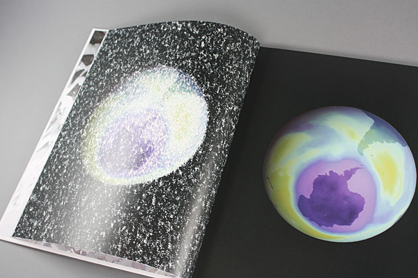
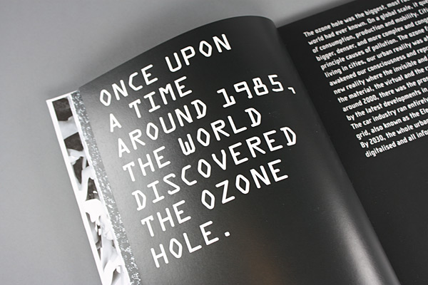
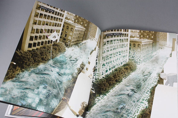
Pokeville is the name of the city of the future
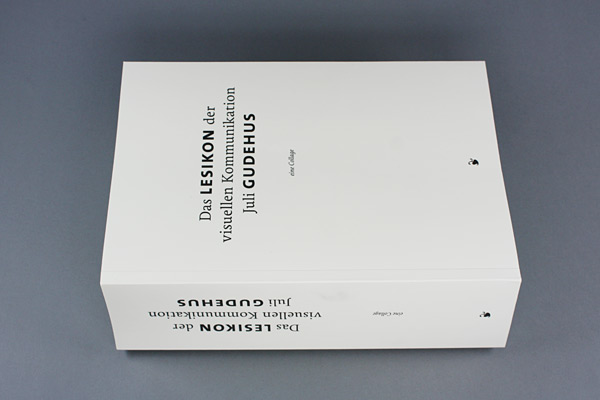
By Juli Gudehus
Soft cover in a slip case, 3,000 pages, German
Schmidt Hermann, Mainz, 2010
80 Euro
www.typografie.de
Edited by Klaus Thomas Edelmann and Gerrit Terstiege
Soft cover, 332 pages, German
Birkhäuser, Basle, 2010
29.90 Euro
www.birkhauser.ch
By Jürgen Mayer H.
Hard cover, 96 pages, English
Trademark Publishing, Frankfurt/Main, 2010
14 Euro
www.trademarkpublishing.de
Edited by Porsche AG
Hard cover, 160 pages, German and English
Dumont Buchverlag, Cologne, 2010
14.95 Euro
www.dumont-buchverlag.de
