So there they strutted on the Salone. Once again in black jackets, dark pants, and eye-catching eyewear. The designers, the architects, the interior designers, and all the others afoot in the world of “furniture”. And they all still opt for understatement. Although the fashion industry has for many seasons been proclaiming the return of strong, radiant colors – a trend that seems not to have rubbed off on dressing habits in the design industry. Where people have remained faithful to their principles. There’s a clever little tome that addresses the question why architects and designers always wear black – and one of the answers there is: so that the objects, namely the buildings, stand out all the more prominently.
The objects and products at the Milan furniture fair also stood out, albeit mainly because they were resplendent in color. That was the tonal message at many a booth, where a bright yellow, a grass green or a pool blue leaped out at you, where pastels seduced the eye, and there was many a small but thrilling colorful detail to be noticed – at second glance. So why all this new thirst for color? What were the designers thinking? What are the new color plays like? And how are they being received?
Total tonal harmony
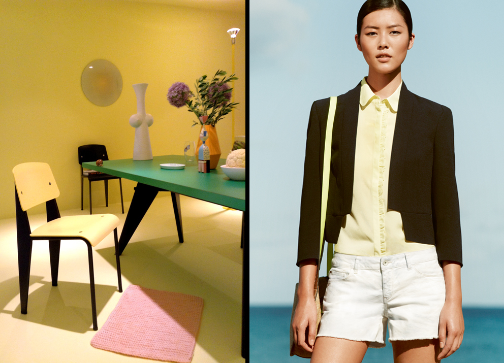
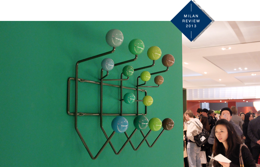
Two names bear mentioning when it comes to the new zest for color in design: Vitra and Patricia Urquiola. Both are close to top of the class, and both plump for strong colors this year, as was more than clear from the Vitra presentation. The manufacturer from Weil am Rhein displayed a range of interior worlds that were strictly dedicated to color. For example, there was a pink room with the Bouroullecs’ “Alcove” sofa and a bright yellow living space with Jean Prouvé’s “Standard” chair, which has a new color look. There’s a system to this: Vitra has appointed designer Hella Jongerius as its “Colour Art Director”, and she has tabled an all-in color concept. Classics in new colors – and at the fair they were in total tonal harmony with their surroundings. A simple idea, but with a mega-effect – such as with “Hang it all”, the Eames coat-hanger system with the colorful balls, now available in nuances of sky blue, rose red and linden green.
Those who wanted even more needed only go to Moroso. The booth was simply dripping in colorful new products, and was the brainchild of Patricia Urquiola. She has used color playfully in her designs for some time, and has now made it one of her main missions. Unlike at Vitra, at Moroso the eyecatchers were brightest colors, pastel hues, and unusual crossovers – Verner Panton would have loved it. For example, “Mafalda”, an Patricia Urquiola armchair, is available in highlight orange or canary yellow. And right next to it Sebastian Herkner’s “Banjooli” – an ethnic wicker chair revisited, in colors you could imagine he found at an African bazaar.
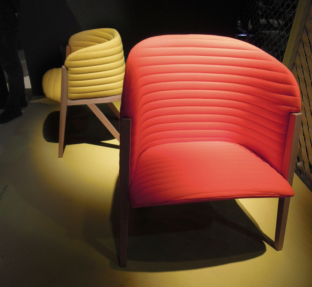
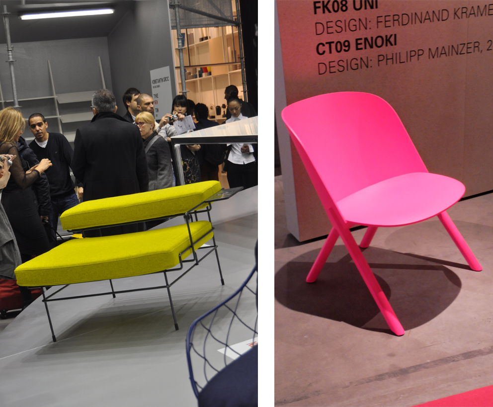
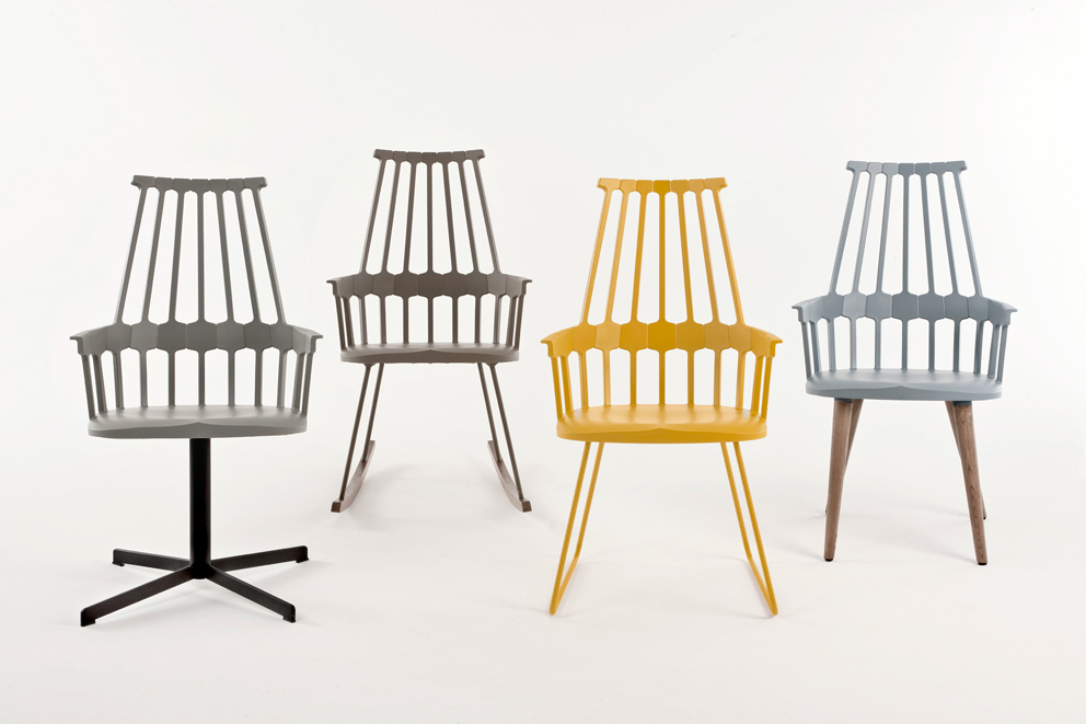
Others have gone super-loud, too, and to name but a few: Konstantin Grcic dipped both his new upholstery series “Traffic” (for Magis) in radiant colors, but opted for strident yellow for his “Medici” chair for Mattiazzi. Or take e15, where Stefan Diez’ series “This, That and Other” was printed in pink, meaning that the company has donned a new coat, and not just purist wood finishes. Managing Partner Philipp Mainzer reports that last year the company found that neon red went well. Asked how colors in furniture design take their cue from fashion, Mainzer commented that the two influence each other. His wife Farah Ebrahimi handles the color design at e15, and she was originally a fashion designer. It’s just that design responds somewhat more slowly to color trends.
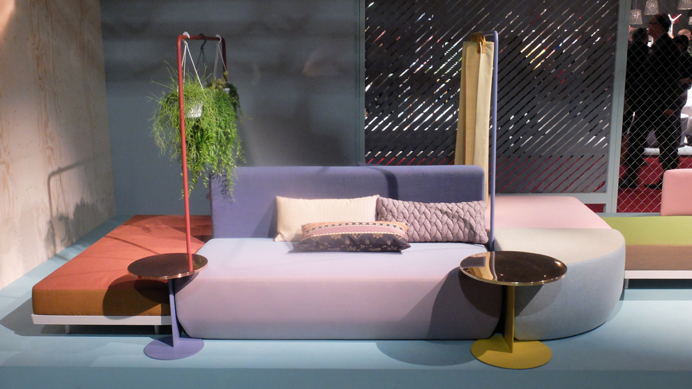
Powdery pastels
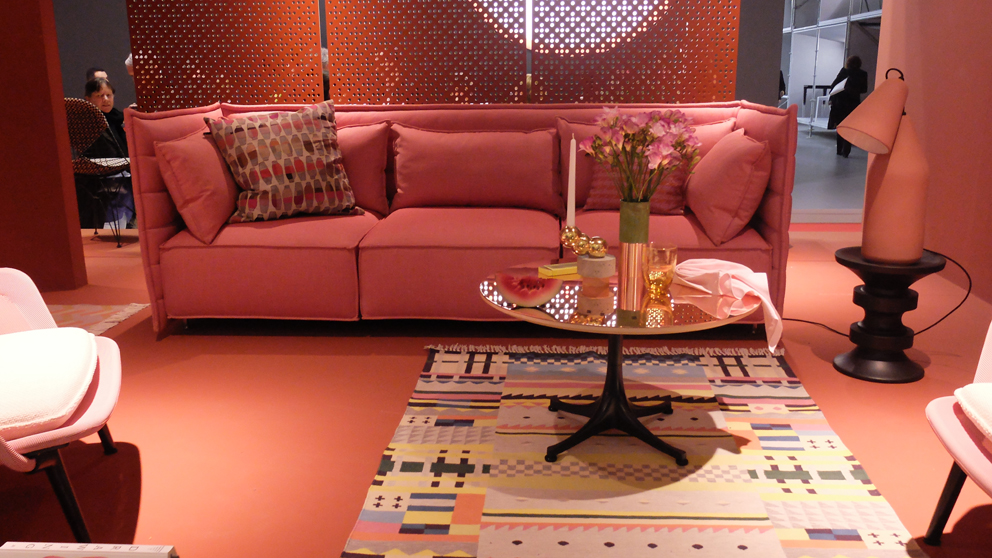
But back to Moroso. There were two other color phenomena to be admired at the booth: the “Soft” new taste trend and unusual color compositions. “Bikini Island”, the new sofa-scape created by Werner Aisslinger in a 1960s look boasted a colorful mixture of elements dipped in ice-cream tones, such as lavender, pistachio and raspberry ripple. Representative of many other furniture groups that took the floor in pastel hues such as mint, light blue, soft yellow and above all rosé and (key note!) with shades – on display at Arper, Cor Interlübke, Dedon, Tribù and Zeitraum, to name but a few. Not least it was the fresh and unusual playful use of the tones through color blocking or even with fashion-fused Batik patterns that was destined to kindle a thirst for new interiors. To name but two examples: e15’s luminaire called “Seam Two” – the new edition combines jade green with candy rosé. Or Werner Aisslinger’s “Bikini” chairs for Moroso, with legs in a soft flow of colors sporting the new dip-dye touch, alternating between green and yellow. While the more experimental of those in the industry wallow intoxicated in color, others are slightly more hesitant in applying more color. The residences of the beautiful and the rich will no doubt continue to be defined for a while yet by non-colors such as white, natural tones, and anthracite.
Oh so nice and colorful
Frank Ziegler from Leptien3 in Frankfurt has a pretty leisurely take on the new waves of color from Milan: The manufacturers’ new verve for diverse colors reflects the ever greater plurality of tastes, he says, which is a result of the various markets growing more closely together. And he also confirms that clients, in particular hotels and banks, are today much more likely to dare go for armchairs in orange or chairs in deep Bordeaux. Will the new colors be a real design innovation? Ziegler wrinkles his forehead, and mentions Cassina, where the classic LC 6 table designed by Le Corbusier, Pierre Jeanneret and Charlotte Perriand is now available with a mint-colored frame along with a rhubarb-colored glass top. It is a moot point whether Charlotte Perriand would have liked it…
Eclectic game of colors
Will people be influenced by the new fun with colors and now cobble together colorful interiors, as they last did in the 1970s? New-generation designer Sebastian Herkner is convinced this will happen and loves colors. “The stress”, Herkner suggests, “when creating interiors is on an ever greater shot of eclecticism.” While his friends in the financing industry are still lounging on white sofas, he lives with an on furniture as colorful as Jacob’s coat and of different styles and origins.
Milan – is fashion and design. A matter of cross fertilization, a matter of ever greater fusion, as could be seen not least at this year’s Salone; one needs think only of Karl Lagerfeld’s photospreads, the collaboration between Tom Dixon and Adidas or the COS show in Ventura Lambrate. And the trends cross dividing lines, too, meaning that not just fashion is colorful, but so is design. A response to the somber prospects on the sales markets? Possibly. In times of economic uncertainty, maybe design goes color, following the lipstick index – according to which women in times of crisis love to go for red lipstick. Because powerful warm reds and oranges as well as tender pastels are said, in purely psychological terms, to stimulate and brighten the mood. And not just that. Alongside the many redesigns the “classics in new colors” are of course a comparatively low-risk way of playing the innovation game. And in our saturated society a choice set of colors is one way of standing out from the masses. Following all the non-colors that dominated homes and clothes in recent years perhaps we sense that we’re just thirsting for color. Whether the entire room has to be pink is another matter. The “Hang it all” in nuanced greens will certainly do, first up.
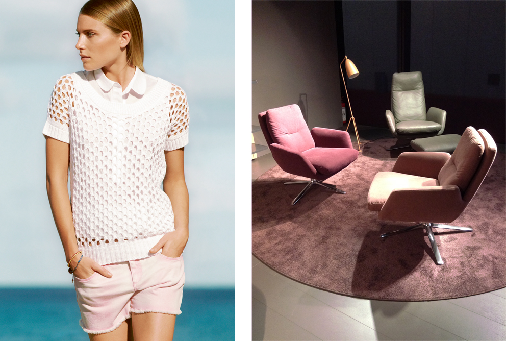
Incidentally: the extreme swirl of color to be seen last season seems to have calmed down somewhat. Both in design (and just Philipp Mainzer thinks this) but also in the world of fashion. On the catwalks loud colors are only a matter of highlights. Pastel tones remain as the summer favorites. Add to which there’s a lot of green as of the summer – Pantone’s no.1 for this year is “emerald”. That said, the latest message coming out of the catwalks in Paris, Milan and New York for this winter is: completely white or all-in-black. Meaning that we also all know what to wear to next year’s Salone – great, one less thing to worry about.