Onwards and upwards
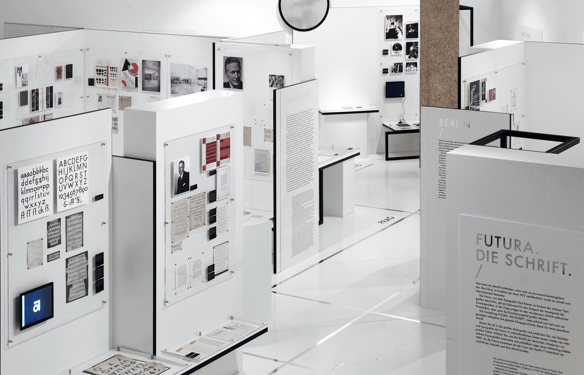
The shiny metallic “Futura” lettering on the exhibition catalog and display walls augur a future characterized by clarity, precision and technical expertise. This was precisely how the protagonists of modernity once conceived of the coming 20th century. Now, a century later, Annette Ludwig, Director of Gutenberg Museum in Mainz, looks back at the sanserif type, which still comes across as unadorned, neutral, as impersonal and cool as possible. She is assisted by design historian Petra Eisele and designer Isabel Naegele, both of whom teach at Mainz University. The team of curators uses sketches, drawings, documents, typescripts and examples of use to illustrate Futura’s paradigmatic development, international distribution and the undeniable attraction it still has. Many of the exhibits in Mainz originate from Philipp Bertheau’s estate, which in 2000 found a permanent home at Gutenberg Museum. They are complemented by loans from public and private collections.
In 1922 the painter, book designer and typographer Paul Renner, who for a long time had stood in the shadow of Jan Tschichold and now finally enjoyed the recognition due him beyond professional circles, set out his ideas unequivocally in the publication “Typography as Art”: “Roman uppercase letters, constructed from the circle, triangle and square, conceivably the simplest and most contrasting shapes, represent the best of European fonts. This type’s sophisticated simplicity exudes something like the final shimmer of the bright intellectuality of ancient Rome. It is the simplest thing that lends the roman type its incomparable vigor.”
Ancient – classic – modern
What is remarkable is that a progressive designer, who spoke out enthusiastically for Republican values and the use of lowercase initial letters, did not (as was to be expected) call for a radical break with the past and conjure up the new in a passionate speech, but deliberately cited Classical Antiquity, albeit Roman Antiquity. Evidently the ideal of humanity that Johann Joachim Winckelmann once derived from studying fragments of Greek Antiquity, Paul Renner drew from observing inscriptions from the era of Roman Emperor Trajan: noble simplicity and quiet magnificence. Only brief consideration is given in the catalog as to whether the latter version of Classical Modernity from the period of the Weimar Republic, which cites both Classical Antiquity and the German Classical period, differs from “New Typography,” which corresponds to the design principles of the Soviet Constructivists – an interesting question from a cultural-historical point of view that would have deserved in-depth analysis.
Typography as Art
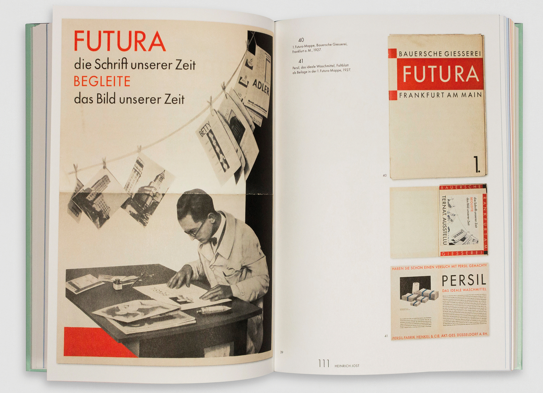
We know for certain that the publishers Siegfried Buchenau and Jakob Hegner decided to visit Paul Renner in his studio after reading the book “Typography as Art.” They commissioned him to design a font that could be considered the “typeface of our time,” neglecting to mention that two artists (presumably Lyonel Feininger and Karl Schmidt-Rottluff) had already failed before him. Unfazed by the enormity of the task, shortly afterwards Renner sent the publishers initial designs inspired by Capitalis Monumentalis. After several months had passed and he had still received no answer, he demanded his drawings back and presented them to his former student Heinrich Jost, who had been working as artistic director at the Bauer Type Foundry in Frankfurt/Main since 1922.
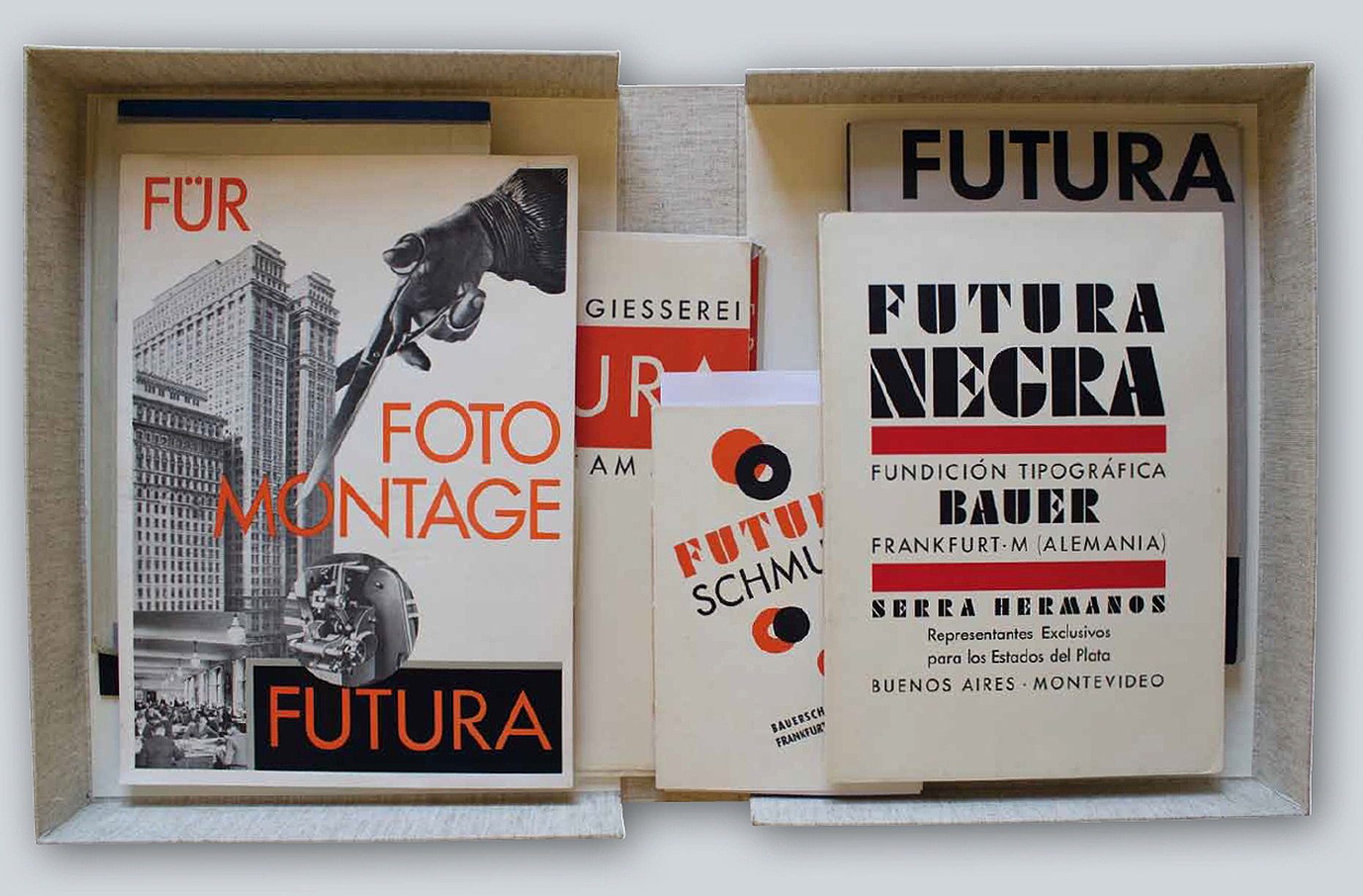
After that things progressed very quickly. In the winter of 1924/25 initial trial versions were produced; by 1927 Light and Medium had been developed. After that, Renner tackled Futura Bold and the special characters. Futura Italic and supplementary sets followed in 1930. Soon advertising art would become inconceivable without Futura, and in its advertisements the Bauer Type Foundry proclaimed that Futura had become a global success. The firm’s extensive network of representatives and subsidiaries in Spain and the United States ensured the typeface was given an ideal international launch.
The typeface of our time
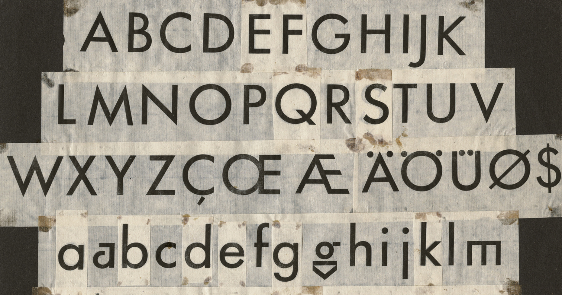
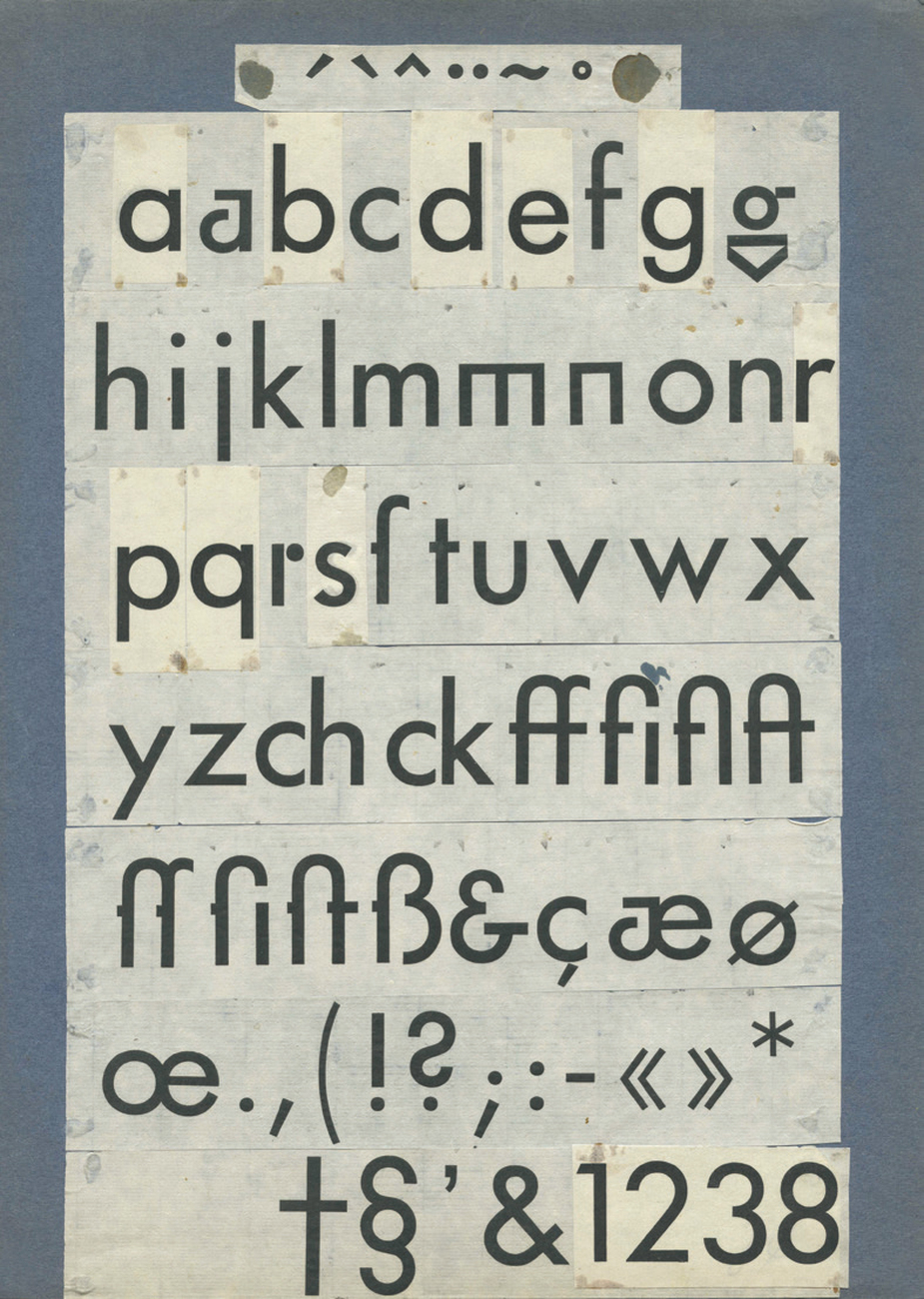
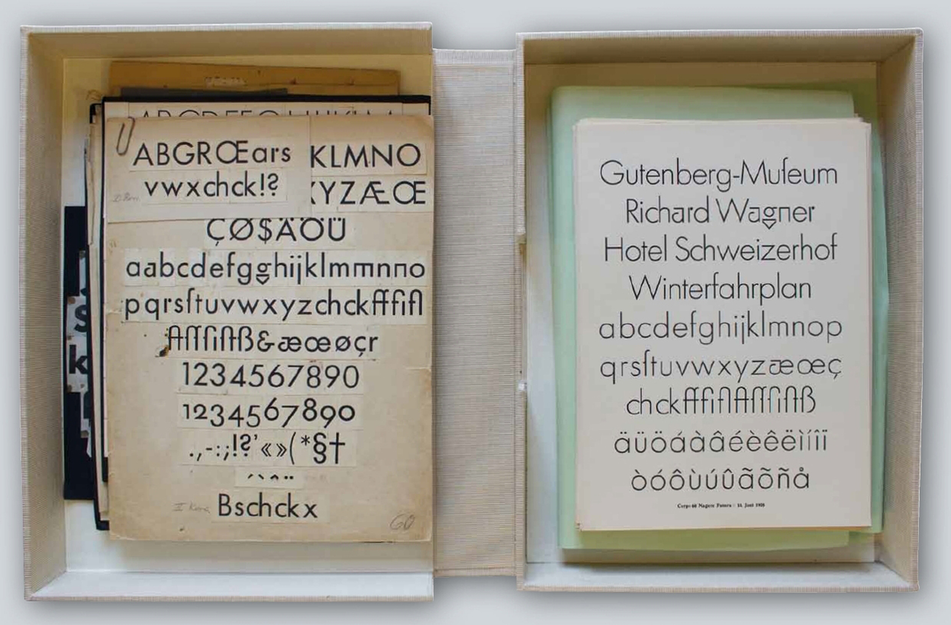
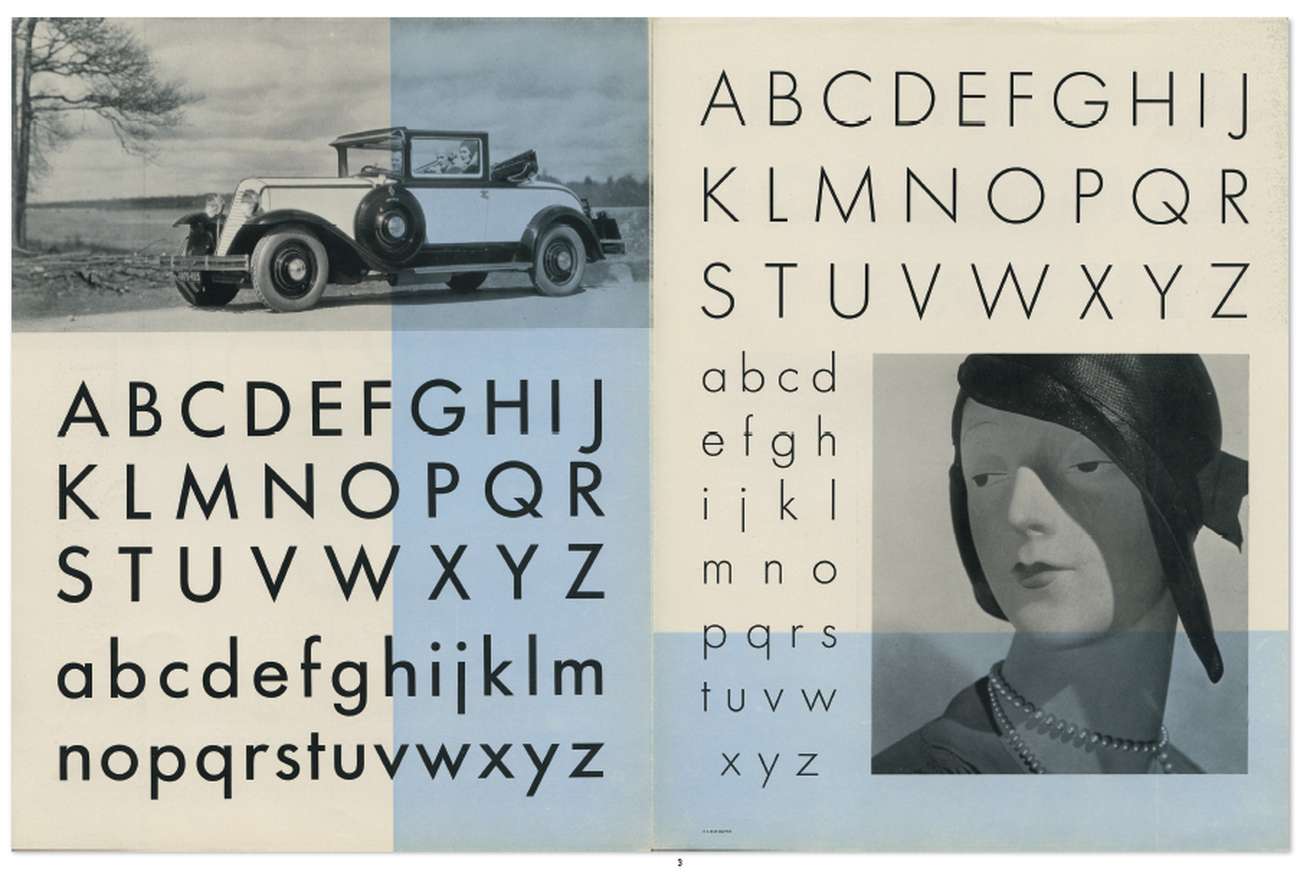
From the beginning one thing was absolutely certain for Renner, namely: “The typeface of our time cannot come from handwriting. (...) Our print is the impression of machine-made metal letters, which are more markers than characters. (...) We have to accept the consequences of the invention of sort casting.” Thus he did not attempt to make the characters indicating a writing direction more dynamic and was equally rigorous in forgoing upstrokes and downstrokes. As shown by various proofs with letters from the sample fonts pasted on, despite the vehement embracing of automation and typification it took a considerable ability to gauge things and the patience and diligence of an experienced typographer before Futura could be presented as Renner intended it, “in an even, glistening gray.”
Visual balancing-out
It was most tricky for Renner to define the ascenders and descenders for lowercase letters, because the Capitalis on which he based Futura only included capitals. So the problem was designing minuscules using the design principles derived from roman Antiqua and making them appear equal to the majuscules. In order to achieve a balanced and harmonious script, Renner did not design his font from pure basic geometrical shapes with equally thick lines, but rather aimed to create a balanced look for the entire alphabet. In other words, every single letter is based on visual laws and results from a large number of creative decisions regarding its relational size and line thickness.
The compact exhibition and highly readable catalog clearly illustrate the many applications of Futura by inviting visitors and readers to embark on a tour structured according to location. It starts in Frankfurt/Main, where the typeface was cast in lead and given the Latin name for future by Fritz Wichert, founding director of the Frankfurt Kunstschule, then continues in Hanover where Kurt Schwitters convinced the Bahlsen biscuit factory and the Planning Department to use Futura, and to Berlin, where from 1930 onwards an increasing number of journals were printed in Futura. In “Red Vienna” Otto Neurath welcomed the unadorned typeface Futura with open arms. He enthusiastically integrated it into his Vienna Method of Pictorial Statistics and used it from 1928 onwards to label Gerd Arntz’ Mengenbilder (amount-pictures). And in the newly founded Czech Republic designers such as Ladislav Sutnar testified to their progressiveness by using Futura.
The dirty sleeve of the Nazis
Munich, however, would put Paul Renner to the test. In May 1926 he became director of a vocational school for graphic art (Berufsschule für das Graphische Gewerbe). Disgusted by a lecture by Paul Schultze-Naumburg, in 1932 he commented on the inflammatory Nazi campaigns against Modern art in a pamphlet entitled “Cultural Bolshevism?” After Hitler was elected German Chancellor in January 1933 Renner warned in the journal “Gebrauchsgraphik” (Commerical Art): “One day the ever more malicious and violent political idiocy will be able to sweep away the entire Western culture with its dirty sleeve.” The response was not long in coming: While Renner was setting up a stand at the Milan Triennale, his apartment and office at the school were searched. In April 1933 he was removed from office. Amongst other things he was accused of being responsible for an imbalance that could not be politically justified: Latin typefaces were prioritized over Gothic ones. What a scandal!
Yet behind the scenes the regime came to terms with Futura: The typeface was already firmly established in the administration and continued to be used for official documents. Finally, in 1941 pragmatism won the day. When it turned out that the Gothic and Schwabacher fonts in the occupied areas were barely legible, a secret decree banned the Gothic type and launched Latin as “normal type.” For Paul Renner it was all to little avail: He was left with little choice but to emigrate to Switzerland. He lived in Hödingen quietly as a painter until his death in 1956.
Nonetheless, his Futura accompanied many European architects, artists, directors, photographers, filmmakers and designers who emigrated to America in the 1930s and 1940s – carrying their hopes to the New World. For example, Herbert Bayer used it when in 1938 he designed the catalog for the “Bauhaus 1919-1928” exhibition. For advertising professionals in the United States, the very sound of the name Futura held an irresistible appeal. Until the invention of Helvetica, it remained the most popular type for American advertisements, posters and magazines – including the highly influential “Vanity Fair.”
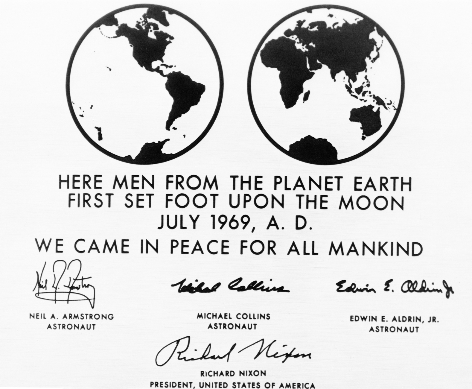
It can be read on the Moon
Just how progressive Renner’s type actually was would be proven in 1969. The stainless-steel plaque that was affixed to the ladder of the landing module of Apollo 11 bears the inscription: “HERE MEN FROM THE PLANET EARTH FIRST SET FOOT UPON THE MOON JULY 1969 A.D. WE CAME IN PEACE FOR ALL MANKIND.” The text was set in Futura. NASA employees had supposedly seen the font used on the movie poster for Stanley Kubrick’s “2001: A Space Odyssey.” The landing module remained on the Moon – and with it Futura. May it augur a glorious future both for the inhabitants of Earth and for future visitors to the Moon with its incomparable élan and the shimmer of the bright intellectuality of ancient Rome!
Exhibition:
Futura. The Typeface.
Gutenberg Museum Mainz
Liebfrauenplatz 5
55116 Mainz
Runs until April 30, 2017

Catalog:
Futura. The Typeface.
Petra Eisele, Annette Ludwig, Isabel Naegele (eds.)
Design: Stephanie Kaplan, Isabel Naegele
520 pages, bound, with numerous color illustrations & samples,
Verlag Hermann Schmidt Mainz
ISBN 978-3-87439-893-0
€ 50