von Thomas Wagner

Photo © Thomas Wagner, Stylepark
Salone 2: Einrichten ist angesagt, Gold und Sattelleder müssen offenbar sein, Farbe wird noch wichtiger – und einer dreht das ganz große Rad.
One /// Nostalgia needs luxury
It is hard to prove, but the impression has for some time been that creating new interiors is somehow all the rage. This can be seen, among other things, from the fact that the topic is increasingly being addressed in the pages, color supplements and magazines of daily, weekly and Sunday papers – pages that are themselves burgeoning. There the sections boast names as pretentious as they are precise, such as “Life”, “Lifestyle” or simply “Living”. Here, the zeitgeist peers over its own slick shoulder and likes to pat itself on the same. Somehow or other, the matter or the impression stick, albeit only because the individual setting where and the social horizon on which this interior creation occurs seem so very different from each other, and so broad.
Should the impression not deceive, then at least in gentrified quarters of the prospering Western metropolises (and increasingly the Eastern ones, too) on the freshly waxed parquet, next to the handmade carpet, people love to present the latest furniture designs, vintage specimens and the one or other inherited piece. On top of which, a highly colorful host of accessories gets included, the symbolism of none of which is readily that apparent. Where skillful interior architects handle the entire design in question, the collage tends to attest to strictly individualized contemporaneity and an insistence of the feel-good with a shot of nostalgia (optionally with a streak of sentimentality) added – spawning ensembles styled end to end, not that far removed from those staged rooms as are presented by the major manufacturers in Milan at their trade-fair booths.

At least as regards materials, what is on show more or less unabashedly there can be considered not only the product of good finishing, but actually as luxurious. It is not as though luxury troubles us; far from it. The exotic mixture of ethnographical quotations and neo-feudal opulence such as has long since been dished up by Edra has a distinct appeal of its very own. It is just, what today is luxury? What could and what should it be in the midst of current social conditions and upheaval? Is luxury simply part of the global ignorance management of the affluent? Or could its redefinition possibly provide the grounds for more sustainability and responsibility? And what has actually happened to the hopes of a completely different notion of luxury, one infused with ascetic ideals?

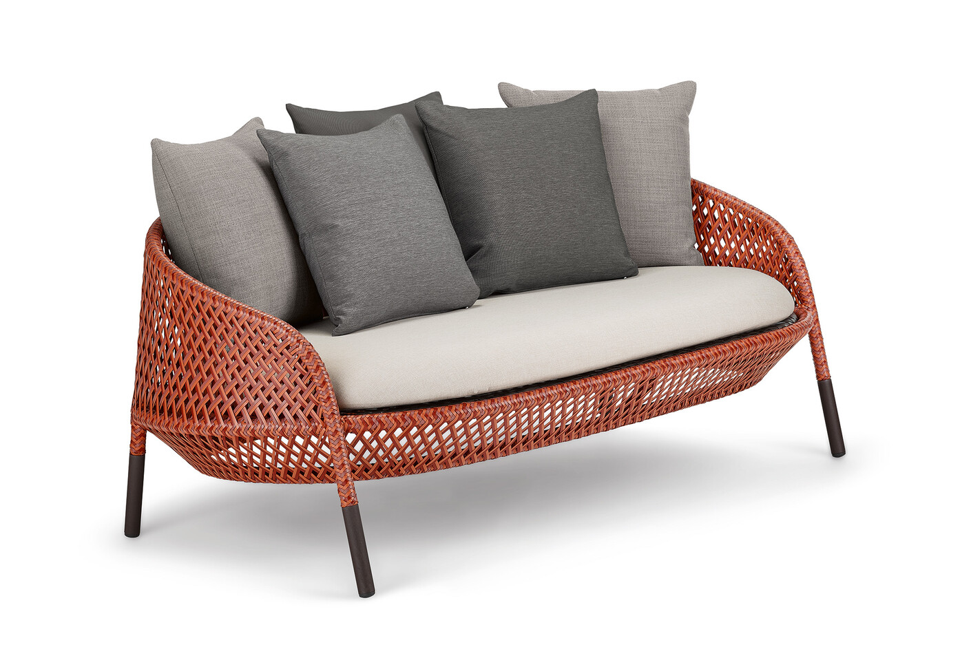
At this year’s Salone, it is clear that no one really wants to discuss such incisive aspects. Many manufacturers currently take luxury to mean what it always has: more, better and more expensive. First of all, there are the large seating expanses, covered with very carefully crafted and appealingly designed fabrics or leather as soft as a glove – and exclusive sideboards and shelving systems developed to require equally outstanding production methods, plus carpets and curtains to fit the taste or style. You don’t need to mount the high plateau of luxury, where for example Hermès Maison presents his craftsmanship as a cupboard for watches and a magnifying glass. As good as ubiquitous: precious metals of all colors, copper, brass and unashamedly gold again, which blends smoothly with the de rigeur mid-century Modernism, and also with more minimalist new creations. Then there’s the obligatory marble and now thick saddle or core leather, all of it soundly or even exquisitely worked.

An important role is definitely played in this regard by new manufacturing methods (not just for wood) that enable perfection without all that much artisanal input and at comparatively favorable prices. The rest is luxury in the conventional sense, i.e., expensive and therefore exclusive. Moreover, evidently you can earn more with luxury goods than with mass-produced articles. Whether the trend follows the creed “after us the cheap stuff” or simply seeks as long as possible to evade the dark clouds on the economic and ecological horizon is a moot point. And that also applies to the question whether such interregnums actually mean anything, and if so what – as regards the development of furniture design that is not just a slave to such purposes. This will first emerge in coming years. Ettore, our small companion, is patient after all.

Photo © Thomas Wagner, Stylepark
All the same, must a new armchair, such as Färg&Blanche have tailored as a “Couture Armchair” for BD Barcelona (where of late the emphasis has been on “art and design”), really have many well-cut wooden scales on its back, however stylish this may look? Is such a thing merely neo-Biedermeier? Or does it perhaps simply mean, where makers start to bask in materials, the clear and simply designed things get lost all the more (although they definitely still exist).

Photo © Thomas Wagner, Stylepark
Two /// Enhancement strategies
The example of Kartell shows that the luxury question is not an easy one to fathom. This is a company that many people still unjustly consider a manufacturer of cheap plastic household objects and only rarely associate with the concept of luxury. Yet the firm, in terms of sales and profits too, has long since struck new paths. This not only includes collaborating with the best designers in the trade for many years and consistently upgrading the materials used. Indeed, together with Agnelli heir Lapo Elkann and at the flagship store on Via Turati, they showed just what is possible to do with Kartell icons using car wrapping technology – and how upgrading strategies function today – under the heading “Kartell + Lapo. It’s a wrap!”. In the collaboration with Lapo Elkann and Garage Italia Customs, well-known items of furniture are coated with foil from the automotive sports sector, making them perfect not only for the rooms or apartments of a youth accelerated by consumerism, but also – in the second version, covered with patterned fabrics – in jazzed-up bathrooms, hallways or even dining and living rooms. You don’t have to love them, but you will certainly notice that they radiate an irresistible freshness. And as if this, and many other innovations, were not enough, with “Organic” Kartell also presented a chair designed by Antonio Citterio made of renewable natural fibers.

And what does a mule think of all this? Ettore looks a little unsettled, after all Buridan’s ass didn’t just have a problem with the hay bales, but also with logic: How to decide given the obvious surfeit to choose from? As with logicians, in the end it is chance that bails out furniture fans forced to choose between seemingly equal alternatives. You don’t need to be a mule to see that the competitive pressure in the industry is continuing to grow. Which doesn’t make courting the ultimately few innovative designers any easier. At any rate, passivity and torpor are no longer on the menu anywhere. That’s left to the mule.
Three /// Who’s going big-time?
There aren’t that many climbers in the industry. Hay seems, if we are not mistaken, to be among the few promising aspirants. At least they brought out the big guns in Milan. Not just anywhere, but in the Pelota Hall on Via Palermo, where once Established&Sons crowed with illustrious names and spectacular innovations before missing the target in terms of profitable quantities and realistic delivery times, Hay positioned itself as design-oriented manufacturer between Ikea and the classic companies. Moreover, at Hay they consistently champion established designers and their expertise, and the argument of in all respects fully developed product lines shouldn’t be underestimated, whereby once again the series/system idea plays an important role.

Colored elements of the equally universal and robust storage system “New Order” by Stefan Diez, which cuts as fine a figure in a house or apartment as it does in the office, were used to construct a multicolored tower in the large hall, which kept watch over roof-less rooms in which sample specimen furnishing concepts waited for visitors. Living room, bedroom, office, apartment – everything laid bare for scrutiny almost as at an Ikea superstore on the city’s periphery. This temporary furniture store was complemented by the luminaire collection “wrong.london”, an advancement of Sebastian Wrong’s cooperation with Hay, and a “Mini Market” for bags, pillows, vases and pens and even including toothbrushes and other bits and bobs. The store was a constant hive of activity.

Photo © Thomas Wagner, Stylepark
Two novel products by the Bouroullec brothers particularly catch the eye in the collection – a cleverly designed seating ensemble of one-, two- and three-seaters named “Can”, probably owing to the perforated sheet metal under the upholstery, and the complete outdoor collection “Palissade”. Both are well conceived and well made. Moreover, there is the wooden series “Copenhague”, developed by the Bouroullecs and Hay originally for the University of Copenhagen, and its extended version “Copenhague Deux”, with benches as well as dining and coffee tables in various sizes.

Four /// Fine paper and a lesson in prehistory
It’s all very well and good that the Triennale is back after a 20-year break, the only thing is in the end we don’t exactly know what it can achieve. At Palazzo dell’Arte in Parco Sempione at least, not much has changed. Yet there are two treats to be found among the various official exhibitions and company presentations for visitors to choose from.
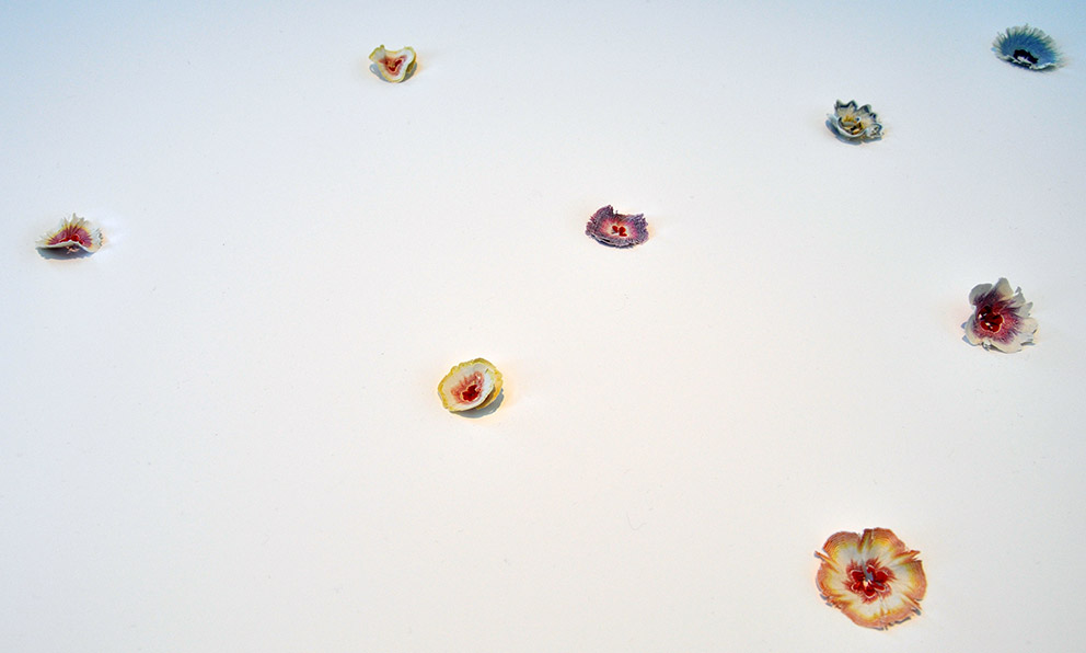
“Subtle” is the name of the show by Japanese paper manufacturer Takeo, designed by Kenya Hara. And subtle, delicate, understated also describe the numerous ways demonstrated in which paper can be used to make something as simple as it is extraordinary – from fragile paper blossoms to flying objects to the most delicate little crowns for exquisite miniature chocolates. Looking on in amazement and entirely without jealousy, we have to admit that only the Japanese can make such things.
Kenya Hara was also involved in the show “Neo-Prehistory – 100 Verbs”, which he curated together with Andrea Branzi. Rolled out here is human and design history in one, suspended in objects and concepts and stretching from gray prehistory to the present day. Even if the overall show is somewhat overladen with cave metaphors and too dark, it does take on the formidable task of negotiating nothing less than the human creative will itself – with all its products. It begins with what nature gave us, simple stone, followed by the stone axe and hand axe, millstone, arrowhead and fertility idol. Later, much later, follow the invention of the wheel and propeller under the term “manufacturing”, and under “despair” Little Boy, the Hiroshima bomb. At the provisional end, number 100, is a reproduction of a heart. The caption: Regenerate.

The exhibition “W. – Women in Italian Design” in contrast, likewise on show at Palazzo dell’Arte, confirms old prejudices more than it sweeps them aside. As though design had never seen a gender debate, in the first room female designers are immediately identified with handicrafts, knitting and crocheting. I’ll get back to the “punch” in another context.

Photo © Thomas Wagner, Stylepark
Five /// Welcome to the Milanese color circle
Anyone who assumed, given our loyal and stubborn companion Ettore (and even if you do not appreciate all those fabulous mule qualities we mentioned in section one), that gray is the new green or the new white, is in for a disappointment. (We nevertheless continue to insist that there is no more beautiful, finer, softer, more velveteen and fluffier gray under the sun than the hide of the right mule.)

The fact of the matter is, even if you would barely think it possible, color is gaining in importance once again. And this is not only visible in freshened-up classics, be it by Thonet or Cassina. Indeed, color is not just an ingredient you could simply leave out. Different yet coordinated colors are important if you are looking for variety, the atmospheric design of whole interiors or a kind of mimicry of existing ensembles, or indeed individualization. It was no coincidence, lest we forget, that modern art paved the way, in Impressionism and related trends, for a revolutionary absolutization of color. Even the rainbow as a symbol of a benevolent divine presence comes into play here.

Photos © Robert Volhard, Stylepark
Many years ago, and in collaboration with Hella Jongerius, Vitra was one of the first manufacturers to begin developing its own system of coordinated and related colors. Now in Milan, we saw the room installation “Colour Machine” at CasaVitra not far from Corso Como. It not only showcased Vitra’s complete color and textile collection, but also examined the insights and inspiration of Hella Jongerius – together with a comprehensive publication documenting the work of the Dutch designer as Vitra’s Art Director for Colors and Materials and the creation of the “Vitra Colour and Material Library”. In future dealers will have an easier time color-coordinating furniture covers and other products and meeting individual needs.

Speaking of green, at the Zanotta stand the lush green really did take over. Dedon meanwhile had few new colors to offer; instead sending visitors straight into the vacation jungle. Which should not be confused with the well-known saying “back to nature”. And on the issue of jungles: We’re asses, who will save us?
Ettore is not moved by it all and simply declares hee-haw, stands still, and opts for another break. On to Section Three.

One /// Nostalgia needs luxury
It is hard to prove, but the impression has for some time been that creating new interiors is somehow all the rage. This can be seen, among other things, from the fact that the topic is increasingly being addressed in the pages, color supplements and magazines of daily, weekly and Sunday papers – pages that are themselves burgeoning. There the sections boast names as pretentious as they are precise, such as “Life”, “Lifestyle” or simply “Living”. Here, the zeitgeist peers over its own slick shoulder and likes to pat itself on the same. Somehow or other, the matter or the impression stick, albeit only because the individual setting where and the social horizon on which this interior creation occurs seem so very different from each other, and so broad.
Should the impression not deceive, then at least in gentrified quarters of the prospering Western metropolises (and increasingly the Eastern ones, too) on the freshly waxed parquet, next to the handmade carpet, people love to present the latest furniture designs, vintage specimens and the one or other inherited piece. On top of which, a highly colorful host of accessories gets included, the symbolism of none of which is readily that apparent. Where skillful interior architects handle the entire design in question, the collage tends to attest to strictly individualized contemporaneity and an insistence of the feel-good with a shot of nostalgia (optionally with a streak of sentimentality) added – spawning ensembles styled end to end, not that far removed from those staged rooms as are presented by the major manufacturers in Milan at their trade-fair booths.
7