Now at long last the news is out: OMA is designing the new headquarters for the Springer media corporation in Berlin. Of late, there have been any number of architecture competitions in Germany’s capital city, the “Hines Hochhaus” on Alexanderplatz (won by Frank Gehry); the “Estrel Tower” by Barkow Leibinger; and the "Hulk"-IBA “Urban Living” strongly promoted by Berlin’s Director of Buildings Regula Lüschers. But none of them has involved as much brouhaha as the Springer project. Which is understandable. Because a media corporation such as Springer does not hold an architecture competition simply to get a “good” publishing house, but above all wants to see good, and at the very least masses of coverage for its efforts.
A super media house
As a result, the announcement of the jury’s decision strategically coincided with the pre-Christmas ebb in news flow. But instead of a winner, all that was released was a shortlist for the next round: OMA, BIG and Ole Scheeren were the three contenders. A somewhat homophonic decision by the jury if one bears in mind that Bjarke Ingels was a staff member and Ole Scheeren was a partner at OMA, and continue to advance the heritage of the renowned Dutch avant-garde workshop in part with mannerist dedication (in the form of Sanaa and Kühn Malvezzi there were two decidedly worthy other candidates who could have been picked). Maybe this clear “REMiniscence” in the three projects chosen was the reason why it has taken a full three months until agreement was reached on the winner.
It took little guesswork to know that Koolhaas would beat his former colleagues to the line, especially given how vehemently Springer CEO Mathias Döpfner resorted to superlatives in the run-up to the contest. The architects were not to concern themselves with existing building permission, height restrictions, and similarly trivial matters, but instead design a building that is “overwhelmingly beautiful” and offers architectural answers to the question of what “the significance of material in a de-materialized media economy”. After all, with this building Springer is not only commissioning a new head office but also completing its strategic reorientation, away from newspaper publisher to digital “content provider”.
Last summer, Springer accordingly parted company with a series of regional newspapers and sent Bild’s editor-in-chief Kai Diekmann to Silicon valley for a couple of months to learn how you cannot only make a name but money with page impressions. And how star architects can be used to offset the increasing immateriality of the business by proudly presenting spatial symbols: After all, over in California Norman Foster is already planning a UFO for Apple worthy of Star Wars, while Frank Gehry is enduringly entrenching Facebook in the greened Californian desert. This is the league that Springer seeks to join. And it goes without saying that in such company you have to go with the master and not with the apprentice. And since Koolhaas is also curating the International Architecture Biennale in Venice, Springer can expect its project to lock into prime “cross-media” synergies.
Monument with offices
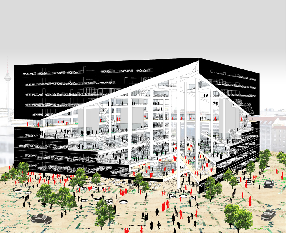
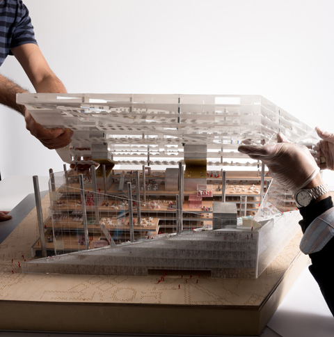
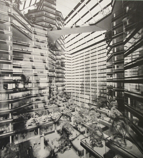
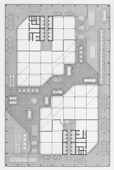
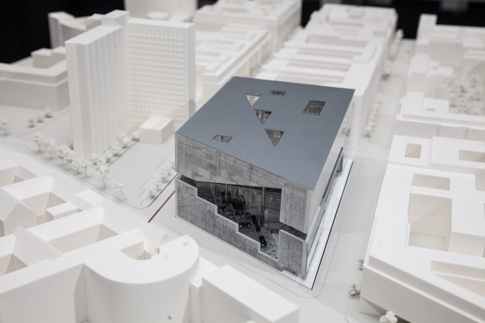
That said, of all the companies taking part it was OMA who most clearly grasped the deeply symbolic element in Springer’s mission and lent it most stringent architectural form. The OMA proposal is not an office building but a monument that can also be used as an office building, no less symbolic than Daniel Libeskind’s project for the World Trade Center in New York. The building’s volume initially fully occupies the site, but only at the edges is it filled with office floors, allowing a monumental hall to rise up in the middle. The hall pierces through the building, creating an immense visual axis that emulates in thrust the line of the Berlin Wall that went past the site and thus brings to mind the old East/West dialectics of the Cold War (and into which Springer positions itself with its new build directly to the south of the Wall). Confrontation not permeation, that’s the message.
Koolhaas calls this empty space a “valley”, also because the office floors on both sides resemble terraced slopes. This differentiated large space is magnificent, architecturally speaking. It evokes a kind of public interior that references the culture of the public domain last witnessed in the architecture of the late 1960s and early 1970s – for example Roche-Dinkeloo’s “Ford Foundation” in New York in 1968 or their design for the “Royal Bank of Canada” in Toronto in 1971. There, the large interiors functioned as public urban space, while here the hall is part of the corporation’s private space and has little of a public feel to it. This iconographic amortization of a utopian space for symbolic assets is also the project’s Achilles heel; yet we must be grateful to Koolhaas for having rendered the ideological crux of the brief so very transparent.
Koolhaas nevertheless allows the public access to certain areas: to the lobby, to a bar on the roof, and to the “Meeting Bridge”, where visitors can watch the journalists drafting headlines. This staged form of participation brings to mind VW’s Transparent Factory in Dresden, where buyers can worship their Phaeton in statu nascendi. Or Norman Forster’s Reichstag, where visitors to the dome can look down through the glass roof and what their political representatives are up to (as if the politically controversial issues did not always get resolved by the Bundestag during the World Cup or after midnight).
Romantic pragmatism
The fact that here Koolhaas resorts to the vulgar equation of transparency and public domain is not some sign of his naivety, but an expression of his personal principle of hope. As a romantic pragmatist Koolhaas is as fascinated by central power as he is repelled by it, which is why he constantly seeks to subversively utilize the symbolic capital of architecture to bring the democratic public sphere back into play. He is presumably familiar with the “Lost Honor of Katharina Blum” by Heinrich Böll, and with Günter Wallraff’s undercover reports from inside the Bild editorial desk, and of course the special role Springer played during the student revolts of 1968.
Nevertheless, or precisely for this reason, he accords Springer a strong shot of support for social transformation. The OMA renderings for the future Springer offices quite clearly allude to the retro-charm of the editorial world presented in Alan J. Pakula’s legendary paranoia classic “All the President’s Men”, which focused on how the Watergate scandal was uncovered by Washington Post reporters Woodward and Bernstein. Incidentally, the Washington Post, that global flagship of investigative journalism, was bought last year by Amazon CEO Jeff Bezos, who is less well known for enlightened political ambitions. So why of all things the commercial digitalization of the print media is thought to result in the strengthening of a democratic public sphere and not in precisely the opposite remains Koolhaas’ guess. But maybe he really knows the answer.
Scheeren’s icon bomb
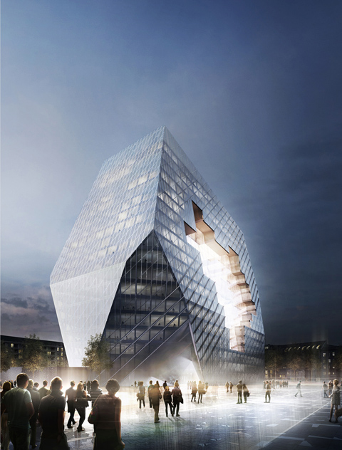
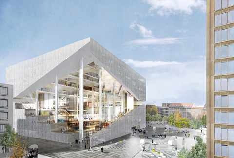
The symbolic logic of OMA’s project is cast in even sharper light if compared to the proposal tabled by Ole Scheeren – he was for almost a decade Koolhaas’ right hand and was in charge of OMA’s Asian portfolio. Conceptually speaking, his building is almost a transfer image of Koolhaas’ project. Yet where the latter articulates his idealist hypothesis by relying on romantic exaggeration, ambiguity and even melancholy, Scheeren quite unequivocally bangs an icon bomb on the site. Scheeren likewise locates the offices on the perimeter and uses special settings to frame a central atrium that is presented as a highly contemporary “Collaborative Cloud”. The fact that from the outside it looks more like the result of a drone attack simply serves to emphasize the iconographical compatibility of the design with the “Breaking News” coverage of 24/7 newsfeeds. Exactly how this ungainly and immoderate monolith is supposed to support the urban advancement of the district south of Leipziger Strasse, which to this day has an especially hard time of it, remains anyone’s guess – and certainly is not obvious compared to other projects submitted in the competition.
BIGs viewing platform
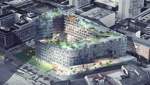
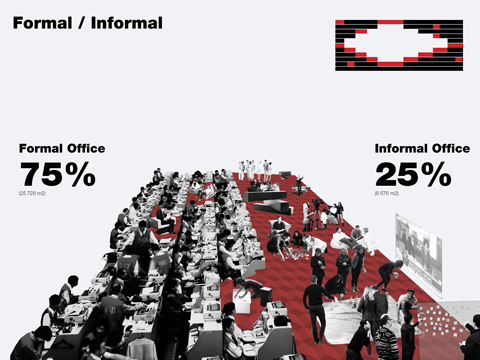
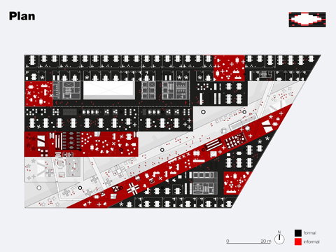
By contrast, the BIG proposal posed a serious alternative to Koolhaas’ project. Bjarke Ingels follows closely in Koolhaas’ path. But he only worked with the grand master for a few years before going it alone in 2001. While of the three, OMA’s design responds to the competition brief most strongly in the critical tradition of the 20th century avant-garde (meaning it stands most for the past), and Scheeren instead offers an aggressive display of branding for the media future, BIG’s proposal seems most strongly rooted in the here and now. Of the three submissions, it is the least draped in symbols, yet for all its pragmatism no less ambitious. Once again, he’s opted for a spiral that draws more urban space into the building than do his two rivals. The offices form the key element of the serpentine, presented in a presently unheroic idiom as placed where work gets done. The special touch: the mezzanine floor that houses all the collective functions. In front of the street-side façade, the floor acts as a public promenade along which visitors can stroll right to the top of the spiral. Just because they can watch Speringer staff taking a break hardly makes the building more public than the other designs. But it gives the city back more than the two rival proposals as it offers not just a path to the roof, but a view out over the city.
Evidently, in this instance the decision-makers, meaning the jury and the client, found that much real added value a bit too much. So we can look forward to seeing how Koolhaas uses the opportunity to erect a building at precisely the place that first made an architect of him. Inspired by the Berlin Wall, in 1972 in his final-year project for the Architectural Association in London entitled “Exodus, or the voluntary prisoners of architecture” he speculated on the architectural potential of a city surrounded by walls. The Springer Medien Campus will now enable Koolhaas to live out his fascination with the dialectical tension between opposites – in built form, this time: the opposites of East vs. West, capital vs. commons, published vs. public opinion – and perhaps the voluntary prisoner of the architecture will this time succeed in leaping over the walls.
MORE on Stylepark:
XXL Koolhaas: In Berlin, Rem Koolhaas has just presented the program for this year’s architecture biennial in Venice. The expectations are high: This biennial is to be larger, longer, and of course completely different.
(18. März 2014)