Biennale Interieur Kortrijk 2016
Caught up in approximations
They have organized and staged, selected and invited, collaborated and even exhibited their own works: The curatorial team made up of “Office” architects Kersten Geers and David van Severen, artist Richard Venlet and graphic designer Joris Kritis has with its scenography undoubtedly decisively shaped the exhibition program of the 25th edition of the “Biennale Interieur”. Yet the team did not manage to find an answer to the question “What is an interior?”, which the Biennale directorship put to them in order to provide the framing context for this year’s fair.
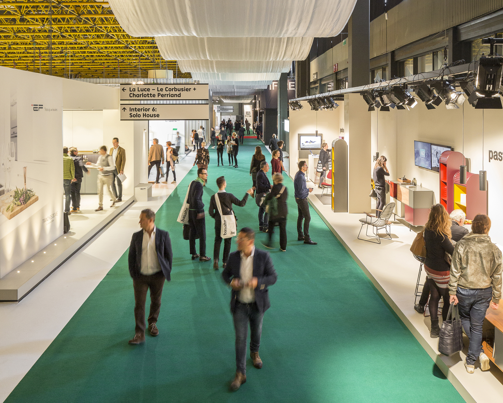
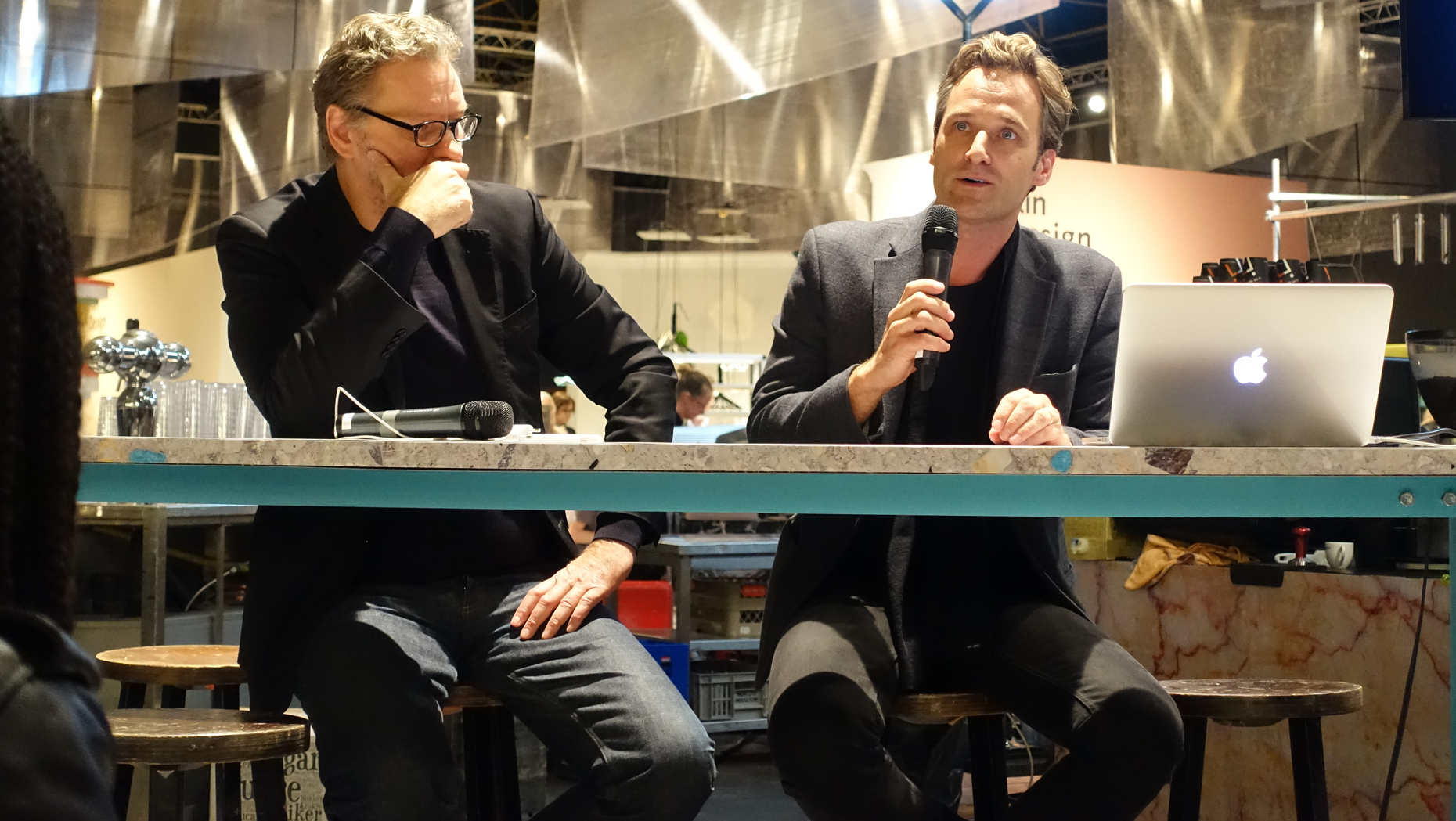
The “Biennale Interieur” is a hybrid: Unlike many other design fairs, the focus in the Belgian city of Kortrijk is not solely placed on sales and the design market. The manufacturers’ presentations are embedded in a scenography designed for the occasion and accompanied by a cultural program. And this is not just entertaining embellishment, but has high aspirations: “The program is able to redefine what contemporary design is,” as architect David van Severen stated in conversation with Stylepark. “If we stop thinking and leave the decision on to what design is today to the commercial exhibitors – that wouldn’t be enough.”
There is certainly enough food for thought to be found in the fair halls: Under the title “Interiors”, the curators have interspersed the fair stands with a number of exhibitions. The biennial did not interfere with their choices, as artist Richard Venlet stressed: “It is really quite rare to have this amount of freedom. Freedom to decide how we want to intervene in these large halls and what kind of spaces we want to create.”
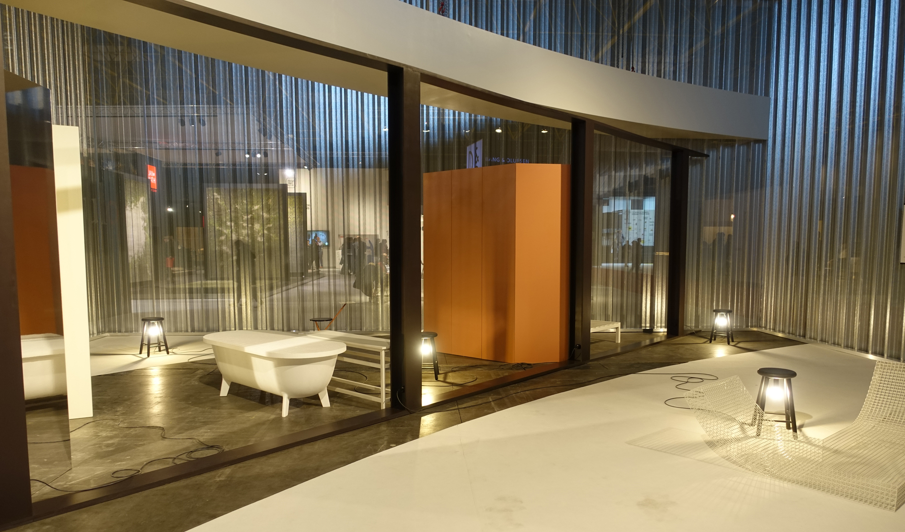
The curators have used this freedom to provide a strong, well-functioning framework for the biennial. They have cleared diagonal paths in the fair halls that make the entire area accessible in the way a right-angled street grid does for a city. These are very helpful as a means for finding your way in the maze of stalls: The main axes are emphasized by way of colorful carpet floors and a textile in shiny silver hung under the ceiling in wide arcs. At the junctions between the axes there are bars, special areas and silver boxes that draw the visitors’ attention from afar. In the otherwise very open structure of this year’s biennial, these boxes create closed-off spaces for the “Interiors” exhibitions. The boxes are made up of folded steel panels, the same kind otherwise used as ceiling elements – as a look upwards reveals. “I also call these boxes public buildings,” stated David van Severen, the son of designer Maarten van Severen and brother of Hannes van Severen, one half of the design duo Muller van Severen. “It’s the same as in a city. The visitors can decide for themselves whether or not they want to enter, I think this is the best way to link a commercial and a cultural program.”
The connection certainly works in spatial terms. Yet in terms of content, there are in part some wide rifts between the exhibitor’s stalls and the curated shows. One of the reasons for this certainly also lies with the exhibitors: unlike at the previous editions of the Biennale Interieur, most of them are now focusing on their products. Very few companies dare to do something a little different with the way they present their wares. Inspiring displays are rare. The exhibitors’ rather conservative and risk-averse performance may well be due to the unstable economic situation. But it means that the ambitious curatorial program feels like an alien element. Rather than sparking inspiring connections with the market, it comes off as distanced and vague. This is of course also in part a consequence of the chosen topic and the rather broadly formulated question “What is an interior?”, which is not particularly fit for creating something akin to relevance or virulence.
And yet the curators had the right idea: “I get the feeling that with phenomena such as Zara Home or H&M Home the interior has by now become as thoroughly commercialized as is fashion,” comments David van Severen. “You can constantly buy new things and then instantly throw them away again. I find this development very questionable in relation to design and interior. Because furniture and architecture are actually slow. We should celebrate this quality, rather than take our cue from the world of fashion.”
However, rather than use the freedom they were given for making precise statements and addressing the mechanisms in the industry, the curators remain ambivalent in their interdisciplinary cross-over. For their “Interiors” exhibitions, they invited artists, architects and designers to participate – good friends, darlings of the art and design world. They then put these together in pairs or whole teams, because, after all, nowadays everyone collaborates with everyone else. In the overall hope that the meaning of the end product would be fortified through the liaison.
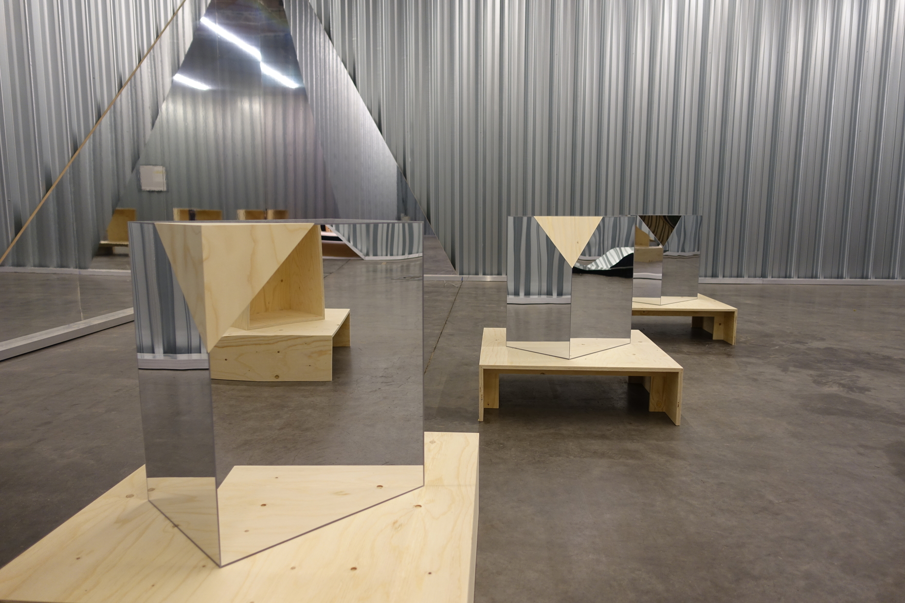
So the guests were not only curated by the curators, but also curated each other. Which has unfortunately resulted in too many curators spoiling the exhibition. As, for example, is the case with the show by Swiss design doyens Trix + Robert Haussmann, who make an appearance together with Fredi Fischli and Niel Olsen of “Studiolo”. On show are a row of small cubes, a variation on the design of corners. This was however evidently not enough for the curators, so a corner of the exhibition space also had to be covered in mirrors. Pretty, but trivial.
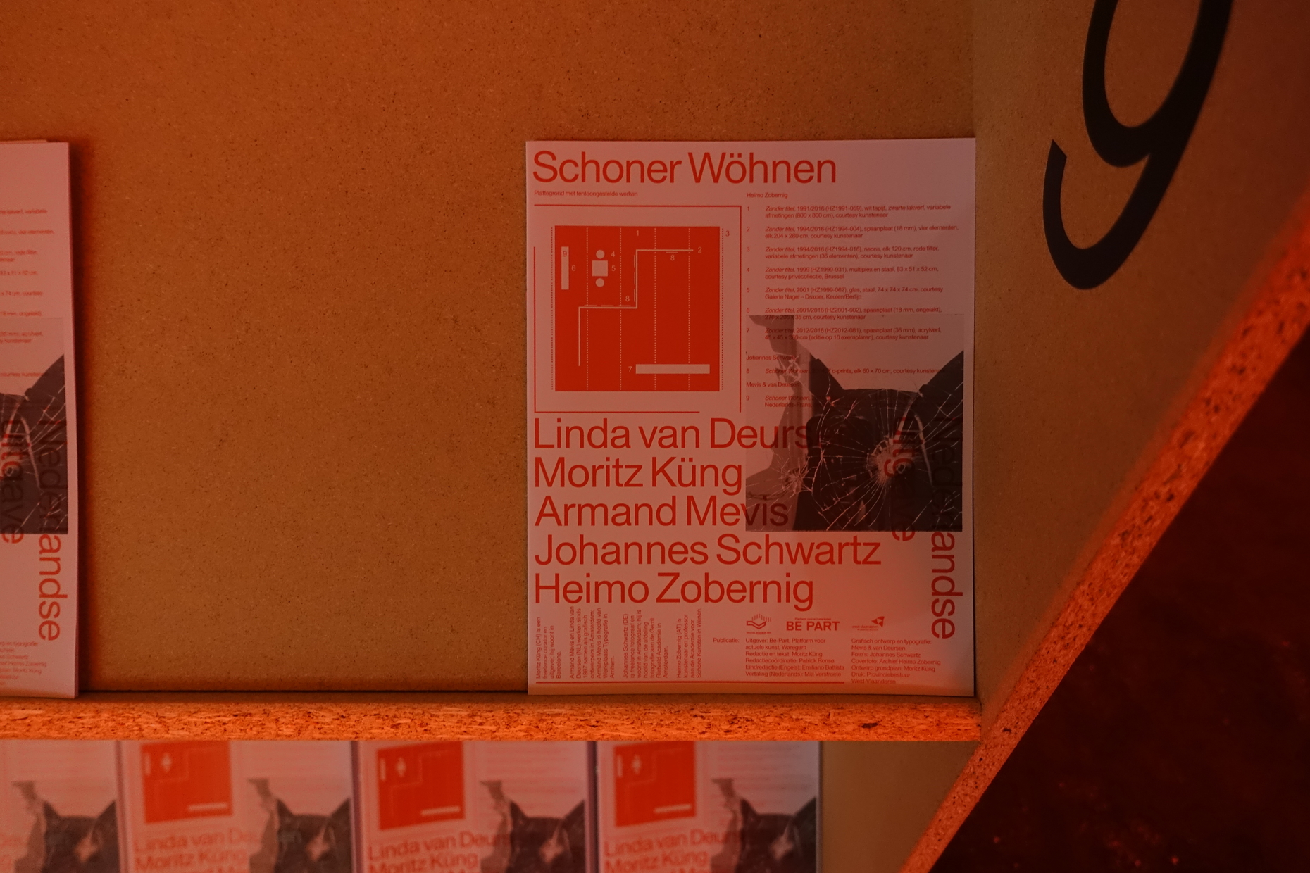
Pointierter schon das Duo aus dem Kurator Moritz Küng und Künstler Heimo
Zobernig, die sich allerdings konzeptionell dabei verheddern, eine Ausstellung von 2004 in verfremdeter, vielfach gebrochener Form wiederaufzuführen. Mit Zobernigs Spanplattenmöbeln, dem lackierten Teppich und der roten Beleuchtung entsteht zwar ein „Interior“, aber die Besucher gucken trotzdem so ratlos, als kämen sie aus dem falschen Film. Hier passen Inhalt und Kontext nicht zusammen, die Schau „Schoner Wöhnen“ operiert mit den Strategien der zeitgenössischen Kunst, ohne Erkenntnisgewinn für die Besucher einer Designbiennale. David van Severen ist sich darüber sogar im Klaren: „Installationen wie ,Schoner Wöhnen’ sind vielleicht irrelevant für die Art und Weise, wie Design heute unterrichtet, präsentiert und kommerzialisiert wird.“ Es sei aber sehr wichtig, zu verstehen, dass nicht nur der Markt entscheide, was relevant sei und was nicht.
The duo made up of curator Moritz Küng and artist Heimo Zobernig is somewhat more incisive, yet they get caught up conceptually in their idea of re-staging an exhibition from the year 2004 – after having reworked and reshuffled the subject matter in a multitude of ways. Zobernig’s particle board furniture, the varnished carpet and the red lighting do add up to an “interior”, but visitors still don’t really know what to make of it, and seem to find the display somewhat bewildering. Here, content and context are just not compatible; the exhibition “Schoner Wöhnen” uses the strategies of contemporary art without providing any useful insights for the visitors of a design biennial. And David van Severen is even aware of this: “Installations such as “Schoner Wöhnen” might actually be irrelevant to the way in which design is taught, presented and commercialized nowadays.” Yet it was important to understand that it was not just the market alone that decided what was relevant and what was not.'
So who does decide? In case of doubt, the curators themselves, who with their project “Solo House”, are also amongst the exhibitors. “Solo House” is a holiday villa, which Kersten Geers and David van Severen are currently building in Spain, a transparent ring with a cement roof, a maximally minimized house, almost without any boundaries between inside and outside, where only a few built-ins and pieces of furniture provide a bit of stability. In fact, this is rather a good object by which to analyze what an “interior” can be. In one of the interior cubes the architects show an arrangement made up of to-size fragments of the house, such as pillars or a section of the roof, alongside stool lamps by Richard Venlet and grid furniture by Muller van Severen. But here again everything remains vague: Those who do not already know the project are unable to surmise that a living space is being cited here and are left feeling as though they are standing in a somewhat messy furniture exhibition.
The Swiss architect Philippe Rahm is the only person to present an interesting contribution with “The Anthropocene Style”. A dimmed interior with a chair, curtain, carpet, lamp, partition and mirrors that store heat, thereby improving domestic comfort and allowing us to save energy. His answer to climate change may be fictional, but he manages to put our habits and certainties into question. It is the sole installation that actually manages to convey some of the critical relevance the curators claim. This might be simply down to the fact that Rahm was allowed to work by himself. One man, one concept, done.
Einzig dem Schweizer Architekten Philippe Rahm gelingt mit „The Anthropocene Style“ ein interessanter Beitrag. Er zeigt ein abgedunkeltes Interieur aus Stuhl, Vorhang, Teppich, Leuchte, Raumteiler und Spiegel, die Wärme speichern, den Wohnkomfort verbessern und uns so beim Energiesparen helfen sollen. Seine Antwort auf den Klimawandel ist zwar fiktiv, schafft es aber, unsere Gewohnheiten und Gewissheiten in Frage zu stellen. Es ist die einzige Installation, die es tatsächlich schafft, etwas von der kritischen Relevanz zu vermitteln, wie die Kuratoren sie fordern. Vielleicht auch einfach deshalb, weil Rahm ganz
alleine arbeiten durfte. Ein Mann, ein Konzept, fertig.