Break away from the usual cutting-edge technology and extra-large dimensions flat screens: „SerifTV“ by Ronan und Erwan Bouroullec für Samsung. Photo © Studio Bouroullec
Framing the TV
|
|
by
Feb 26, 2016 It is a well-known 19th-century invention that the idea that the Earth is flat held sway until modern times. As early as the sixth century BC Pythagoras had assumed for aesthetic reasons that celestial bodies were spherical, and Aristotle later observed that when ships were sailing away from the coast their hulls disappeared from view before the sails and that the Earth’s shadow is always round during a lunar eclipse. It is the genesis of the television set alone that still tends to confuse our image of the world. Indeed, in the beginning TVs were boxes. Under evolutionary pressure, the box mutated into a flat and ever larger panel, while the spherical shape was always an exception however. This is readily demonstrated by a somewhat random design-historical series that starts with Herbert Hirche’s “Braun HF1” of 1958 and Dieter Rams’ Braun “FS 80 TV” of 1964, takes in the “Algol” box designed by Marco Zanuso and Richard Sapper in 1965 for Brionvega (portable and with a visible kink) and ends with Hartmut Esslinger’s “Wegavision 3000L” of 1966 and his “Wega Color TV 3050” of 1978. Yet the ultimate box is the 1972 Brionvega ST201, likewise designed by Zanuso/Sapper, a reflective “black box” made of mysteriously dark and semitransparent acrylic (20 years later Mario Bellini advanced the idea based on new technology to create his “Cuboglass TV”). Thus we reach the end of the history of the image-emitting box and – around the turn of the 21st century – enter the age of no-longer-designed or no-longer-worthy-of-design flat screens. From now on the electronic window to the world was to remain a dark surface when not in use, a bland nothing in a space without spice or taste and which can be best tolerated as a rectangle mounted on the wall. An anonymous user interface, nowadays we are granted nothing more this side of the programs. Whereas back in the late 1980s Hans Magnus Enzensberger called television a “zero medium” and declared all complaints about it groundless, as far as furniture goes, too, it subsequently found its ideal form in the flat screen. Now, however, “Serif TV” is on the scene – and with it a first attempt at correction. Who knows whether this device, designed for Samsung by the omnipresent Bouroullec brothers, will remain just another episode in the history of the base flatness of televisions, or whether its still slender body constitutes an evolutionary step forward in terms of aesthetics and design. It is of course surprising in itself that such renowned designers took on the challenge at all. The fact is, the Bouroullecs wish to restore to the television set, reduced as it has been to a bodiless, magical surface, its character as object and item of furniture – even if in doing so they obviously fall short of going the whole hog. Indeed, it is above all the frame that Ronan and Erwan Bouroullec have given a design makeover, the spaceless interior of which is disposed to pretend to contain the ubiquitous outside world per se. As far as the profile is concerned, the still very slender housing resembles a double-T beam of considerable height. You could say that with its top and bottom cover panels it looks like a capital “I”. Just as if in profile the screen – the name “Serif TV” hints at this – were a letter in the alphabet, the designers have finished the vertical line (changing from Helvetica to Times, so to speak) in a horizontal end point at the top and bottom. This produces a surface at the bottom that ensures the TV is secure and, if you add the long, thin spider legs available for the larger models, means the television can stand anywhere. (Although this inevitably carries the association of a board for noting things down on.) The protruding upper edge in contrast is a waste of space, or can perhaps be adorned by the decorations department – yet proves too thin for the famous crocheted doilies. Thus it sounds somewhat exaggerated when Erwan Bouroullec states in the Samsung video that “Serif TV” closes the gap between technology and environment. And given the results, we may find it hard to believe such great claims as that one of the challenges was to make the design stronger than the technology. Yet “Serif TV”, with its fabric rear panel and available in three colors, is certainly a nice change and has a hint of nostalgia. In any case, the metamorphosis of the dark panel would appear to have begun.
We used to be more frivolous: In an interview with Martina Metzner, Erwan Bouroullec reveals the ideas behind the new product and how design stimulates the senses. Formations in the Sky: Meeting in Copenhagen: Ronan and Erwan Bouroullec have come to Øresund to put the finishing touches to the first Kvadrat showrooms in Denmark shortly before they are opened. |

„What we were looking for was just like a piece of furniture“, say Erwan and Ronan Bouroullec. Photo © Studio Bouroullec

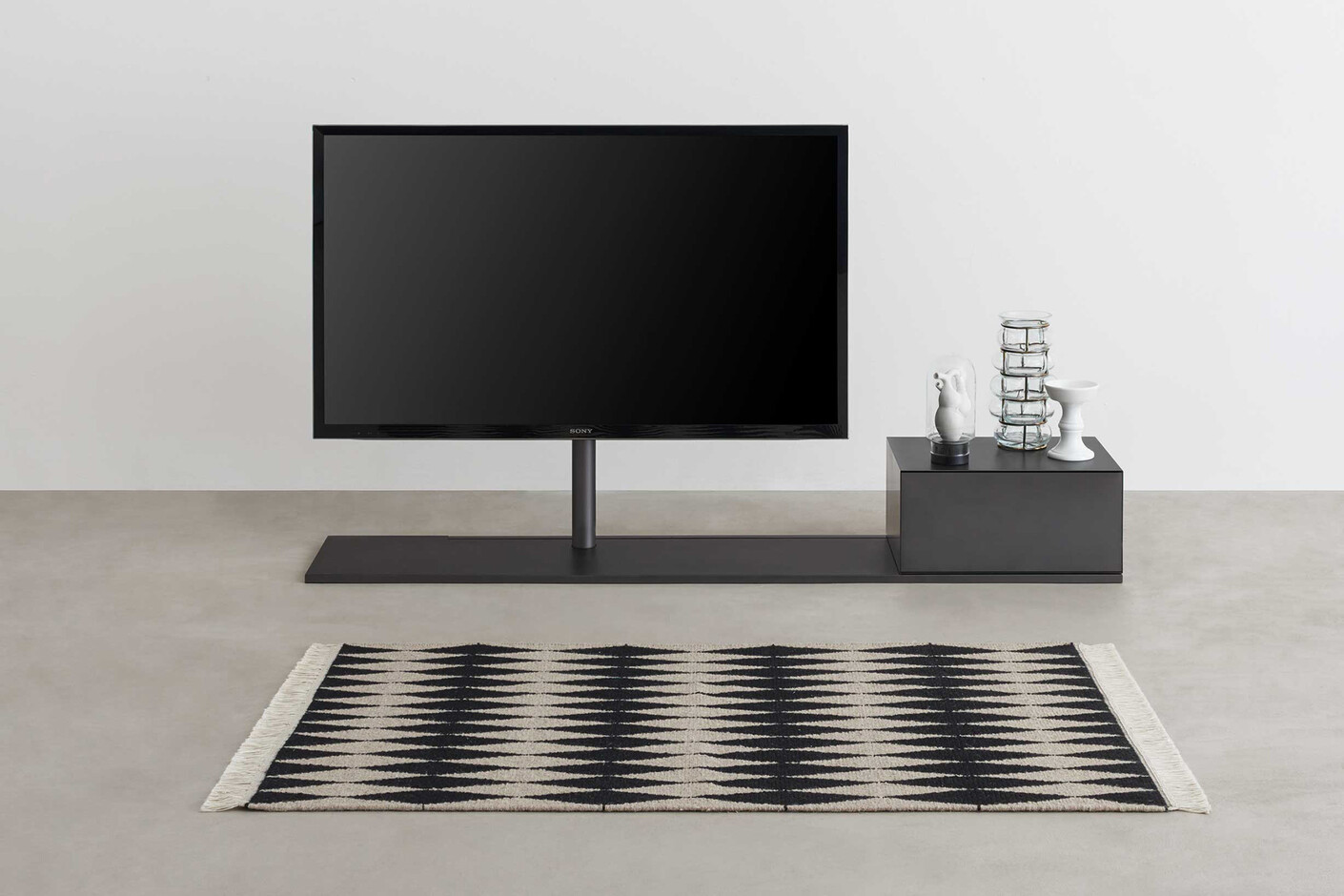
The TV is defined by the frame that embraces the screen. Photo © Studio Bouroullec

Also the screen saver with different functions has been desined by the Bouroullecs. Photo © Studio Bouroullec

„SerifTV“ is starting at 700 up to 1500 Euros. Photo © Studio Bouroullec
|
In profile the TV shapes a clear capital „I“ that gives the screen the needed stability. Photo © Studio Bouroullec
|

Also the back of the „SerifTV“ is attracting, thanks to special designed fabrics. Photo © Studio Bouroullec
|
The Bouroullecs studied the effect on the room of the TV. Photo © Studio Bouroullec
|

Additional legs subsitute a console. Photo © Studio Bouroullec
|