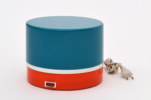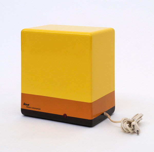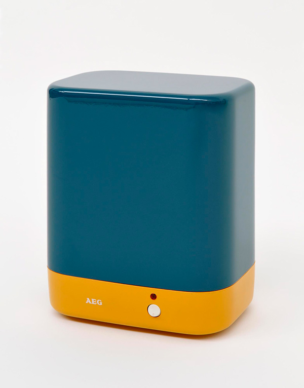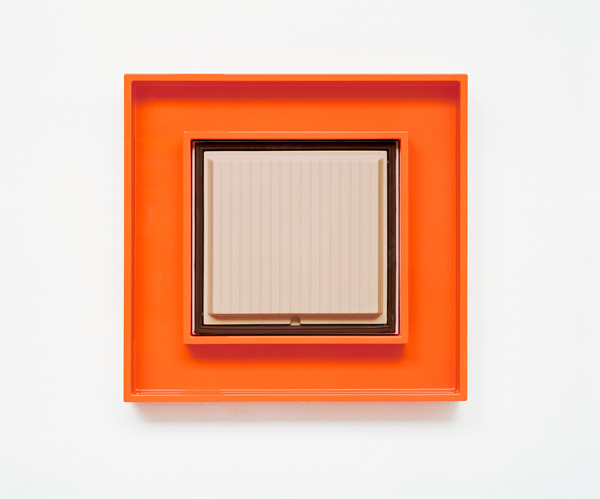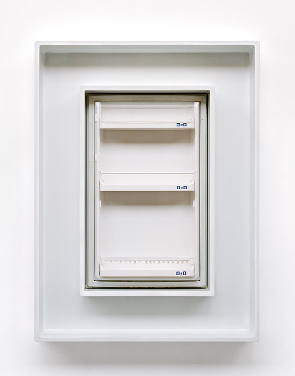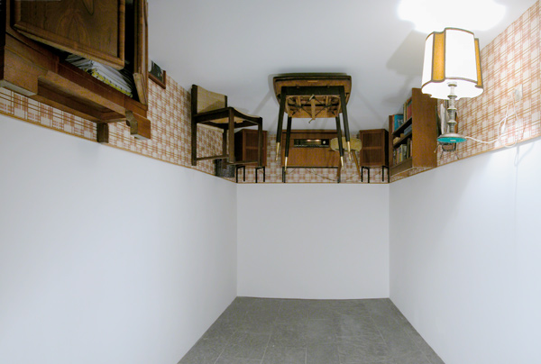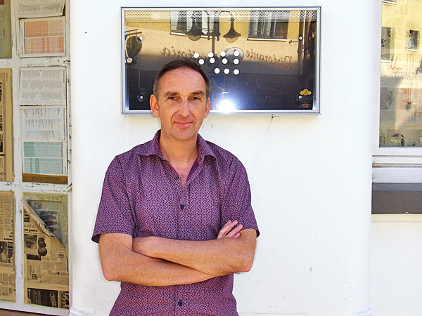
Nina Reetzke: Herr Brüger, you studied art, but design and architecture also play a key role in your works. Why do you deal with such everyday objects? Martin Brüger: I am not interested in art that seeks to be a new creation. It fascinates me to use things as the starting point for my work that exist independently of myself and my art. However, unlike Marcel Duchamp my aim is not to declare an everyday object to be art but to alter it in some way so that it loses its everyday function and is enriched by a level of artistic reflection. How does that translate into action? Brüger: Once I have selected an everyday item or an architecture photo as the starting point for my work then I take something away from it, namely the thing that defines the familiar function of the item or building. Subsequently, I add something to it, which you would not normally expect at this point. Often my works are extended in their proportions – compared with their original state. The result: hybrids that can be assigned both to the everyday but also to art. Form should always have a quality, regardless of the context it stands in. How do you choose the starting point in your appliance objects? Brüger: I like products that have something reduced and simultaneously convey a colorful, strong design statement – usually they are from the 1970s. There is some fantastic design around today – the Apple products, some of the Braun designs or for instance the wonderful Wogg 52 shelving system – but the current trend is towards sophisticated materials and surface structures, less use of color and much more subtle. My original products are not necessarily high-end design, but rather “cheap”, industrial design, which precisely on account of its simplicity can be linked to Pop Art, Minimal Art and Constructive Art. How do the color concepts come about? Brüger: Some time ago I bought two bathroom cabinets in a second-hand store. First of all, I found them somewhat disgusting because they were this awful dusky pinkish beige color. But then I tried to find out what colors would suit them and could also form a strong contrast to them. I ended up with a neon green and strange salmon pink. These are colors that have nothing to do with the 1960s aesthetics and stem more from a contemporary color range; they break up and ennoble the original cream color. What is the role of effects such as shine, transparency and little bulbs that can be switched on and off? Brüger: In the appliance objects the inserts are made of MDF with a high-gloss finish. You cannot allow any dust to get in the paint, they have to be carefully done. I get the paint work done in a car paint workshop. The original products are used items that I buy on Ebay. Though they are usually injection molded and had shiny surfaces there is a scratch there or a corner missing or the material has become more matt over the years. I remove the electronics, in other words the part that constitutes the appliance. Only the little bulbs remain. So when you put in the plug the little bulb comes on but nothing else happens. And then you have the names on them such as AEG, Bauknecht or other brand names … The term “semantic breaks” is often used when talking about your works. Is the expression apt? Brüger: I tend to think in contrasts rather than in a strong coherence, where everything harmonizes with each other. On repeated occasions I have experienced that ultimately even contrasts are interlocked and have something to do with each other but in a more rambling and complex manner. What do you think about the word “economic miracle”? Brüger: What I find miraculous is that unconsciously the planning basis for industry is still a belief in unrestricted growth and inexhaustible resources.