“The White Cube Has Had its Day”
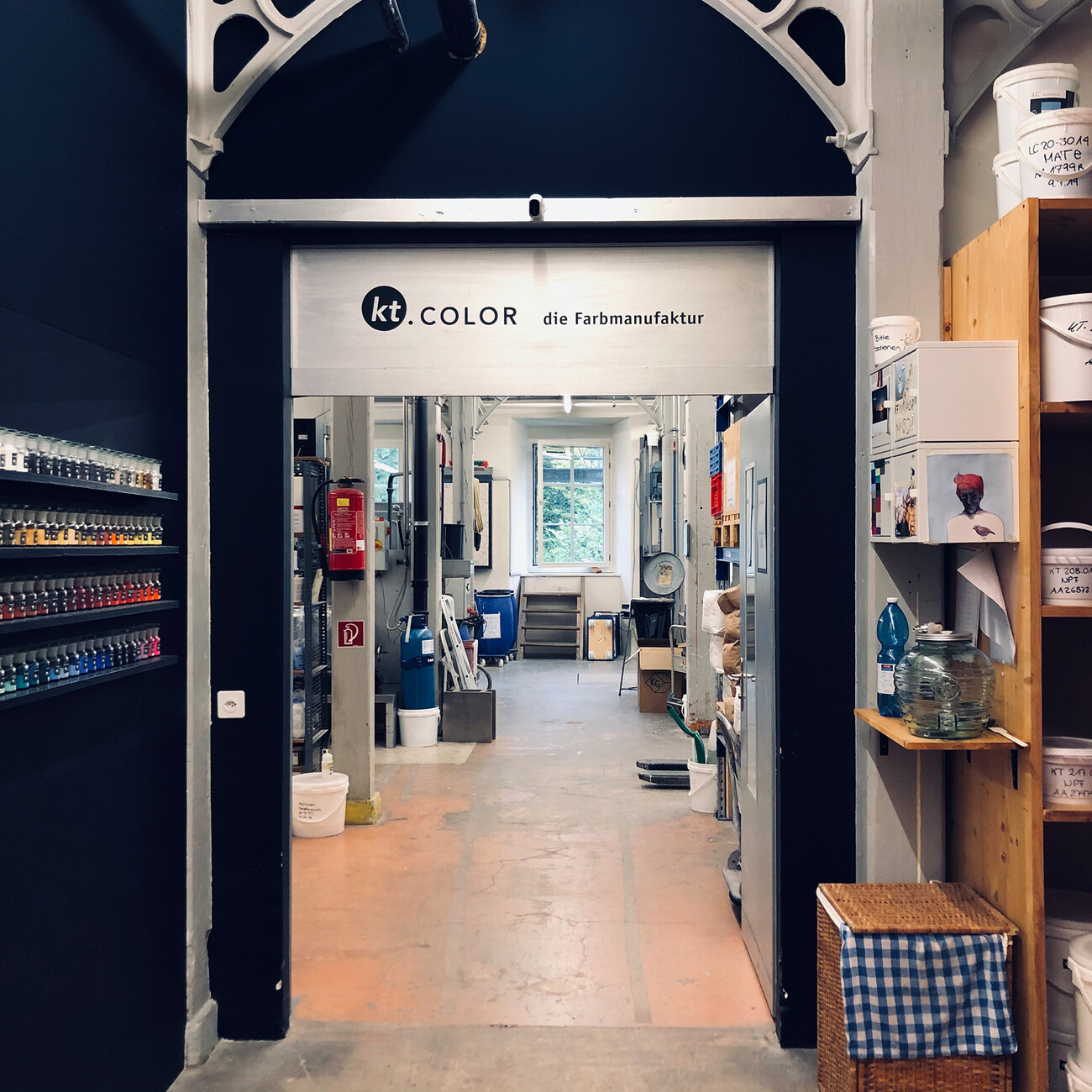
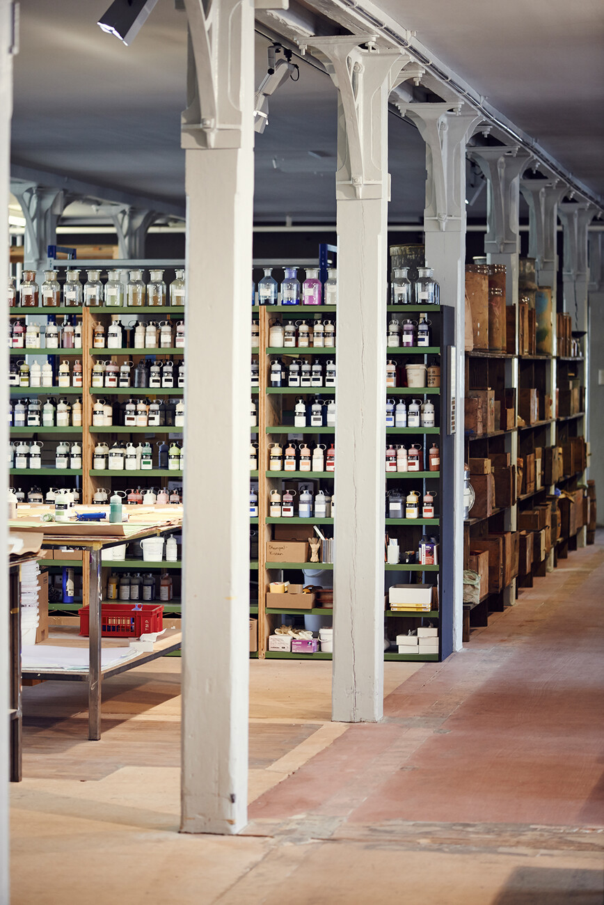
Anna Moldenhauer: Ms. Trautwein, you are the founder of color workshop kt.COLOR and you conduct research into color. What can you tell me about your work?
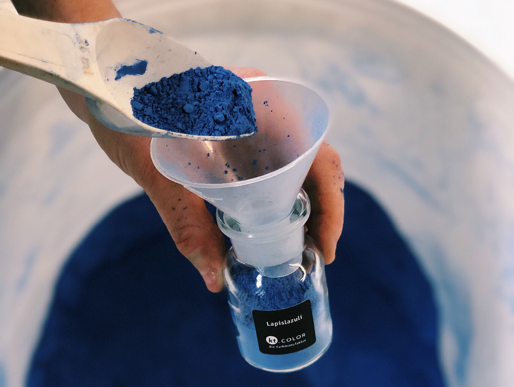
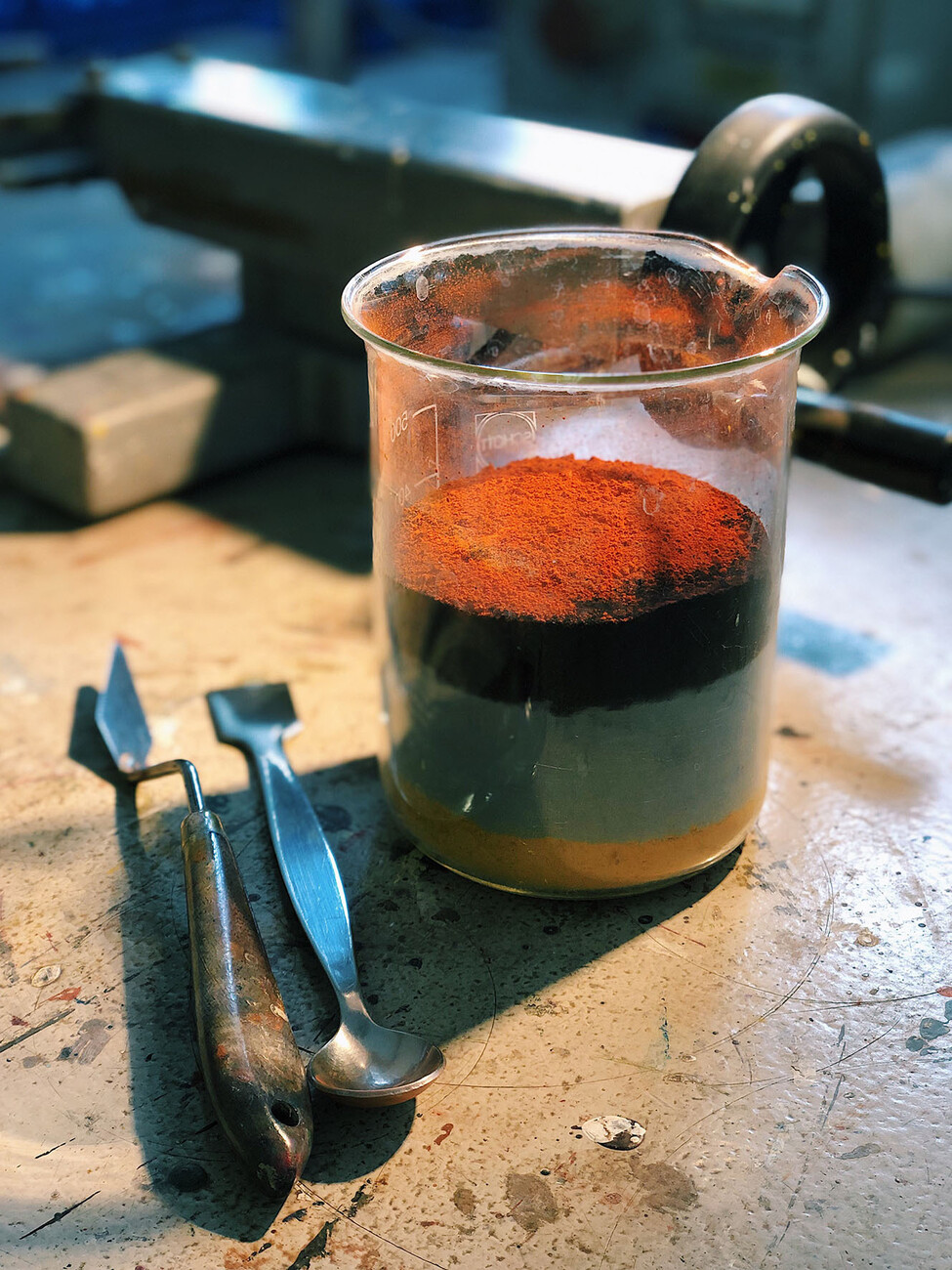
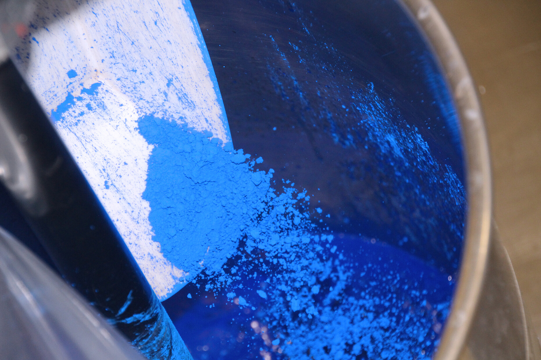
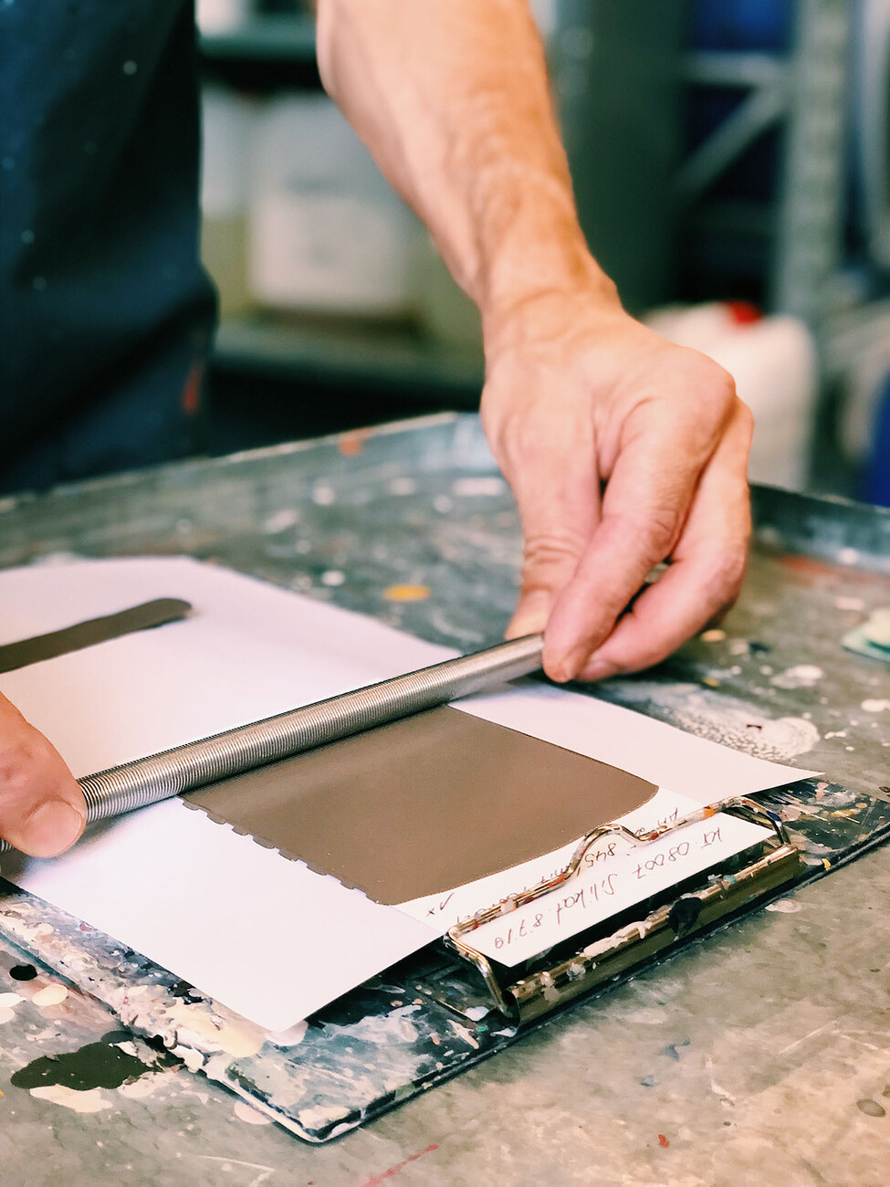
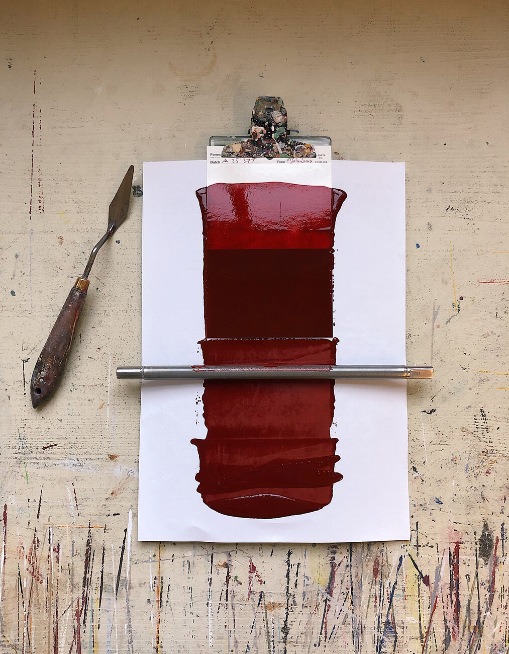
Katrin Trautwein: I am basically a chemist and it was while I was investigating color in Le Corbusier that I came across the cluster of topics that is color, light, space and man. Colors are the most important information system we use to apprehend our surroundings. They cannot simply be broken down into one aspect, they are a material which says something about culture. For example, a mineral crimson from a heritage building has a different effect from an artificial Ferrari red and is differently synthesized. In my books and training courses I attempt to make this approach understandable for specialist audiences.
What particularly fascinated you about the range of colors employed by architect and designer Le Corbusier?
Katrin Trautwein: At the time, Le Corbusier joined forces with a company by the name of Salubra to produce a sample book on color design in architecture. It documented in very concrete terms the colors that he considered important for showing his architecture in the best light. The colors he chose have a particular depth, allowing rooms to appear pleasant and natural in combination with light and lending the architectural an ideal vitality. It really does matter whether the paint for white walls is an artificial titanium white or a natural chalky white – and the impact this has on the overall effect produced by a room differs accordingly. The idea that color and shape are separate sciences, that color should only be considered a variable of measurement and seen as an area of Pop psychology only emerged subsequent to the Bauhaus era. For me, this is utter garbage and amounts to very much the same thing as saying that the taste of wine depends on how red it is.
You were involved in restoring the famous E-1027 villa by Eileen Gray and Jean Badovici in the South of France, it was you who identified and re-created the colors. What role did Gray attribute to color in this project?
Katrin Trautwein: Eileen Gray’s house represents an attempt to take the formalisms of Modernism and to transform them into something sensual, to give the soul enough space for what it needs. For her, colors were very important to this process. The shade of white that she chose thus corresponds to the pebbles on the beach in front of the house, whose particles of pigment wonderfully reflect the mood of the light. The same applies to the bluish green hue which reinforces the soothing effects of the half-light. With her E-1027 she establishes a relationship between inside and outside, between the rhythm of nature and man in a spatial environment. She achieves this with color. Accordingly, when entering the house people experience a dramatic composition of various shades of blue and this calms them down as they come into the house. It is as if they were diving from shallow waters deep into the sea, from a greeny blue to a turquoise blue and on to a dark blue, fabulous. Very cleverly and with a twinkle in her eye she has used details and contrasts to succeed in establishing a connection between a place and the individual. The idea behind her design was the notion that interiors can provide a better relationship between man and his own nature, his own core.
Color will also play a central role in the design for locations for the new mode of working – are architects currently taking their questions about the ideal color combinations for this to you?
Katrin Trautwein: Yes, more and more. I believe that the white cube has had its day. The kind of space that flatters the eye does not need to look different in an office from the way it looks as at home. The more monochrome an environment is, the more artificial it looks, and it is, moreover, a real strain on our eyes. The kind of monochrome white rooms painted titanium white that are to be found up and down the country are even taxing as far as our eyes are concerned.
Does this mean that when choosing the colors for workspaces the focus should be more on the needs of the individual and on the way our eyes react to colors?
Katrin Trautwein: Quite so. What is called for are discreet contrasts. If I have a black desktop my pupils dilate and I can concentrate on my tasks better. If the surface is white, they contract and let less light into my eyes and looking becomes more strenuous. If I then have harsh contrasts between the different colors in my office, such as the colors of the walls or the interior, my eyes need to adjust the amount of light that they let in constantly. If the colors are coordinated and harmonious, I can see details better and my eyes consistently keep their screening out light process at a medium level. When choosing colors, we should really always think like a landscape gardener – when everything is the same it is boring but too many harsh contrasts make a setting too loud, in visual terms. Our evolutionary intelligence is linked to the contrasts in the landscapes around us. And the more pleasant these are, the more energy we have at our disposal to devote to our work.
What do you think about the kind of color trends that are regularly announced?
Katrin Trautwein: I don’t rate them at all. If a room is pleasing there’s no point in permanently changing its color. It certainly isn’t conducive to business but I would never encourage people to change a room because of a trend, that isn’t a sustainable practice.
What do you like about natural colors?
Katrin Trautwein: If you look at samples of old pigments under a microscope, the colors are always spectacular, they react very well to the rhythm of daylight, radiate warmth and take on moods. Natural pigments have all these virtues and we work with them in order to achieve that vibrancy in our colors. And this is also how they come to be capable of engaging in dialogue with one another, because every color in nature always holds details of the other ones within it to a certain extent. They correspond to one another through their variegation. Artificial colors cannot achieve this spectrum by means of simple gradation, there is no reciprocal action of this kind with light.
When coming up with his wall hangings, Le Corbusier restricted himself to 63 colors. In your opinion, is less choice beneficial to an ideal color design in architecture?
Katrin Trautwein: Absolutely. A transparent number of colors is something that I can control, a situation where I am familiar with the reciprocal effects. The more different shades I use, the more difficult things become. Instead of as large a range of shades as possible it should be more about the quality of the color and the pigments, as it should be with other materials.
Are there aspects of the way color is used in the field of architecture and design that you would like to change?
Katrin Trautwein: I wish that the subject of color as a whole and that the painter’s trade would be taken more seriously because color is the skin that surrounds architecture. As far as I’m concerned, it makes no sense to invest a great deal of time and money in structure and shape, only to paint everything over with a simple artificial white, which only devalues the atmosphere of a room once again. My wish would be for the topic of color to reappear on the curriculum of Architecture, after all, it does determine people’s perception of shape. In these digital days we also need to start thinking about color differently. The colors we see on a computer screen do not translate into reality one-to-one because in the latter case they take on a different character when combined with shape and light. The right color on a wall relates man to the architecture that surrounds him, something which should really appeal to the architects. Nevertheless, the courage to experiment is often just not there, which results in people falling back on that artificial white. That is something that I would like to change.
Tip: Katrin Trautwein’s free webinar “Farbe und Raum” (Color and space) by videoconference in February and March 2021: Please click here.