Colors That Spark Curiosity
Providing greater safety, clear route guidance, and quick orientation not to mention improved service – these were the main priorities when Museum für Kunst und Gewerbe in Hamburg was granted city funding to refurbish the foyer of the long-standing institution. The main objective: to improve visitors’ experience in the entrée, which was last refurbished in 2010, by selected interventions in the design. And thus a new color concept and better spatial acoustics now make for a pleasant atmosphere. Moreover, this has been achieved in a “thoroughly contemporary manner”, as museum director Tulga Beyerle is quick to emphasize. Visitors should immediately sense that they are in a building which showcases the many different aspects of design and puts them up for discussion. And at the same time feel welcome and in good hands. That might sound banal, but it isn’t.
After all, the immediate vicinity of the museum not only includes several exhibition galleries and the main municipal library, but also the Drob Inn, a facility providing advice and support for drug addicts. Likewise within sight is Hamburg’s central rail station, Germany’s busiest for long distance journeys. Businesses run by migrants dominate in the Steindamm area while the department stores of the once magnificent Mönckebergstraße can no longer claim to be the sole source of commercial revenue or the face of downtown Hamburg. According to Tulga Beyerle, differentiation of design meanwhile includes an increasing interest in research on social issues as well as designing with them in mind. Under her stewardship, the museum has been offering a wide variety of events relating to such topics. For example, since 2020 the museum has had a space that is available to everyone free of charge and aptly named the "Freiraum" (free space). It can be used for casual meetings, for breaks and discussions, and is designed to be experimental, versatile, and community-oriented. With the newly-designed foyer, the museum is presenting itself to visitors in a completely new vein.
Interview with Studio Besau Marguerre
Thomas Edelmann: Why have you opted for this cozy style in redesigning the foyer of the Museum für Kunst und Gewerbe?
Marcel Besau: For us it was important to create a place where you arrive and have the opportunity to focus. Here you can put aside the hustle-and bustle-of life outside before you move on and enter the exhibitions proper. This way you can better appreciate the works which are presented here. To this purpose there are different spaces within the foyer that merge into one another. Further aspects that reinforce this coziness include the color scheme but also the careful choice of furniture to suit the purpose of the individual areas. On one side of the entrance there are stools around a large wooden table displaying current books and catalogs. Here you can prepare for or follow up on your visit. In the open lounge opposite upholstered furniture and carpets add to the sense of relaxation. We have generally used textiles to introduce a sense of softness to the foyer. With a barely visible suspended ceiling they help to improve acoustics. And posters on the wall that convey information also contribute to a homely atmosphere because they are framed like pictures.
Eva Marguerre: It’s very important to Tulga Beyerle not to block out what is happening in front of the museum. The museum stages exhibitions that address this environment. It reflects on the public space in a variety of ways. But now here in the foyer it’s important to distance yourself somewhat, to consciously create a place where you can catch your breath and realize that you are in a totally different kind of world. I consider it appropriate to address political issues in exhibitions, catalogs or other reading material.
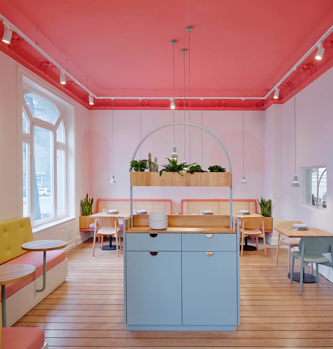
You are well known for your zest for color and your use of certain strong shades that you often contrast with one another. Originally, your plans for the foyer were much more restrained. Why? What was different here?
Eva Marguerre: The basic colors were already here. The ceiling in the restored porch that is located directly behind the entrance dates back to when the museum was first built. There you have the blue, various shades of terracotta and also gold. We said: We aren’t really fans of gold; it didn’t seem appropriate for the foyer. So we transformed it into a very warm yellow. That was the start of the project. We pointed out that you can opt for a much quieter look or you make a statement. We’re very happy with what we ended up with. The more intense colors were the result of our consultation. It’s important to us to brainstorm. And Tulga Beyerle wanted it to have much more of a Pop buzz to it.
Do you often experience such a wish for intensity?
Marcel Besau: This is more of an exception. Our collaboration here was really very special. It was more a case of Tulga Beyerle motivating us to go further: “Let’s make it nice and bright!” It’s good to have a sparring partner who knows about design and has a clear idea of what they want. Many clients are not accustomed to coming out so strongly on such matters. But this kind of dialog, where clients act as a sounding board, now that is always important. It adds something to every project.
Eva Marguerre: Sometimes clients can’t imagine exactly what the final thing will look like. Then they ask: “Isn’t that a bit too much?” Our answer is: “Trust us!” The effect will be toned down by the space. If we had tried to cram all five of our colors into the front area of the entrance it would have been overwhelming. It’s always a question of how you employ the colors …
Marcel Besau: … then the result is a consciously choreographed color scheme
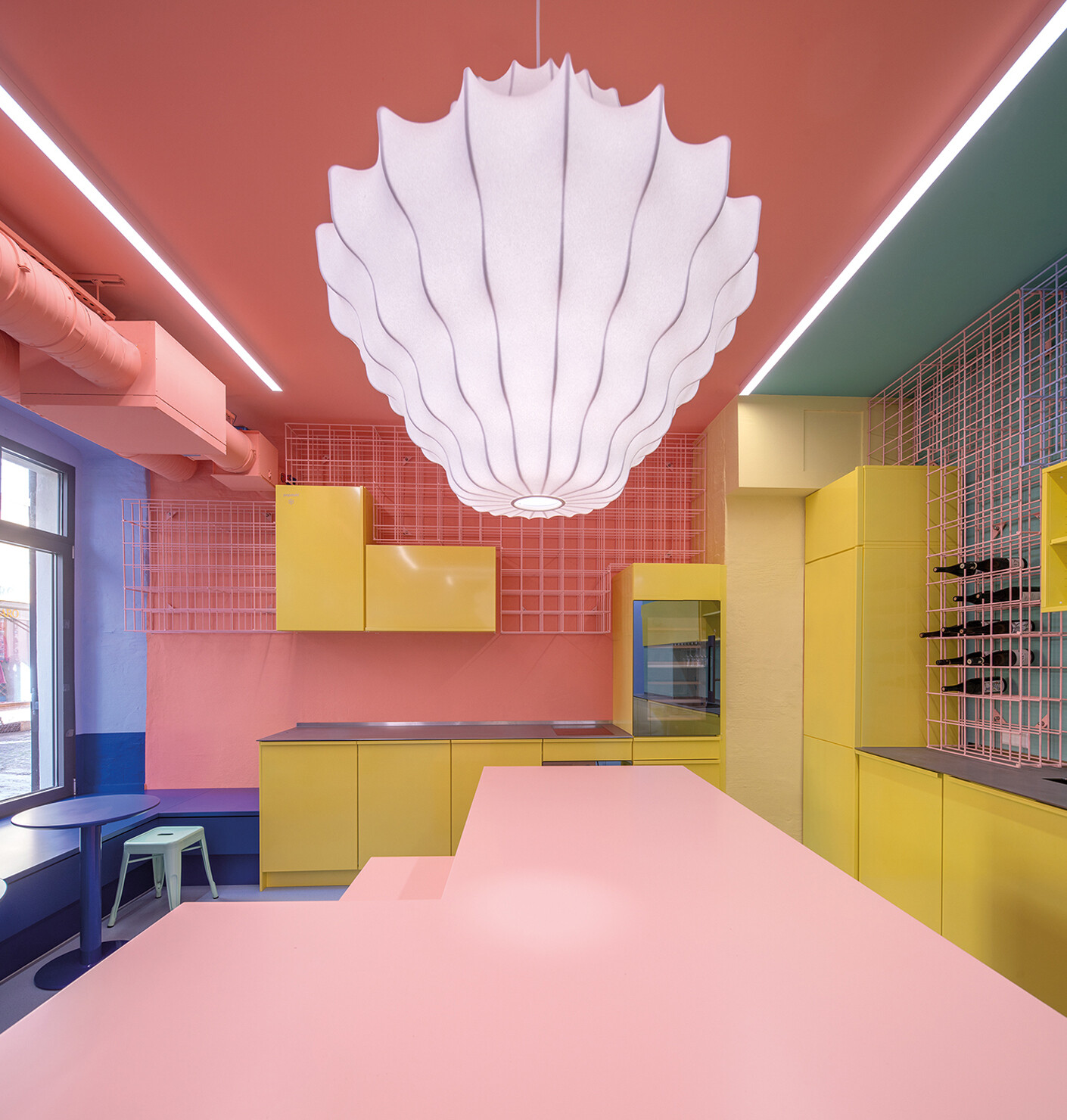
Eva Marguerre: Take only the effect that the curry yellow has when contrasted with the blue and the four nuances of terracotta on the walls: It’s incredible! It considerably alters the impact of the other colors, which in turn influences the individual rooms within the foyer. Many clients would have chosen the more subdued version, but Tulga Beyerle wanted to make a statement and also wanted an additional accessory which jars so that the overall effect is not too perfect, not too harmonious. So we chose mirrors in neon coral.
Has your handling of colors altered? Or do you select from those colors that require repetition?
Eva Marguerre: We don’t have firm favorites and remain open to new ideas. Nor do we always opt for the same colors by any means. In this case, we derived our colors from what was already here. It’s the color combinations that are important and how you employ them. As a result, every interior, every product is different.
Marcel Besau: Intuition is an important aspect. And then there are the practical considerations: How do you combine colors, what grades of certain colors do you employ, where do you place them and in what amounts? For whom is a certain colorfulness intended ? It wasn’t like we made everything colorful, by any means. It’s a matter of creating harmony but also having deliberately placed disruptive elements, contrasts that catch people’s attention.
An example of that?
Marcel Besau: In the entrée the white world encounters a dark blue. You can hardly create a stronger contrast than that, not only in terms of intensity but also brightness. The other elements are pared back.
Eva Marguerre: And I would never simply transfer a combination I’d discovered to another project. It is true that yellow and blue often crop up in our work because they are brilliant partner colors and produce a great brightness. We have a faible for very clear, bright shades; naturally one has favorite colors because you know from experience that they work well together. Funnily enough we’re often asked about the concept for the Elbphilharmonie that we realized with Daniel Schöning, but as if it wasn’t something we’d done. It is every bit as colorful, but is white with light nuances. This choice has to do with the architecture and the client.
Marcel Besau: Our intuitive handling of color alters in accordance with our perception and age, our personal development. Put very broadly it has to do with what we experience in life. No doubt our taste will also alter. There’s a physical reason for that as sooner or later the eyesight gets weaker. Everything becomes grayer, which is why we make it more colorful.
Until now visitors encountered the first display cases in the foyer. Why did you alter that?
Eva Marguerre: There were fragments in the foyer that had a lost look about them. Our aim was to express: What’s this [the museum] all about?
Marcel Besau: The starting point was that some areas seemed little used and somewhat neglected. With its massive columns in the middle the space appeared disorganized. We wanted to create a good overview of what the museum has to offer. Screens inform visitors about the exhibitions taking place and what activities are currently available.
The museum should be perceivable as just that. Our aim in the foyer is to arouse curiosity about the museum. Perhaps that will help new audiences to identify with the museum, to make it their own place, because they appreciate the vibrancy of such a place.
Can you give us an idea of what the process is like? How do you develop your design concepts?
Eva Marguerre: At any rate, we don’t sit at a desk and think, what color should we take? It’s an intuitive process. Before we draw, we talk about it. It’s about getting a feeling for a space or a product. We walk a lot; in any case we spend a lot of time in nature and chat about the project. Then images develop in your mind, and it’s like a game of ping pong. A lot of design work is done in our minds, in our imaginations before we put anything down on paper or into a computer. At this point I would never pick up a color fan and say: I’m going to take that color! By doing that I would put a stop to the process. We spent a lot of time in the museum foyer, looked at rooms and watched the various goings on. This time we were guided by what colors were already there, but it’s almost always the case that Marcel and I come up with similar colors for a project. As soon as we swap ideas, we realize how similar our color preferences are. It has to do with perception and being able to listen carefully.
Marcel Besau: We are very well attuned to one other.
What happens then?
Eva Marguerre: The art is in working out: Which shade of blue is it exactly? You can’t be very precise when talking about colors. You have to work around that. So it might happen that Marcel sees the yellow completely differently to me. Then we need sample materials and color swatches.
Marcel Besau: On top of that you have light and materiality, because colors appear different in every situation.
Eva Marguerre: As soon as you are dealing with a color palette other aspects need to be considered. Perhaps we have one to three basic colors in mind for the product. But then you also need to ask: What does the market want? Have we covered female and male color aspects? Have we catered to warm and cool colors …?
Marcel Besau: … and elegant as well as playful nuances…
Eva Marguerre: … In short: It’s about producing a good range. And that is a true art where you are dealing with subtle differences. When I say I want this color at all costs, how can you produce a range with it? Can the colors exist in their own right, do they go with one another? How can they be complemented? These are the practical aspects of development work.
Are there people who can’t relate to your topic at all? Can you ignore color?
Eva Maguerre: With color it’s something like it is with light. You can’t blank it out. If you are sitting in a small room with a low ceiling and neon lighting then you aren’t going to tell me that you feel fine. It has an effect on you. Many people are not aware of that. It’s similar with colors – as to whether you can feel good in a room or not. People mustn’t necessarily be aware of it, that’s irrelevant. But we can play with color as a dimension. We give the people that come here a feeling to take away with them. Then when you see this effect on their faces that is really wonderful.
Do visitors learn something about colors in the foyer of the Museum für Kunst & Gewerbe?
Marcel Besau: With many projects it’s a matter of letting people experience color. Being able to assess a color or develop your own position towards it is not really something that you learn. You might perhaps learn something about complementary contrasts at school, but nature offers a veritable explosion of nuances. When it comes to perception, we are emotional beings. There is little opportunity for most people to deal with it in everyday life. That was not something we particularly focused on when redesigning the foyer but if through our work here we create another take-away for people that would be brilliant. Perhaps it will influence other designers. Or children who come here, experience it and take it away with them. Who knows where it will lead?