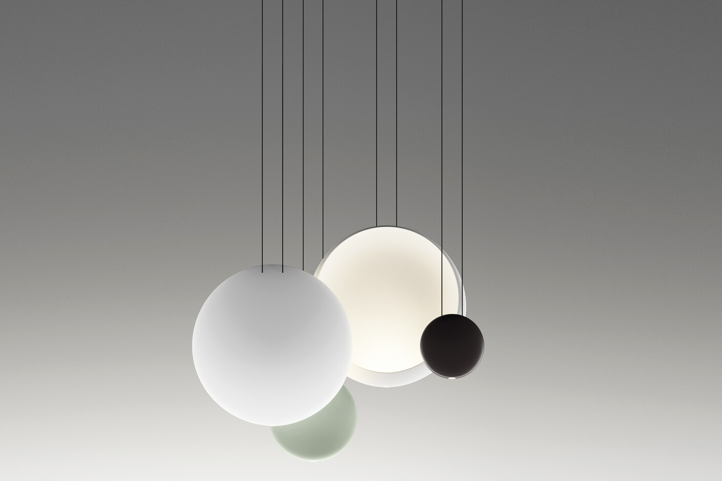
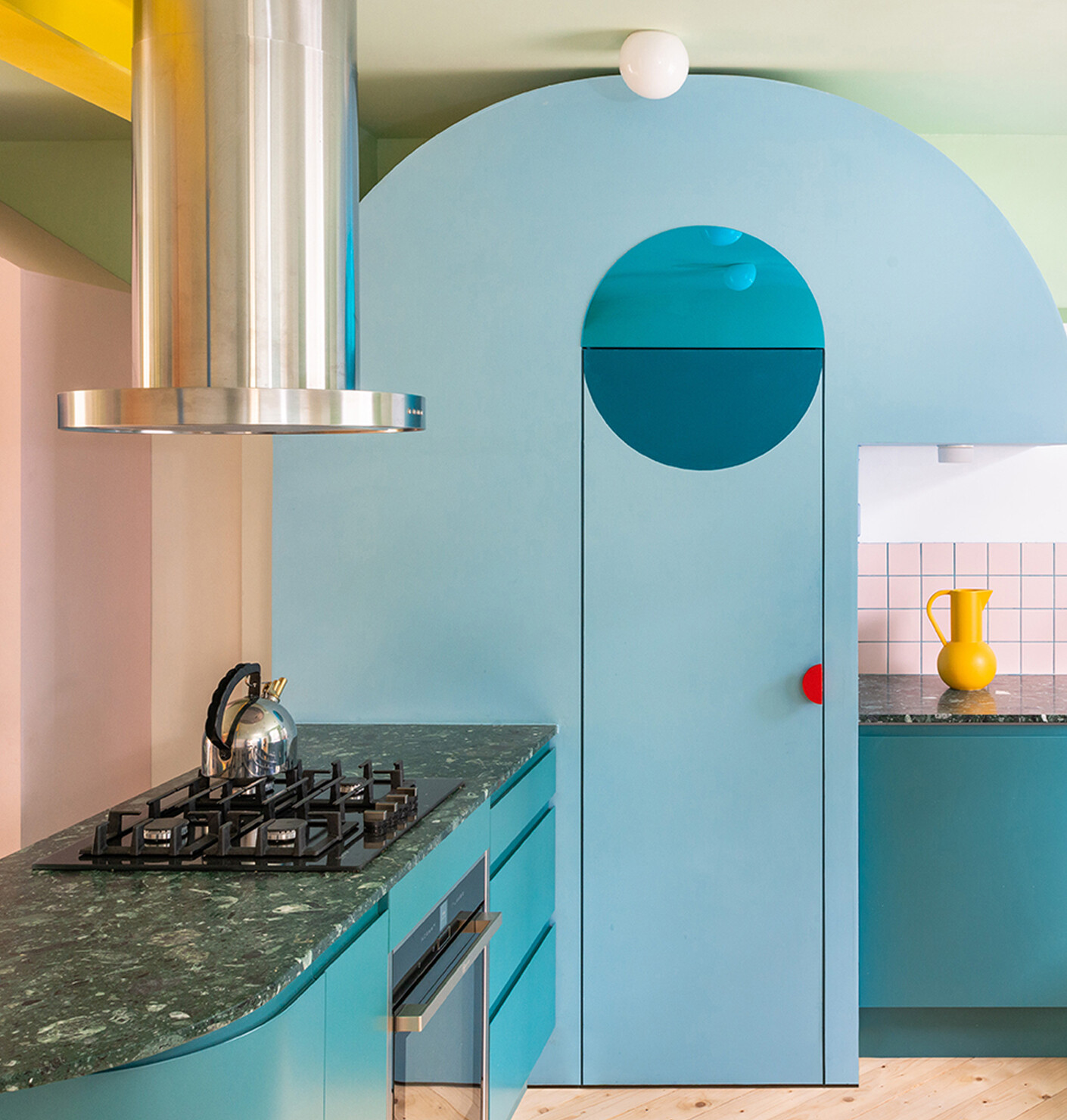
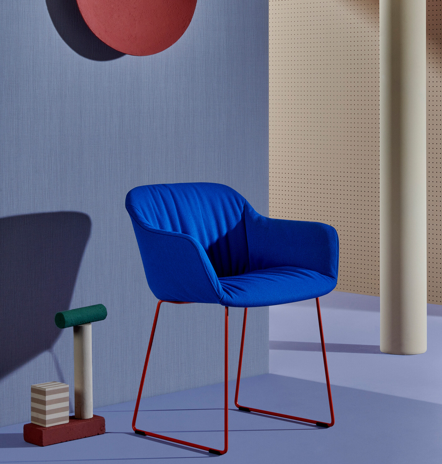
Communication with colour
Anna Moldenhauer: Ms. Pressman, Pantone has been offering universally understandable colour systems since 1963, the Pantone Matching System™ (PMS) for graphic design now holds almost 9800 colours, the Pantone Fashion, Home + Interiors (FHI) system comprises almost 3050 colours. Why do you think it is necessary to have such a large selection of colours, which is almost impossible to oversee?
Laurie Pressman: Color is such a critical element to design, and while it may seem as though we offer such a wide variety of colors across all of our different libraries, a designer will always tell you there can never be enough colors to choose from.
The Pantone Colour Institute advises companies on colour in the context of brand identity and product development, as well as on the application and integration of colour for strategic objectives. Why is colour important for branding?
Laurie Pressman: Color is the first thing we see, the first thing we connect to. This is why color is your single most important communication tool. With about 80 percent of human experience filtered through the eyes, visual cues are vital to getting a message across. When it comes to branding, color is one of the easiest ways to create a singular distinctive visual identity, one that stands out and one that consumers remember. Because every color conveys its own unique message and meaning, when it comes to selecting a color to represent a brand, it is very important to consider its psychological meaning and how it will broadcast the image of the company.
Pantone has been announcing the "Colour(s) of the Year" for a good 20 years, what was the intention behind the idea?
Laurie Pressman: The Pantone Color Institute originally created the Pantone Color of the Year educational program in 1999 to engage the design community and color enthusiasts around the world in a conversation around color. We wanted to draw attention to the relationship between culture and color; to highlight to our audience around the world how what is taking place in our global culture is expressed and reflected through the language of color.
"The Pantone Color of the Year has a significant influence on product development and purchasing decisions in numerous industries, including fashion, furniture and industrial design, as well as product, packaging and graphic design," it says on Pantone's website. To what extent is the aspect of sustainability an issue for Pantone in this context?
Laurie Pressman: Sustainability factors into our thinking at Pantone in terms of the materials we use to create our books and the pigments, inks or dyestuffs we use to create our physical color standards. Some of our books are with recycled materials and all of the ingredients we use to create our colors must be in compliance with global guidelines for each of the individual industries. We have always taken this position. The clients we work with expect nothing less.
The Pantone Studio app offers an alternative to the classic colour fan, but colours often have a different effect on the screen than they do on paper, on textiles or in space – what should you look out for when using the app?
Laurie Pressman: Using the app will give you the convenience to access Pantone colors no matter where you are and the device in which you are working. We would highly suggest that before anyone makes a critical color decision that they consult physical Pantone products to get an accurate read of the color.
Can you share a current tool or project that Pantone is working on to support architects and designers?
Laurie Pressman: In addition to our physical color standards tools and the different trend books we offer, there are many different projects we are working on within the digital space at this time that will be helpful for both architects and designers including TAC software from XRite which enables accurate material definition for use in 3D rendering software. There are other projects as well which unfortunately I cannot share at this time.