Biennale Interieur Kortrijk 2016
Caught in the Curator’s Grid
So, Kortrijk and the Biennale Interieur in gleaming silver. Sitting in the airport early in the morning before leaving for Belgium, what had been announced days before was emblazoned across all the newspapers: Bob Dylan is awarded the Nobel Prize in Literature. “The Times They Are A-Changin’...” Over the course of the 1960s the song, which was supposedly written in late 1963 and appeared on Dylan’s third, eponymous 1964 album, was to become the anthem of the youth and student movement, and not just in America. The politically so turbulent year of 1968 – anti-Vietnam War protests, Martin Luther King’s murder, the attack on Andy Warhol, May demonstrations in Paris, the “Ausserparlamentarische Opposition” political protest movement in Germany and the end of the Prague Spring, to mention just a few of the events – also saw the beginning of “Biennale Interieur” in Kortrijk, the 25th anniversary of which is being marked with a Silver Edition running until October 23. Of course one cannot help but ask: Where are we, and where is the Biennale Interieur today, what with the times indeed having changed in many respects and fundamentally since its beginnings?
A brief look back
What began in 1968 in the “Kamer voor Handel en Nijverheid” in the wake of the renaissance of interior decoration and design soon emerged as a trade fair that was respected far beyond the Belgian borders, one which – and this is what is important – wanted to be, and indeed was more than just a marketplace for new products. From the outset the Biennale Interieur recognized the cultural aspects that go beyond what money can buy and the economic concerns and succeeded in skillfully interweaving both – market and idea, business and ideal, trade and design. The aim was to display new ideas for the home and to accompany and help shape the transformation to more openness and freedom. By entrusting responsibility for the concept and image to well-known architects, designers and curators, and with established members of the community such as Gio Ponti and Verner Panton, Alessandro Mendini and Philippe Starck, Konstantin Grcic and Jaime Hayon giving the whole thing fresh impetus and form, noteworthy statements about contemporary living kept on emerging beside and between the trade fair stands.
Not on account of their abundance, but because in each case the latest new products were repeatedly examined and – directly or indirectly – in the context of the latest trends and surprising ideas by individual designers and architects were translated and extrapolated to home trends, a statement worthy of consideration about the status of furniture and interior design also emerged from the product fair. In addition, the show went down new roads as far as presentation and orchestration in what were now the pleasantly spacious halls of the XPO were concerned: Instead of isolated booths there were open areas and extensive spaces. Instead of constriction, spaciousness now prevailed. This way, in sync with changing furnishing trends and fashions for almost 50 years, the Biennale developed its own profile, which set a precedent elsewhere not least of all because thanks to diverse events (“accompanying cultural program” is a terribly bureaucratic term) the trade fair spilled over into the city itself, where time and again sheer numbers gave rise to enriching diversity.
Going all out for the jubilee
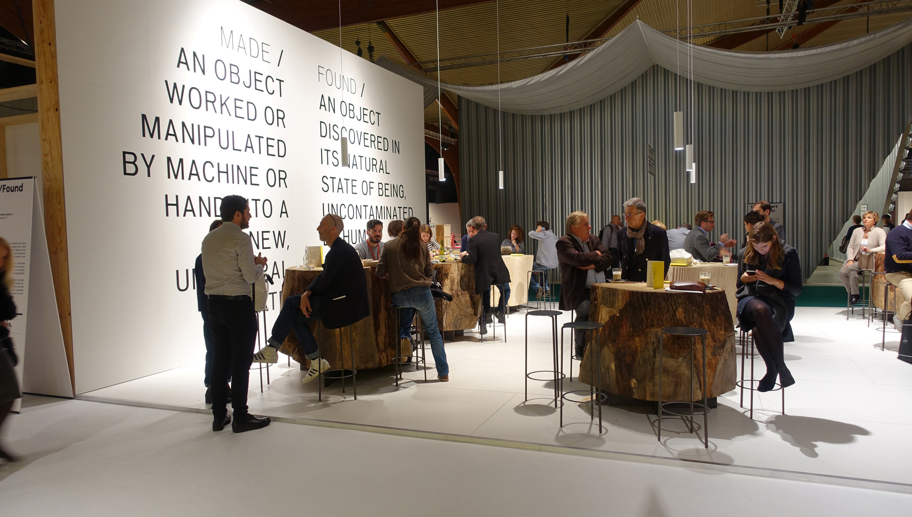
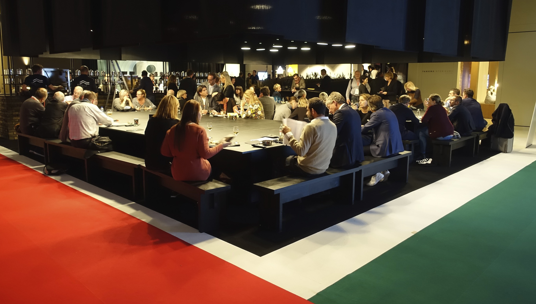
Given that the trade fair can rightly be proud of its history and what it has achieved, it wanted to do things particularly well for the jubilee. It did not entirely succeed. Although it is not particularly favorable to instantly start talking of a crisis (the word is in any case used in as inflationary a way as the words design and curator) we do want to know why the often so fresh spirit of Kortrijk is in surprisingly short supply this time. On the plus side again in 2016: The intelligent constellation of manufacturers of furniture, faucets, carpets and textiles as well as suppliers of new materials and architectural systems ensures the tour is still varied and full of surprises. The winners of the competition in the category “Spaces” once again conjure up restaurants and bars worth seeing between the stands – beginning with “Bar Nose”, which was built of the simplest materials and looks somewhat improvised, but at the same time is a perfect space, through to “Made/Found”, tree trunks which juxtapose the natural and the digital, and the open, circular counter of “Le Banquet Gaulois”.
It is also noticeable however that the dovetailing of trade fair and culture, business and reflection, is suddenly revealing weaknesses, indeed it seems all of a sudden to have almost disappeared. The intention, so the official version goes, was to strengthen the trade fair grounds as a venue, to bring back reflection to the halls of the XPO by means of exhibitions and other activities. A short stroll through the city and across Buda Island, which is surrounded by the River Leie, reveals that here there is as good as nothing more to see of the Biennale. Whereas in 2012 there was a colossal magenta-colored chair standing on the “Grote Markt” downtown and in 2014 robotic vacuum cleaners danced Viennese waltzes in the gymnasium of an old school (near the Broel Towers, a relic from the former city fortifications), today the inner city is left to locals and tourists. Whereas at earlier editions you would stroll through the Buda Factory or, in Buda Tower, listen to an extraordinary concert by the band “Goose”, in which each of the four musicians performed on a different floor but were still in harmony acoustically and visually, this time there are no such highlights outside the fair. Even the exhibition dedicated to the history of the biennale, which has been relocated to the new Voka office building close to the XPO, is an accumulation of just a few objects unlovingly crammed onto small quadrants.
Less curating and more discovering
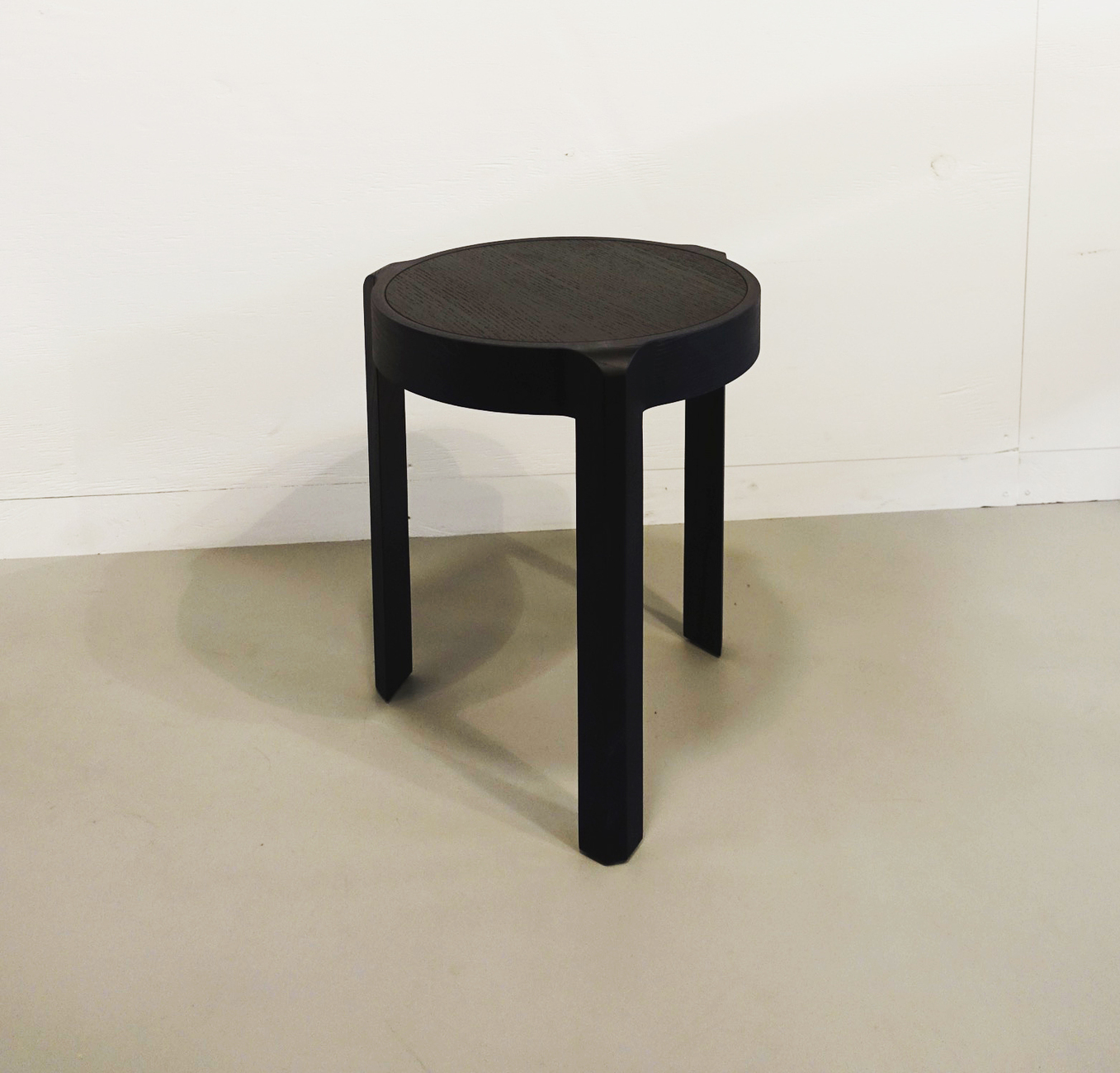
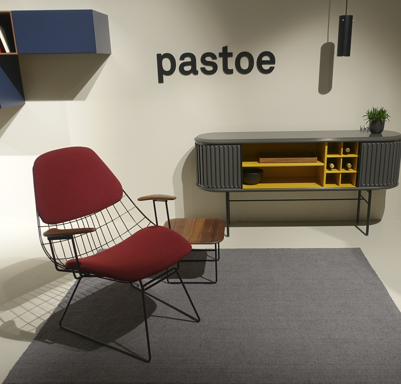
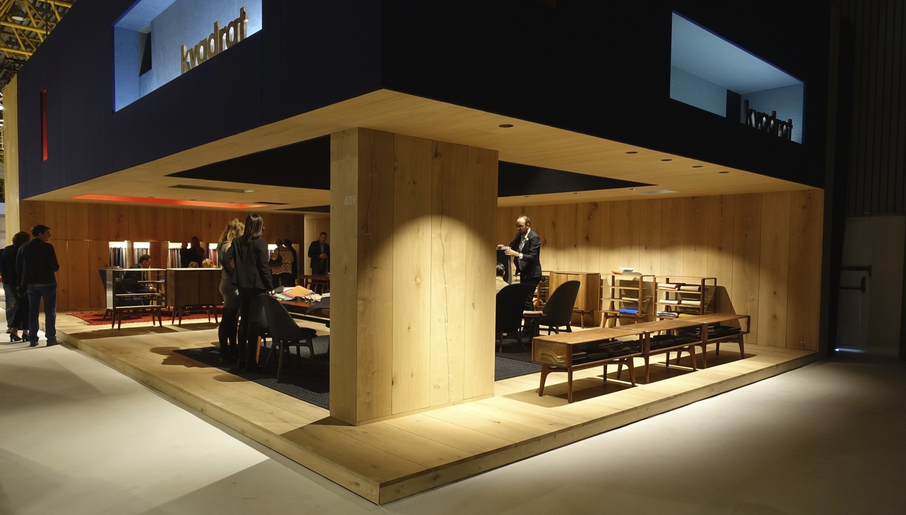
Any self-respecting furniture designer who wants to make it will at some point design a chair. Yet it seems designing a stool is even more appealing and challenging. Steffen Kehrle has designed several chairs. Now the “Stattmann Neue Moebel” stand, represented this year in Kortrijk for the first time, is featuring his new “Add Stool”, stackable up to six times. It has three legs, is compact and yet elegant, and it goes without saying that it can also be used as a side table. Irrespective of the anniversary edition or supporting program, Kortrijk is always good for new discoveries – whether Pastoe is showing new, warm colors, or Axor rounded single-lever versions of its collection “Montreux” designed in the style of the first industrially produced fittings, whether we find in Fenix NTM® an extremely matte nanotech material for worktops or room design that shows no fingerprints, whether Kvadrat transforms its stand into a pleasant store where one is happy to be advised, or Sky-Frame is offering elegant slanted sliding glass doors.
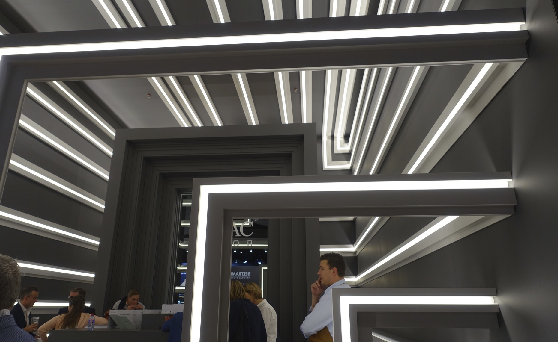
Under the silver lining
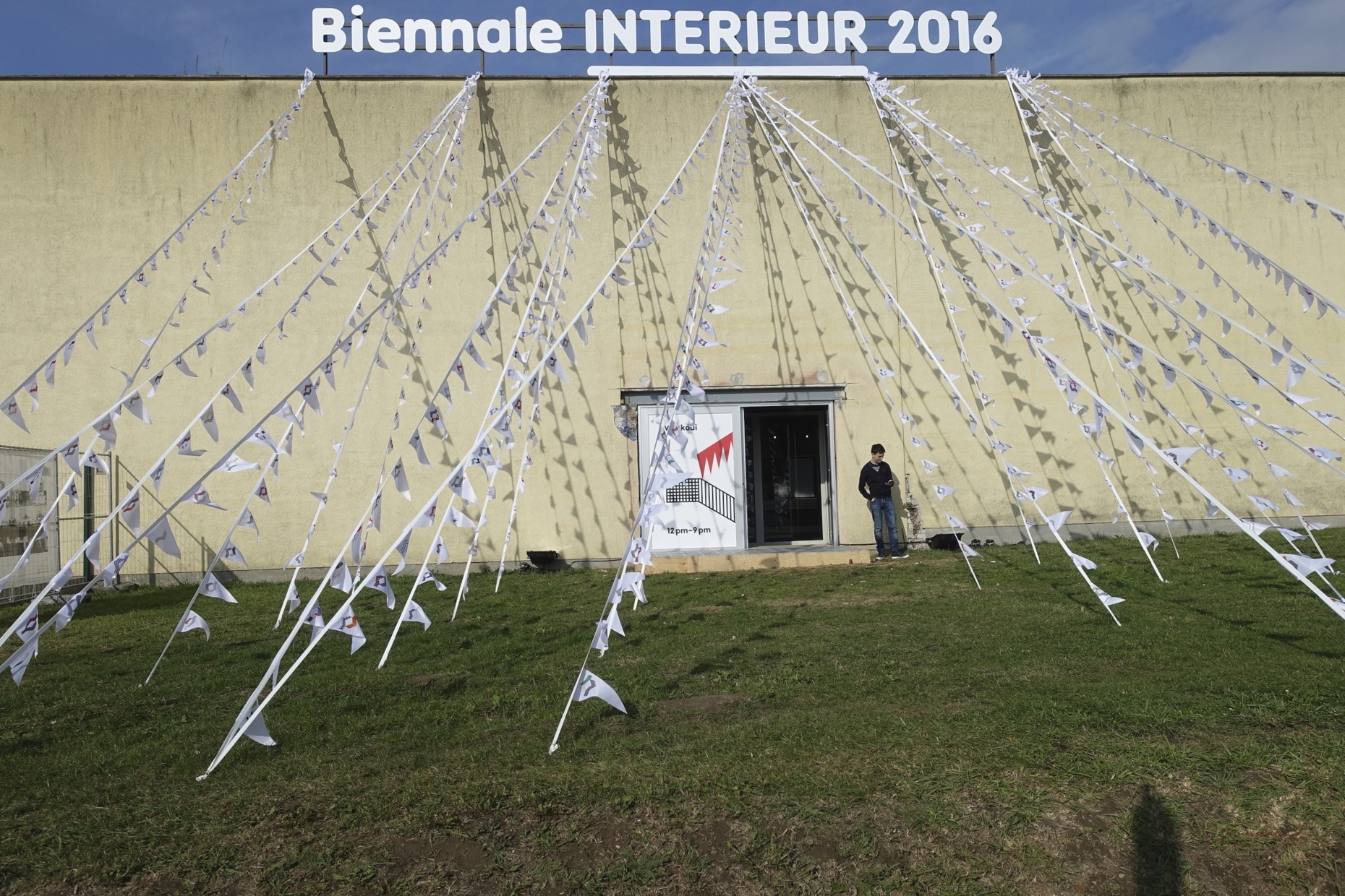
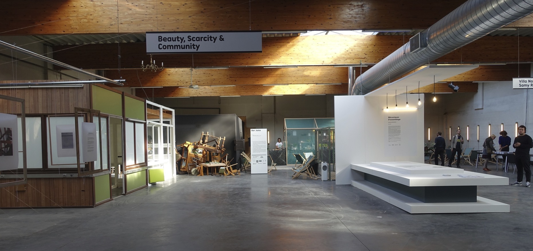
This year the fair is curated by the two architects, Kersten Geers and David Van Severen, from the Belgian architecture studio “OFFICE Kersten Geers David Van Severen”. Their jubilee motto is “Silver Lining Interiors”. Moreover, in close collaboration with artist Richard Venlet and graphic designer Joris Kritis they are responsible for the exhibition concept at the design fair. The color silver is quite simply intended to represent the fact that the marriage of commerce and culture in 1968 has lasted 25 editions. And so the curators lined the aisles in the trade fair halls with a guidance system consisting of shimmering silver strips of fabric. On the floor, long strips of carpet in gray, green, blue, yellow and red mark the main axes. The halls are well structured, only David Van Severen could have omitted the presumptuous reference to Piet Mondrian’s painting and the significance of the grid at the press conference.
The importance of vision
As is the case everywhere nowadays on an epidemic scale, in Kortrijk too the curators sought this year to present a vision for the future. Thus in Biennale President Lowie Vermeersch’s statement headed “Our Vision 2016”, we read: “Today design is ubiquitous and intimately connected to our daily experiences. What was once niche has become mainstream, and we have ready access to an inexhaustible supply of design. What was a vision in the past has now become a reality – a cause for celebration! [...] We are at the dawn of a new world in which our ‘creative living’ represents endless new possibilities and challenges. And with this new world comes an evolving Biennale Interieur.” How true. Only, we are still waiting for the “evolving Biennale”. As the example of art has taught us, success can lead to paralysis and easily become the enemy.
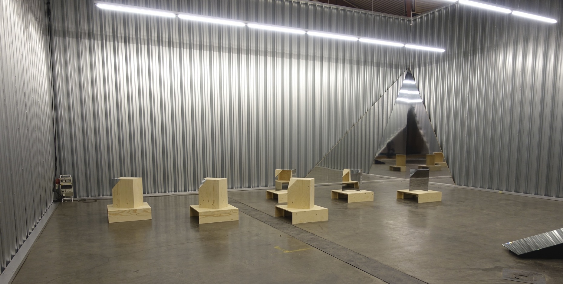
Interiors in a tin box
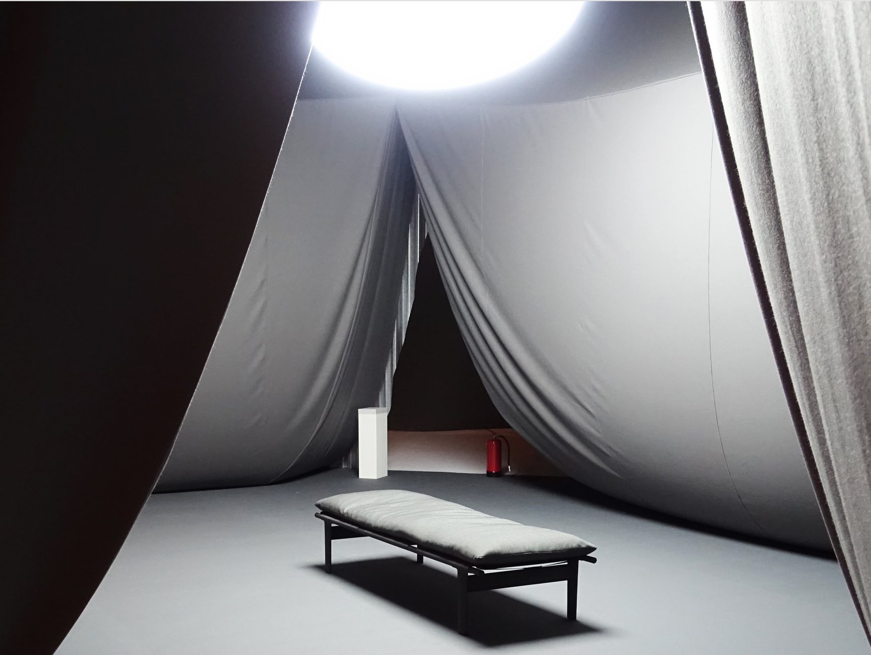
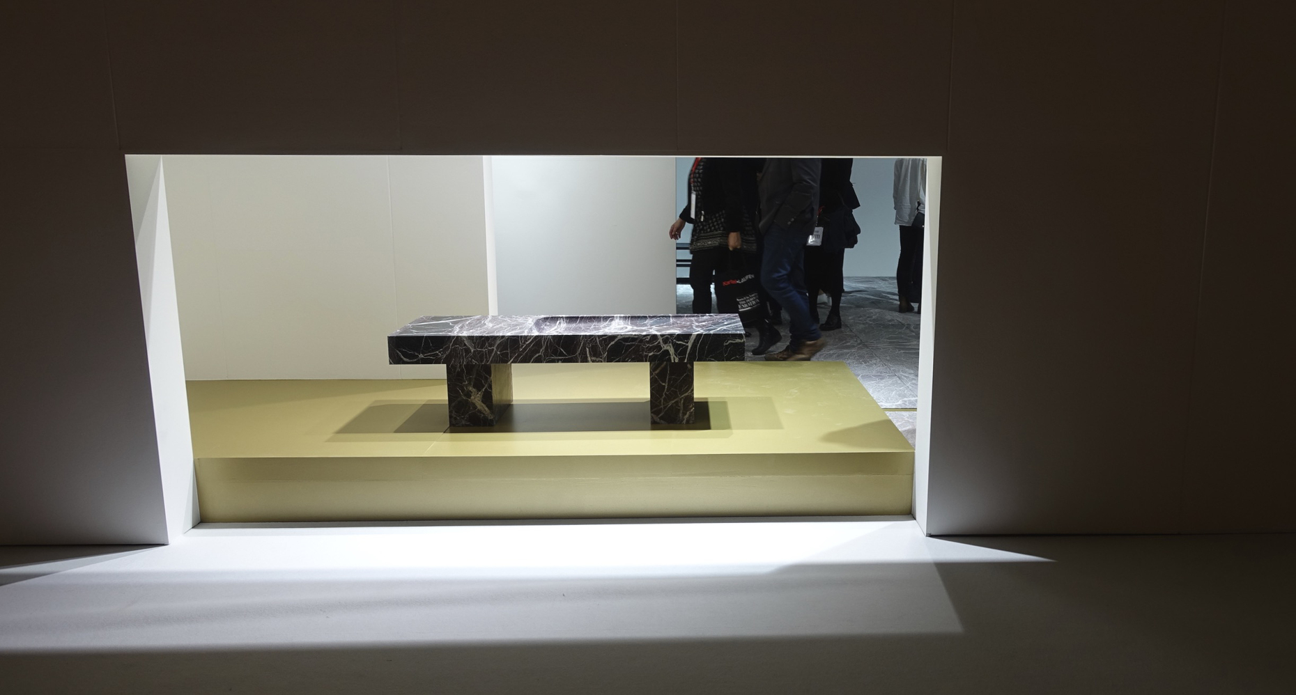
The addendum “Interiors” to the six cubes made of chamfered perforated sheet metal and integrated in the halls at least falls flat, because the promised return to entire interiors rather than isolated design objects fails to materialize. Instead of facing the reality of home living, the curators pay homage to an unwieldy conceptualism that is unable to attract either experts or interested members of the wider public. Little more sticks out in our memory in terms of interior-design objects than the loneliness of a daybed in a room. Even in the “Solo House” designed by the curators themselves, a real structure is confused with its ambitiously staged imitation. The supposed effect of the temporary installation remains a claim. The “rooms of the self-sufficient villa” oriented in a circular gallery around a patio with swimming pool may open out to the natural surroundings in Spain, but this impact is lost entirely in the trade fair cage.
The “Interiors”, supposedly “at the heart of the Silver Lining edition” of the Biennale, suffer moreover from an unexplained proliferation of curators. This may bump up the importance of all the architects, designers, artists and galleries that act as such, but may also invoke a common feature entirely unreflected in reality – but which does reveal the state of affairs. All artists or curators or both suddenly descend whenever someone is stuck or doesn’t have the confidence to assume their own position. And because no-one really knows in what direction they are going, they bundle together so they can not know together, but share the experience and, with visions, to at least pretend they do. Surely more and other things are needed to visualize a “holistic interior design”. And such lofty claims as the following don’t help hide the emptiness either: “With Interiors, the curators will attempt to offer a new understanding of objects in their context instead of the objects being consumed as autonomous trophies.
Le Corbusier and Charlotte Perriand could do it
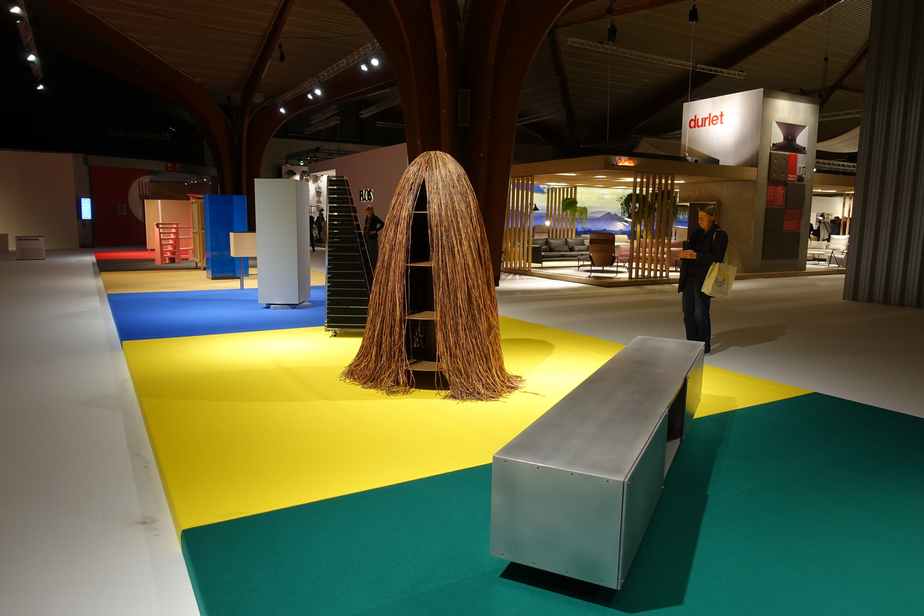
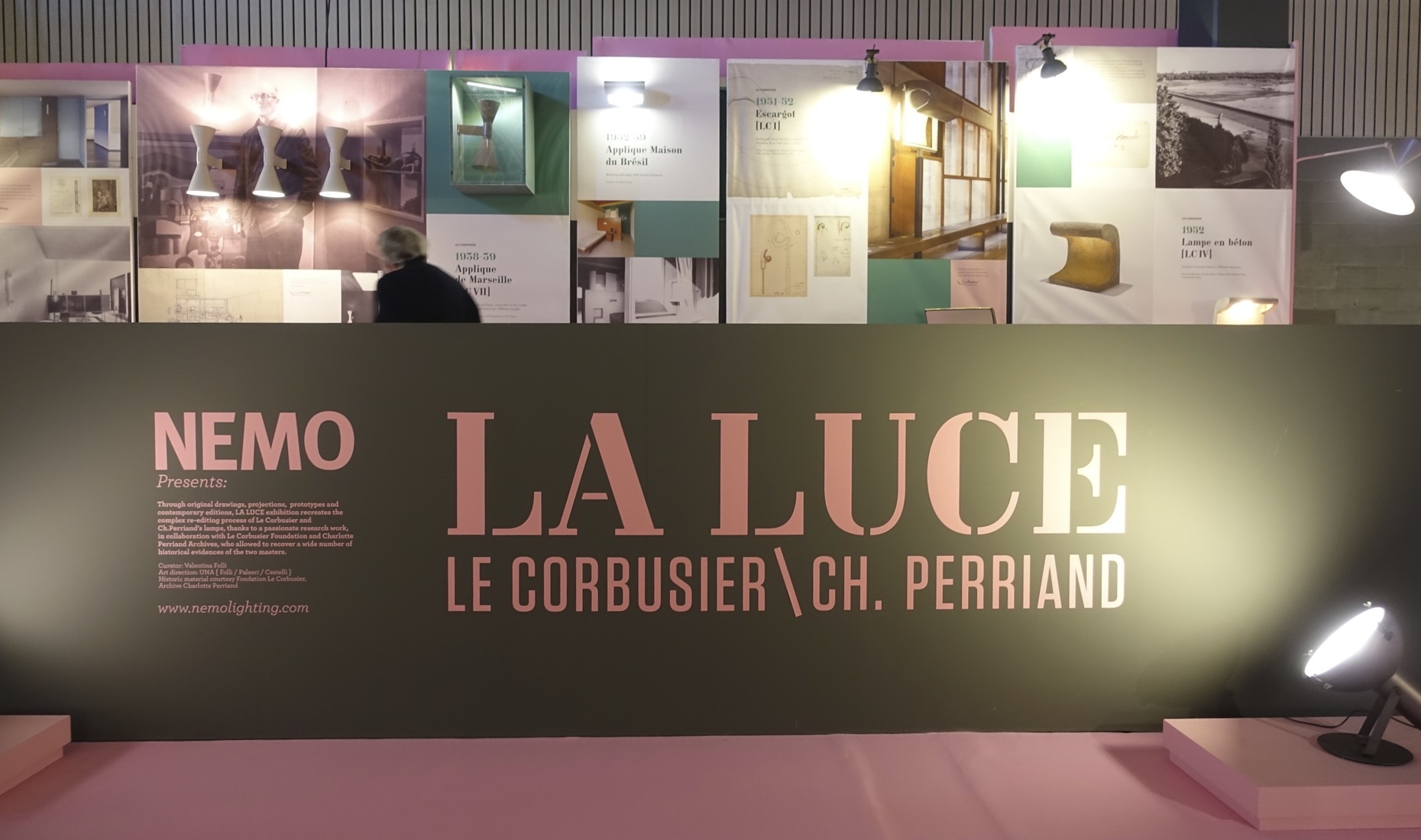
While the curators are busy indulging in such self-celebration, the small series of design highlights from 1968 to the present day seems as conventional as it is reassuring. Under the title “Generations” it presents a selection of units, designed among others by Jean Nouvel, Jasper Morrison, Gio Ponti, Achille Castiglioni, Ettore Sottsass and Andrea Branzi. If we do indeed take the topic of (re)contextualization seriously, it is more than puzzling given the failed Interiors why the exhibition “La Luce” by luminaire manufacturer “Nemo”, which combines luminaires by Le Corbusier and Charlotte Perriand designed specifically for certain projects with plans, draft sketches and photographs of the buildings, is literally pushed to the side. For here we see precisely that combination which is only claimed elsewhere – incidentally without consuming objects.
Times are changing
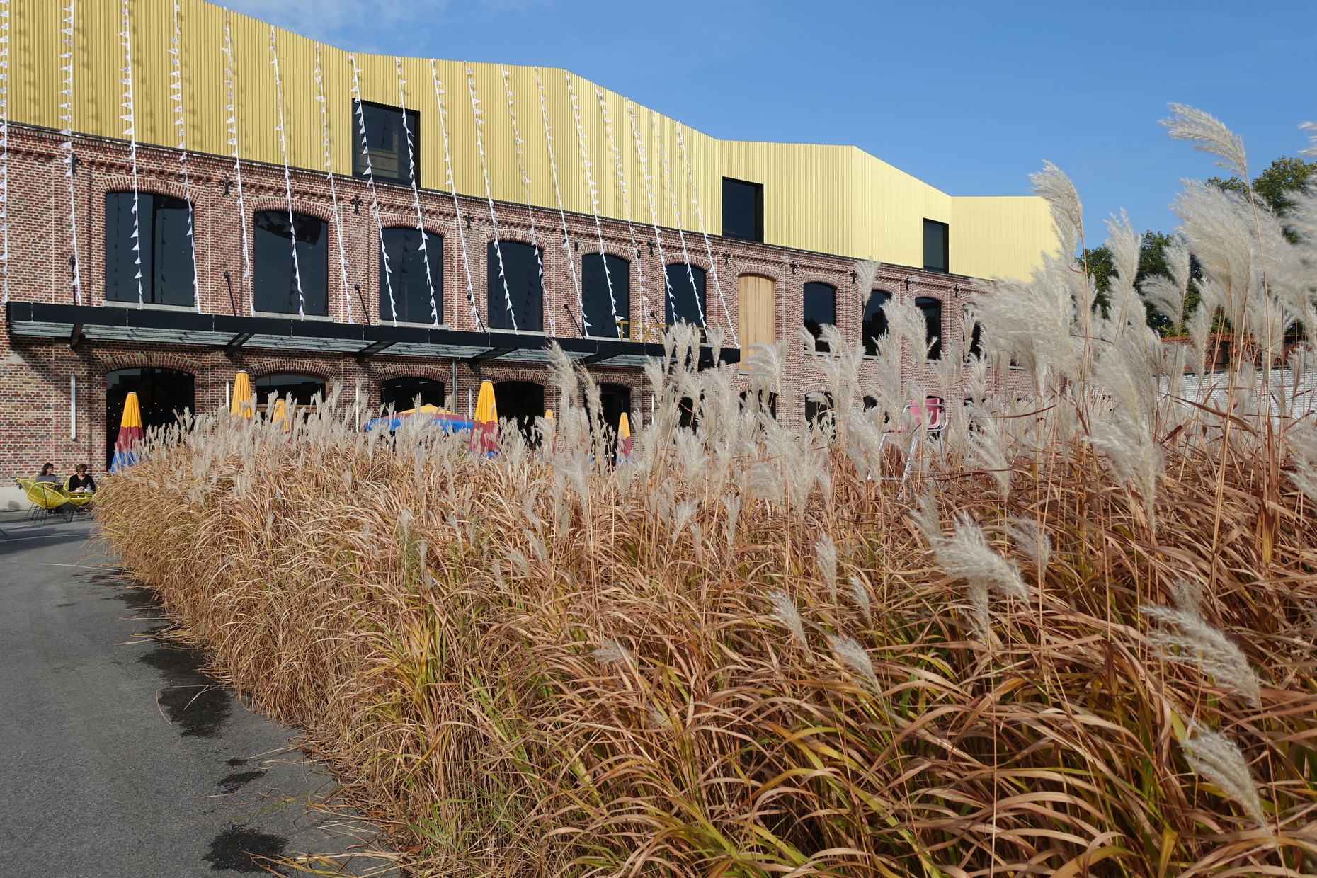
What a shame, exhibitions at the Buda Factory and events in Buda Tower are now passé. Indeed, an escapist concept of artistry has now also pushed itself to the forefront in Kortrijk in the search for originality, as is currently the case on the fringes of many furniture and design fairs. – NB: Young audiences wanted! Venturing critique of a fixation on objects and consumerism is laudable, but if this itself is not new, we would rather have it in an original, crude, quirky, but above all fitting form. And as much as they try and as much as we might want it to be so, the student projects around the “Texture Site” on the Noordbrug don’t really help much. How does the third verse of Bob Dylan’s song go again? “The battle outside ragin’ / Will soon shake your windows and rattle your walls”. And this raging, shaking and rattling will also mean the interiors of the comfort zones will change. Times are changing. And with visions and fearful exercises in discourse by curators alone we’ll hardly be in for a rosy future. “The Times ...” well, you know.
Biennale Interieur 2016
25th Silver Edition
Kortrijk, Belgium
XPO, Villa Voka and City Program
Thru October 23