Letters dance in music videos and title sequences, they fit together to make short films, promote TV formats, products and services. They radiate into the public space from banners, large screens and media façades. The variety of ways in which type is set in motion is the focus of the exhibition "Type in Motion", now on show at the Museum of Design Zurich.
It all started with a teleprompter: This piece of equipment projects through a semi-transparent mirror texts to the presenter, enabling her to look straight into the camera that is positioned behind the mirror while she reads. The lines of text surface and disappear again at a preselected pace. Sentence by sentence, the script scrolls down and transforms in the presenter's mouth into a news item that is then heard by millions in front of their TV screens. At the exhibition, visitors get the opportunity to have a go at reading out a running text.
Following World War II, it was not just the teleprompter that caught on in the United States; along with it the tickers for news and promotional ads also came on the scene. Not only did these have to be easily legible, they also had to catch people's attention. This was the point when it became fun to experiment with form and content, and there are countless examples. Andres Janser, who curated "Type in Motion" for the Museum of Design Zurich, has compiled a wide selection. Structured into five chapters, over 120 works convey a somewhat different kind of media history. It would take about three hours if you were to see it all.
The most spectacular start to the world of moving letters is no doubt David Carson's hyper-nervous roundup of the history of humanity. His short film "The End of Print II" starts with Zeus, next is Mercury, who introduces fire and thus enables culture, the joy in seeing pictures, in story-telling, with the stories then taking on written form, in other words, texts were written down, then printed at some point along the way before they came to be widely available and were reduced to a fluid state in the digital age. Which is where we are. Within the space of just five minutes we find ourselves helplessly immersed in fonts and illustrations, snippets of words, text fragments (read by William S. Burroughs) and scraps of music, and we recall that from the late 1980s David Carson made letters dance across the printed page, too, much to the delight of the gods.
Musical types
When music videos first appeared on the scene, they still seemed to have been written by hand, as it were; they had a more leisurely and, in a sense, somewhat melancholic feel to them. In 1967, Bob Dylan in his video "Subterranean Homesick Blues" is seen dropping sheets of paper on the floor, silently, one after the other, sheets displaying handwritten and not always grammatically correct fragments of his lyrics, which can be heard off-camera. This prototype of the music video, which was the intro to his tour movie "Don't Look Back", set the stage for many to follow. There is a long list of successors and variations, with some included in the exhibition, such as Yello, INXS, Wir sind Helden and Kanye West.
In music videos it all comes down to rhythm, synesthesia being the ultimate goal. What you hear is what you see - because even letters can make music. This connection was forged virtually by the book in a French video some years ago. In 2002, graphic artist and disc jockey Arthur King Estienne introduced the techniques of sampling, showing that tempo, rhythm, sound and tone pitch can be manipulated, fragments can be cut and pieced together differently to result in rap or techno. The beauty of it: King demonstrates all this simply using letters and single words that light up against a black background.
When letters take the reins
In promotional clips and short pieces called "motion graphics" the letters are supposed to convey a message. Which, essentially, needs to come across. For example, when customer opinions about a certain phone bank are displayed typographically. In this case it is so well done that you feel you can even detect the customer's accent in the letters in front of you. Or the clip that promotes a guide on how to work more efficiently, which expresses purely typographically that the good Lord really let things slip when He created the world: Disregarding his calendar and post-it reminders, He kept procrastinating until five minutes before the deadline. And then got the job done in a mad rush. The rest is history.
What has up to now been illustrating an existing text is at times replaced in short films and music videos by letters telling a story. The video to Alex Gopher's 1999 song "The Child" makes the narrative legible in the literal sense of the word. A pregnant woman is making her way across the city in a taxi to arrive at the hospital just in time to have her baby. She, her husband, everything she sees along the way, is couched in words: the taxi, the traffic lights, the veryverylong Cadillac at the crossroads, the streets, houses, pedestrian crossings, everything. Related to this is the Oscar-winning short film "Logorama" by H5 featuring members François Alaux, Hervé de Crécy and Ludovic Houplain. Using logos instead of words, this film is about the apocalyptic chase of two Michelin men who are on the hunt for the criminal Ronald McDonald.
Remix and sampling
Much of what is being circulated today has taken its cue from what went before. Advertising professionals and graphic artists get inspiration not least from the title sequences of movies, the prime example of type in motion. The difficulty here is that, while it is important to communicate names that are outside the diegetic realm of the movie, the title sequence equally has to lead into the film itself. Always a sure hit: James Bond movies, represented in the exhibition by "From Russia with Love" made in 1963 and featuring Robert Brownjohn's sequence in which the title is projected on to a dancer's body. Another must is Saul Bass, for example, his intro to Hitchcock's "North by Northwest" from 1959, which incorporates the names into the grid of an illustrated high-rise façade that then becomes real. At the end of the sequence the camera follows the people who come pouring out of the building. A true classic.
The effect that type in motion has in the public sphere sadly takes a backseat in the exhibition. A presentation of tickers and how they emerged is absent, as are examples of media façades or LED displays, along with the debate about what these media should be allowed to do in public. We leave the show somewhat comforted by the reference to art projects (Jenny Holzer is represented by her 2006/07 piece "For Novartis"). Those who got immersed in the interactive installation "Being not truthful works against me" by Stefan Sagmeister and Ralph Ammer will at least know that letters on the move can never be innocent.
Type in Motion
From February 2 until May 20, 2011
Museum of Design Zurich
www.museum-gestaltung.ch
 David Carson, “The End of Print II”
 Alex Gopher, "The Child"
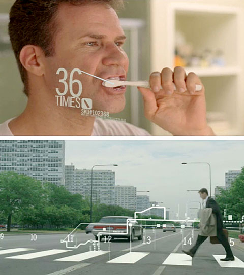
 Werbeclips, Motion Graphics
 Stefan Sagmeister and Ralph Ammer, „Being not truthful works against me“
 Kevin Blanc, "Tiger Dust"
 Opening of "From Russia with love"
 Kyle Cooper / Imaginary Forces, "Se7en" 1995, © Imaginary Forces
 Exhibition „Bewegte Schrift“ in Museum für Gestaltung Zürich Image of the short film "Logorama" by H5 (François Alaux, Hervé de Crécy & Ludovic Houplain), 2009 © Autour de minuit, Paris
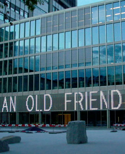
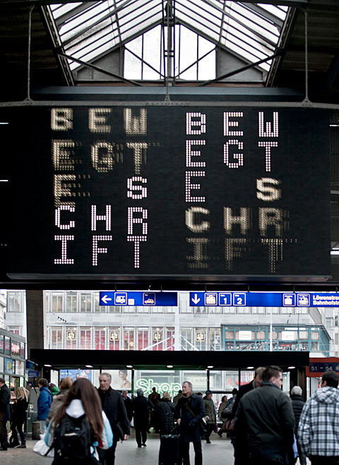 “Bewegte Schrift” Central Station Zürich 2011, Foto: © ZHdK
 MK 12 / FX Cartel, Stranger than Fiction, Filmbild aus der Titelsequenz, 2007, © Participant Media
 Jenny Holzer, Besucherzentrum Novartis Campus, 2006/07 © 2006 Jenny Holzer, Mitglied Artists Rights Society (ARS), NY
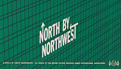 Saul Bass, North by Northwest, 1959, © Metro-Goldwyn-Mayer
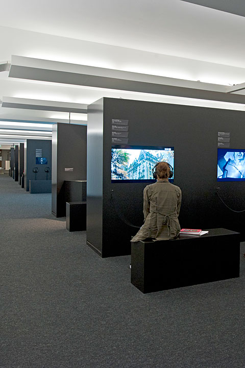 Exhibition „Bewegte Schrift“ in Museum für Gestaltung Zürich, photos: Betty Fleck, © ZHdK
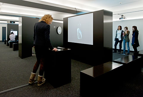 Exhibition „Bewegte Schrift“ in Museum für Gestaltung Zürich, photos: Betty Fleck, © ZHdK
