MODE UND MÖBEL, TEIL 1
Schwingen Möbel und Mode im gleichen Takt? Wir haben in Köln, London, Mailand, New York, Paris und Stockholm nachgesehen. Den Anfang macht die Farbe.
Anyone who had a look round the furniture fairs in Cologne, Stockholm and Milan will not have been able to miss seeing them: Furniture by renowned designers and makers given a new set of clothes by fashion designer Raf Simons, who since last year has been collaborating with textiles manufacturer Kvadrat as regards upholstery fabrics. For example, Vitra and Walter Knoll have in this way raf-fined a few of their classics. With their animated Web images, colors and material mixes, the fabrics which the Belgian couturier incidentally also uses for his own fashion line and for Christian Dior menswear are evidently especially attractive. It would seem that today, how the respective models are clad is just as important for upholstered furniture, too.
Raf Simons’ Kvadrat textiles are only one example of how fashion and furniture are currently dovetailing. There are many crossover points. So we set out to take a closer look at some of the current trends in fashion and in furniture design. What overlap, similarities and echoes are there – and what are the differences as regards color, shape, material and texture? To find out, Silke Bücker checked out the fashion shows in Milan, Paris, London and New York while Martina Metzner cased the furniture fairs in Cologne, Stockholm and Milan.
For some time now, pure vibrant colors have been a real eye-catcher in furniture design. Along with surfaces made of wood and brash splashes of neon next to feathery pastel colors, strong colors in textiles and carpets, not to mention settees, chairs, shelves and tables, have made our apartments and homes more colorful as a whole. One need think only of carpets by Danskina or Nanimarquina, the color-refreshed classics by Thonet, the unicolor novelties from Magis or Moroso, not to mention companies such as Zeitraum, which presents its entire collection in pastels. Then there are designers such as Scholten&Baijings, Hella Jongerius, Cristian Zuzunaga and Werner Aisslinger, whose respective color concepts have given a new lease of life to existing collections or simply created new impulses. What is certain is that now that the furniture market (and the clients) have opened up to color, the use of colors, color gradients, and nuances has become more diverse and complex. Colors get combined in unusual ways and not infrequently presented by textures and patterns. Strict black-and-white patterns form a captivating contrast to the approach. The current color range also continues to be rounded out by metallic accents in copper and brass.
If the emphasis is on being innovative and taking everyone by surprise, it is not color that drives fashion. Rather, it is the skillful combination of what initially seem irreconcilable nuances that makes things exciting. Once again it is Miuccia Prada who sets the tone. As early as 2011, for her summer collection she coined the fashion term “colorblocking”, making geometric color fields in orange and pink, for example, a permanent theme, until everyone had simply had enough of this color combination. But her love and feel for innovative color mixes has remained. In her upcoming fall/winter collection she has chosen such finely balanced mid-tones hues that any touch of saccharine kitsch gives way to a strong and courageous female attitude. Only logically, “How can sweetness be strong?” is the motto she has taken for the collection. We can safely assume that a pale military green along with turquoise and azure, a satin apricot along with baby rose, pillar-box red along with bright green and camel brown, or mustard yellow with lime green and steel gray will fill her trend books and color cards in coming seasons, too – albeit in dosages that will also be readily digestible for the conventional fashion pundits.
You could witness a minor revolution in the fashion world and as regards color most recently at the Paris showroom of Spanish luxury leatherware maker Loewe, which thanks to its new creative director, British fashion superstar J.W. Anderson, has regained its former strength and expressive zest. The new head of design has used pale colors on oversize coats and combinations of off-white, beige, hazelnut, milky blue and pink on traditional Loewe leather outfits and accessories to create highly desirable products. Hardly surprisingly, Anderson had the women in the audience oohing and aahing with his patchwork top with batwing sleeves – which boasted precisely such a color mix.
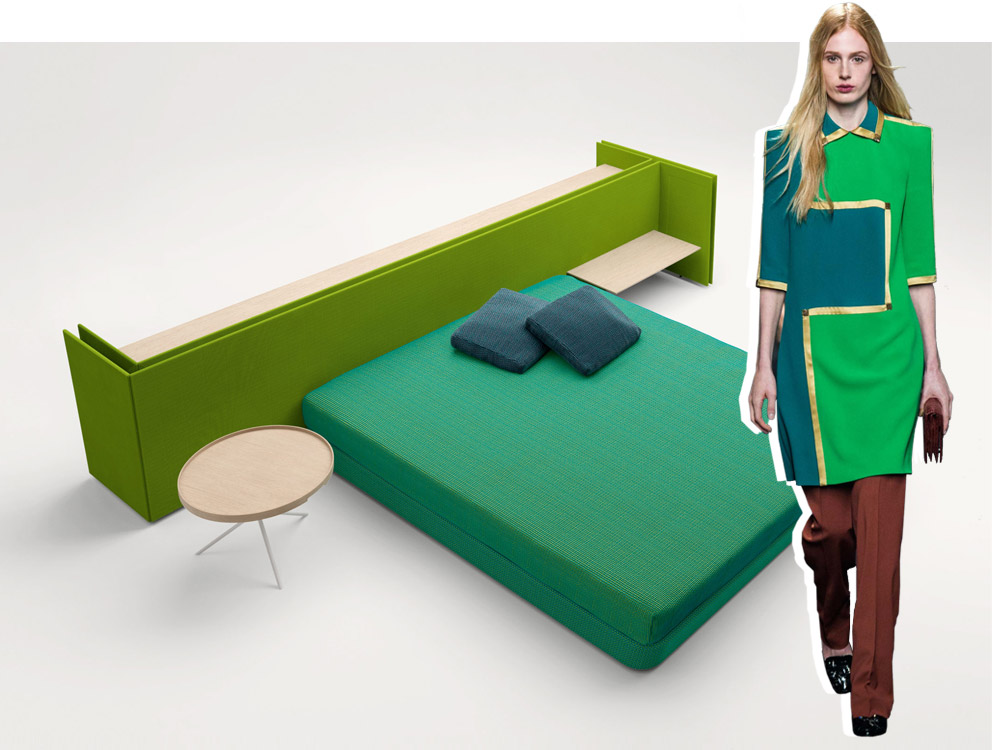
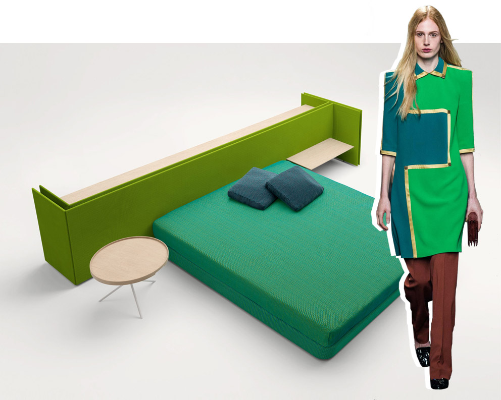
Furniture: This year, green was the most striking “new” color at the furniture fairs in Cologne, Stockholm and Milan. Alongside upholstery groups in lush pine and meadow tones, there were olive touches, above all when it came to leather. And green in various shades even spread to table legs. It could well be that this is a knock-on from the Pantone 2013 trend color having been “Emerald” and that this has only just reached the interior design buffs.
Fashion: As regards fashion, what catches the eye are the combinations of different green tones from a single color group. For example, the combination of grass green and emerald with gold edging at Bottega Veneta. Certainly an eye-catcher. As with the furniture, mossy greens are currently preferred primarily for suede. Whether their cultural coding plays a role here or the idea is to appeal to an eco-mindset that loves references to nature is anyone’s guess.

Furniture: The heyday of the pastel, which over the last five years washed across the interiors of dwellings like the Flood itself, is now well past. What has remained is rose – in all variations. And you can now combine rose with just about anything, for example black, azure, and olive green.
Fashion: In Prada’s upcoming fall/winter collection there’ll be a girlish rose combined with pink and apricot. While this summer unadulterated rose has shaped the face of collections right through to the middle of the market, there is the one or other deviation that drifts toward orange to be noted. By far the most popular: powdery old roses, preferably on refined wool or finest nubuck. J.W. Anderson or Christophe Lemaire set the pace. Incidentally, rose is one of the colors most adored by those Asian women with deep pockets.

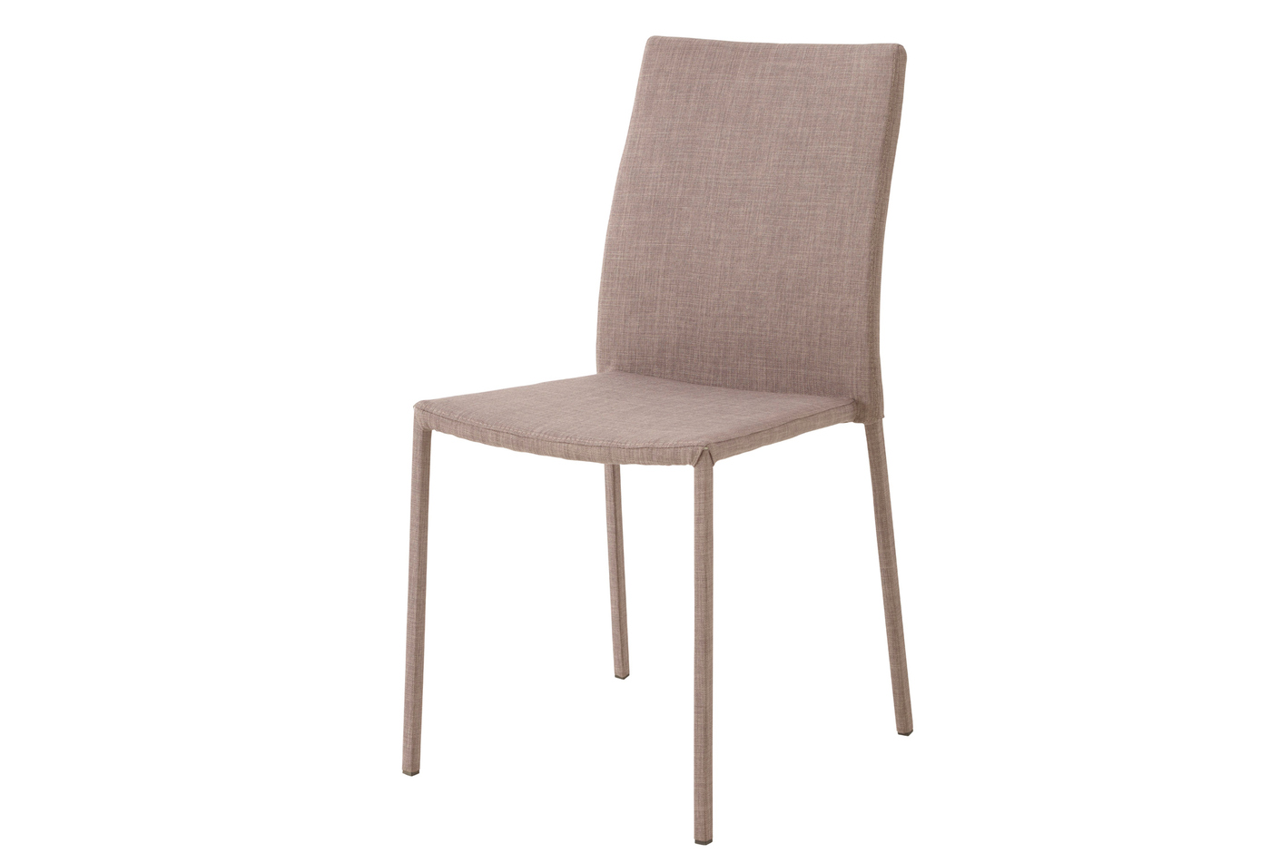
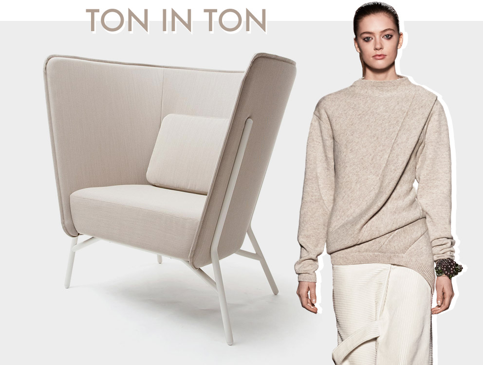
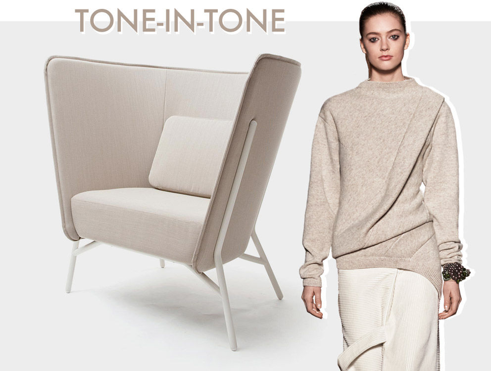
Furniture: White, gray, sandy, beige: the combination of light tones has gained sway in recent years. The next step: The lighter nuances are carefully played through, down to the details. Seat shells are presented in the same light brown as the frame, the settee’s feet lacquered as gray as the upholstery covers. In recent seasons it has mainly been Desalto that has indulged in this game of tone-in-tone.
Fashion: In fashion, alongside the well-established “head-to-toe” look the focus has mainly been on refined combinations of non-colors such as off-white, cream, vanilla, greige or beige. And it’s easy to be just that slight bit off-tone, meaning the finer nuances are what count. The best thing is simply to check out what Véronique Leroy, Marni, Victoria Beckham and Fendi do. And into the bargain, matching shoes and bags are easy to find.

Furniture: Dark jade, chalky cobalt, intense old rose, a watery lilac, a gray sand, yellowish olive and grayish beige – they’re all so-called midtones. And often reminiscent of 1950s colors. Werner Aisslinger gaily mixes them in his current carpet collection for Vorwerk and with his luminaires for Marset.
Fashion: In fashion, skillful combinations of purportedly irreconcilable midtones are causing a real stir. Miuccia Prada masterfully demonstrates this in her upcoming fall/winter collection, but so do others such as Christophe Lemaire, who has a brash red blend with a fatigued old rose, or Bottega Veneta with a collage of emerald, satin Bordeaux and greenish yellow. To tread such a tightrope successfully when it comes to furniture design you need a consistent spatial concept, where in fashion you first and foremost need courage and a perfect sense of style.

Furniture: At Cologne’s IMM entire booths were in black, such as that of Germany’s Supergrau label. Vitra launched the “Eames Lounge Chair” in a black special edition, and Thonet Marcel Breuer’s side table, with its tubular steel now also available lacquered black. In Milan, Kartell presented subtly erotic black plastic interior worlds, Classicon Eileen Gray’s “Adjustable” side table with satin black tubes. And customary white goods, such as fridges, electric stoves and washing machines, are now also available in black.
Fashion: The dark side is back en vogue, at least if we are to believe Comme des Garçons, Rick Owens, Junya Watanabe, Alexander Wang and Ann Demeulemester, who fashionably nurture black in all its facets. In his coming fall/winter collection Wang reveals the full diversity of the color, with satin, gloss and complex textures. In Germany, black tends to be associated primarily with Berlin-based designer duo Augustin Teboul, who have already made a name for themselves on the international stage.
Furniture: In furniture design there is likewise a manifest wish to use contrasts of black and white to catch the eye. Not necessarily on an item of furniture. Rather entire collections get structured such that they form black-and-white configurations. Skandiform showed this in Stockholm, as did Nanimarquina, Vondom and Minotti in Milan. And textiles maker Dedar also emphasizes strong contrasts in its patterns.
Fashion: Thick stripes, zebra stripes and checkerboards, polka dots and all manner of geometrical designs – black and white can be combined with great variety. In fashion, the interplay has long since become a rhythmic underlying tone. What is relatively new is combining it with colored accents, for example on shoes, bags, a turtleneck or a cuff.
Furniture: A good shot of reddish orange has infiltrated design, both of furniture and of fashion. A bit like that classic Campari Orange long drink. Thonet blazes the trail with Emilia Becker armchairs “S831” and “S832” reminiscent of the 1970s. For living areas, a bright reddish orange sets a specially striking and often unique accent.
Fashion: In fashion, things go even further when the same hue is juxtaposed to no less self-confident pinks. Fendi, Bottega Veneta and Céline, on the other hand, contrast reddish orange more delicately: with white, black, beige or medium brown.

Furniture: And those who can’t think of anything new tend to dig deep into the box of things from the past: The furniture and fashion industries love relying on 1980s patterns and colors. A little less than a year ago, the fashion makers at “American Apparel” brought out a collection with patterns by designer Nathalie du Pasquier. At the Milan Salone del Mobile Cappellini and above all Kartell fielded vases and fabrics by Ettore Sottsass, looking back with a sigh at those heroic times.
Fashion: Even the prêt-à-porter shows revealed the one or other reminiscence of design groups such as “Memphis”. Strong prints with blocks of stripes and wild patterns on garish backgrounds have also appeared on Jil Sander or Delpozo pieces. And things get really crazy and colorful in Junya Watanabe’s current summer collections: Color encounters circular shapes made of PVC and results in spectacular outfits that aspire to be more art than fashion.