BAR
No cliches
Anna Moldenhauer: Could you explain to me the idea behind the interior design at Gregor's, the new boutique wineshop in Frankfurt’s Westend district?
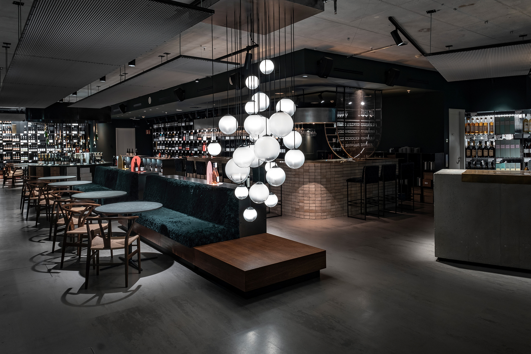
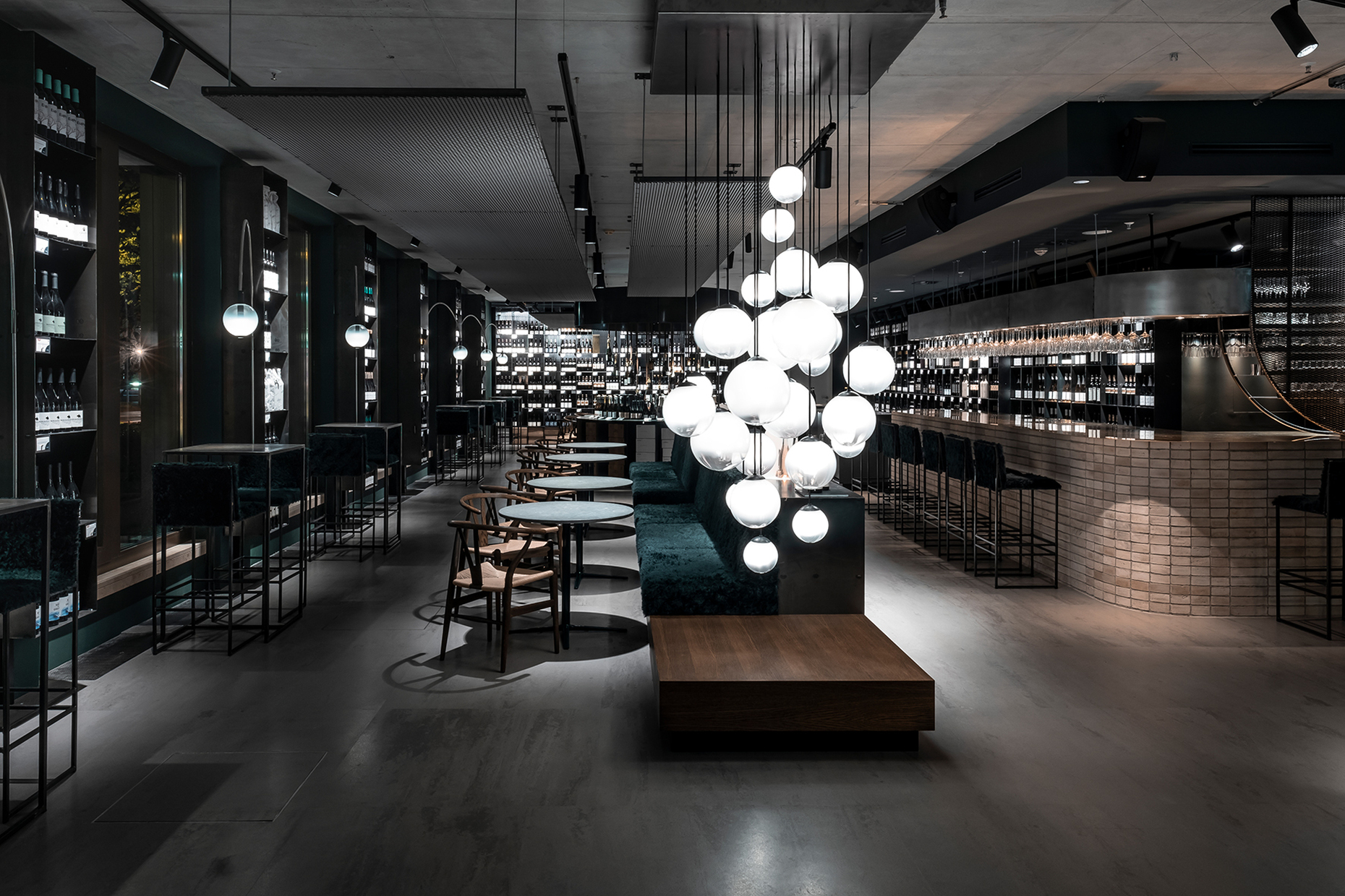
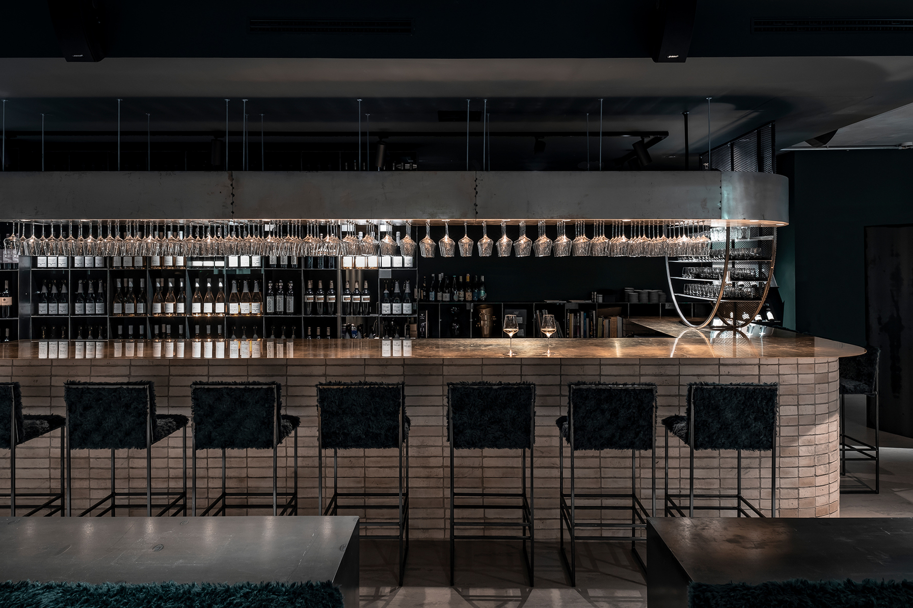
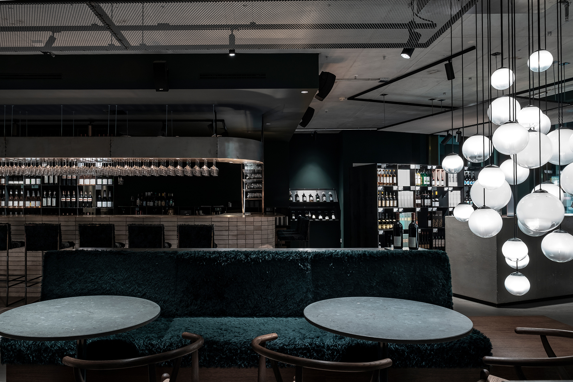
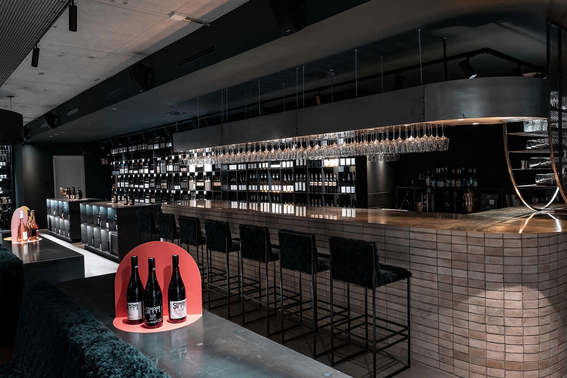
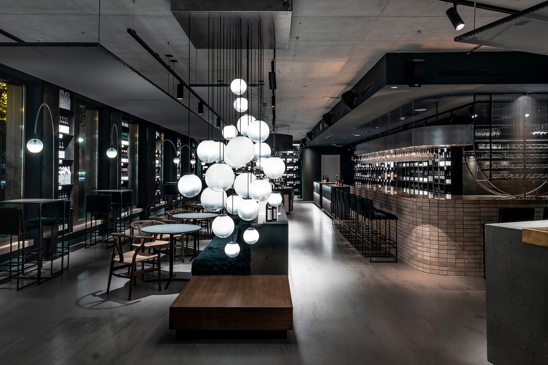
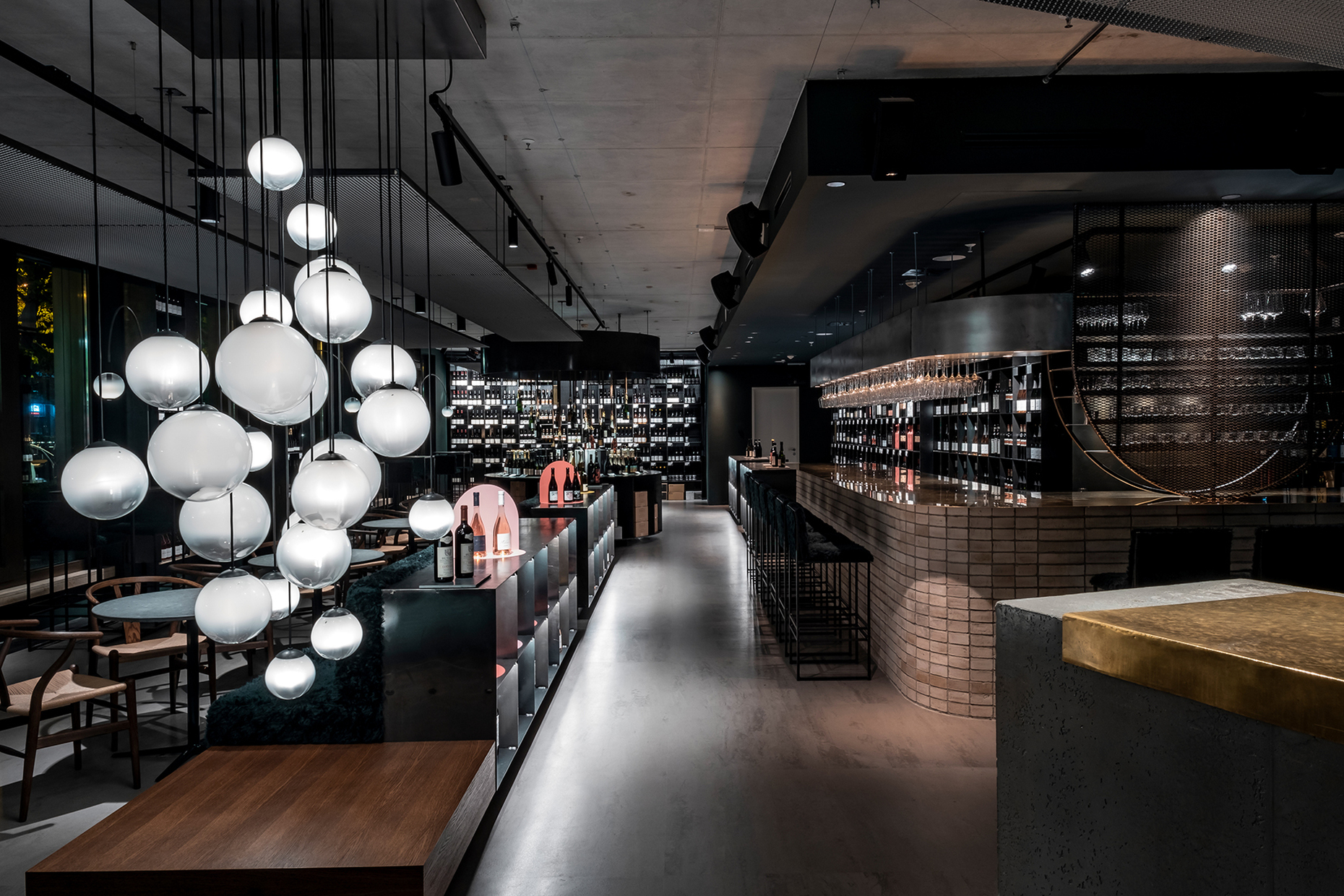
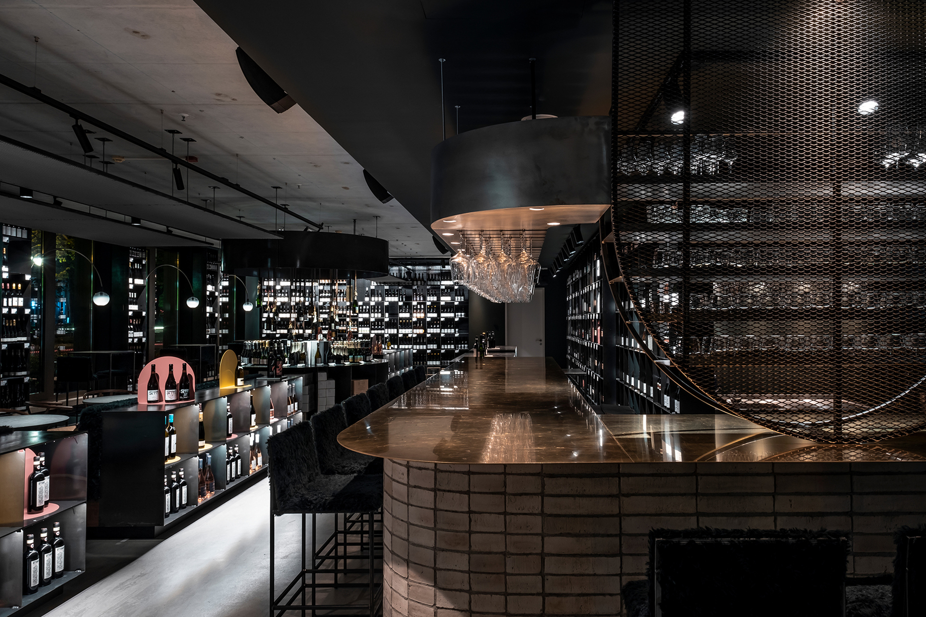
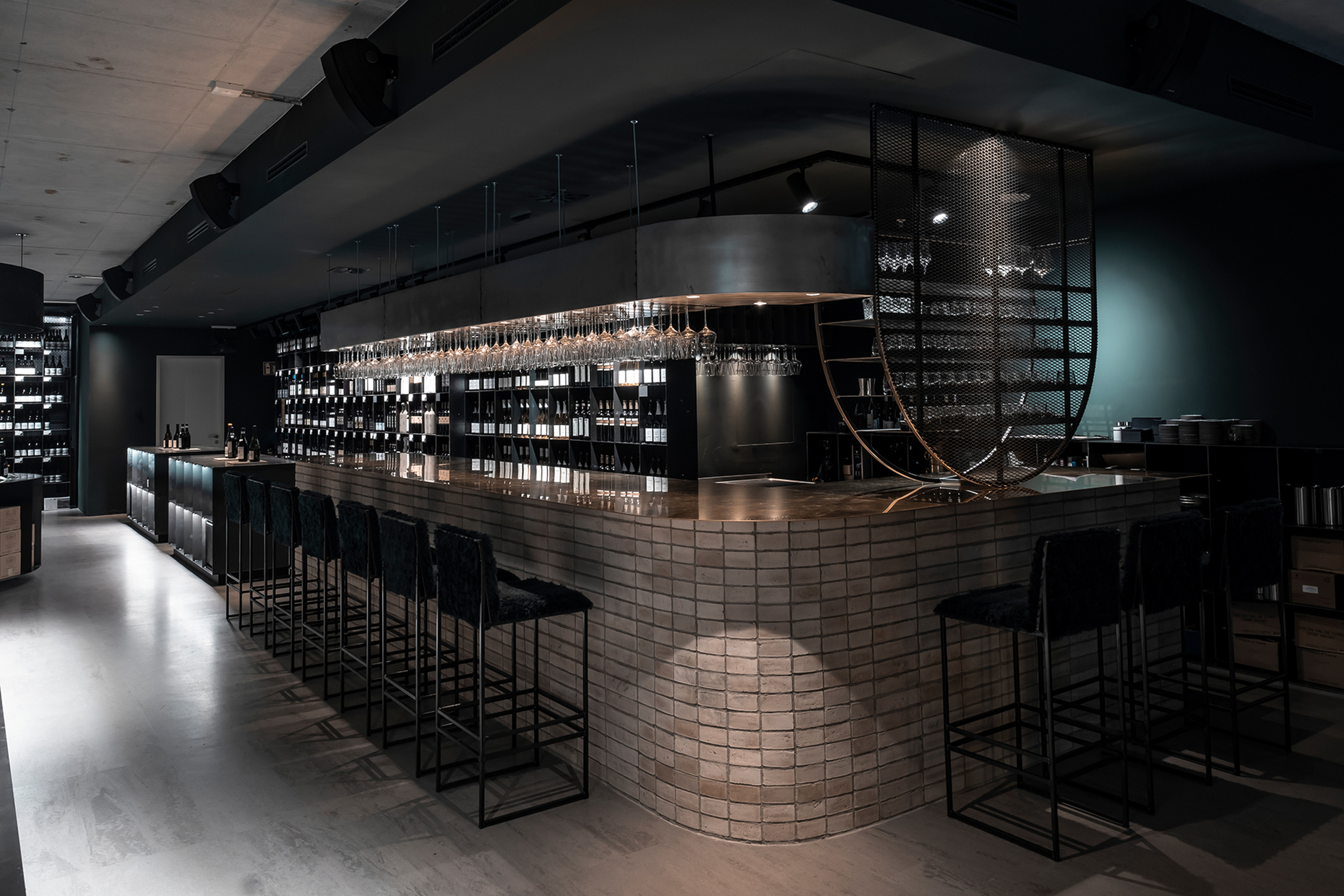
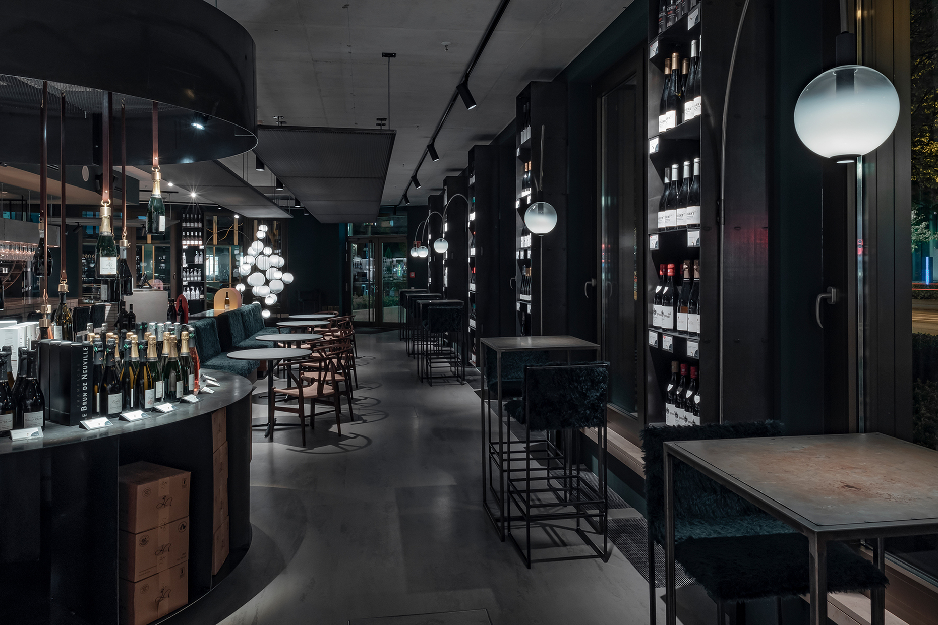
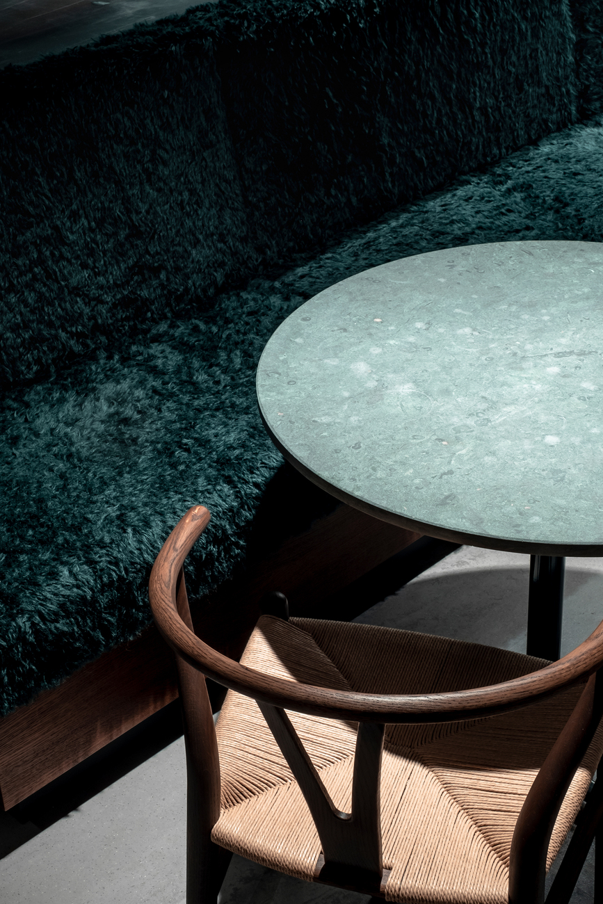
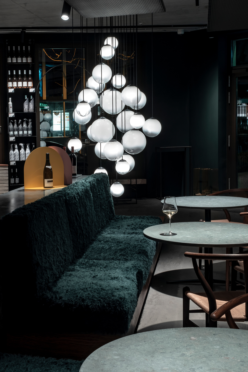
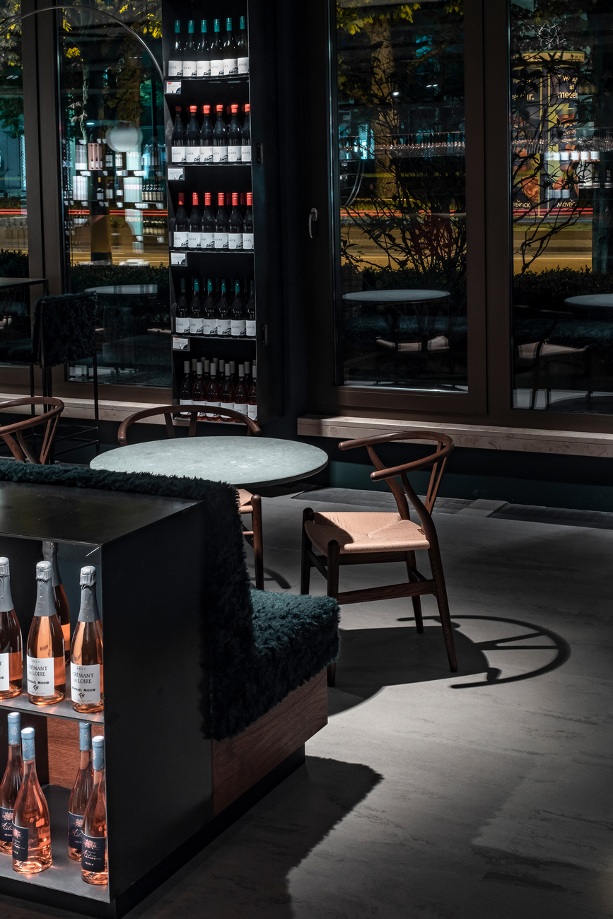
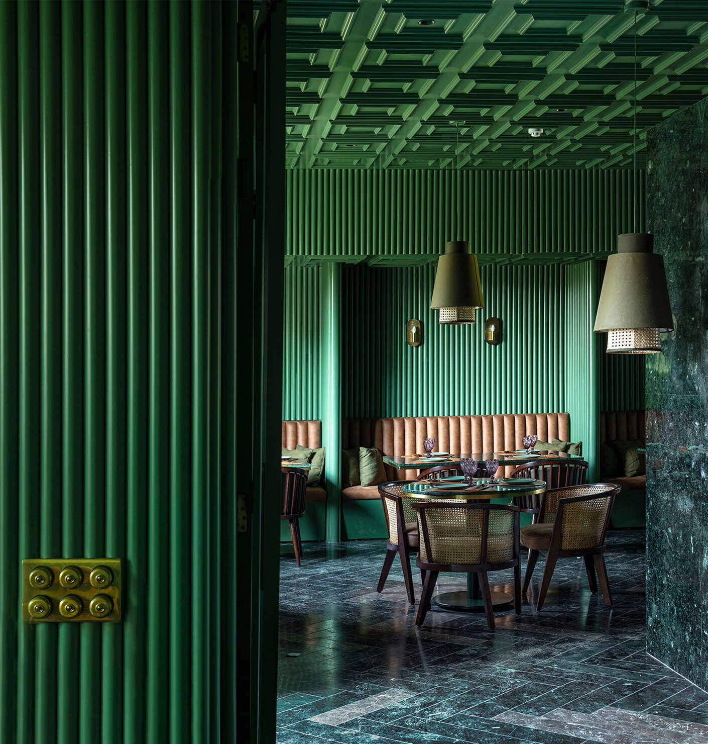
Joshua Lux: We had already come up with the interior design for “Liebesdienste”, a wine merchant in Frankfurt, for its owner Gregor Bernd. What was important to him was for visitors to notice immediately that the large range of wines he offers has been curated, and that in each case he first found out where the wine came from and what factors impacted on the ripening processes. The underlying concept also involved highlighting the following important elements, namely the crafted aspect, the character of the place, and the way it has been reduced to the basics. For example, visitors will notice that the steel furniture has been handcrafted, that traces of this process remain visible, and that the items are not always perfect. The wine has also been handcrafted and therefore the idea was for the interior design to consciously reflect this, too. The color used for the premises – dark green – calls to mind the green of the vineyards in summertime, as well as softening the reflections on the glass of the bottles. The darker the room, the less the setting impacts on the products.
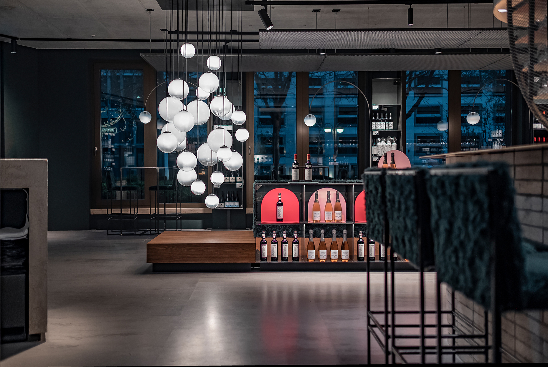
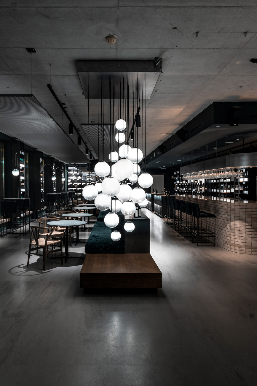
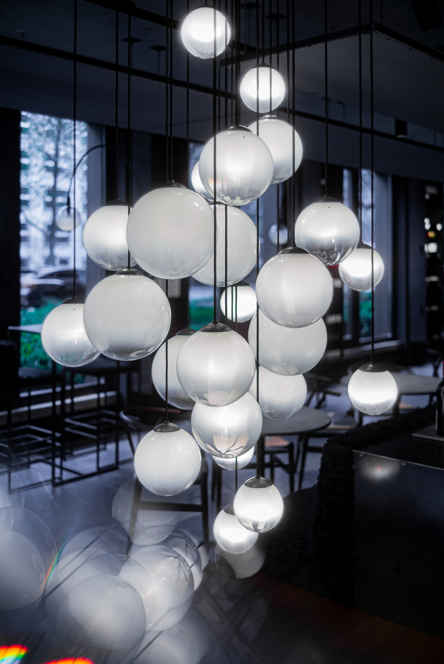
Another very elegantly presented solution is the luminaire ensemble at the entrance, which is reminiscent of a bunch of grapes. In terms of layout, essentially you had to work with a letter “L” lying on its left side. You opted to leave a great deal of space open at the front, to position only the checkout there and to reserve the rest of the available space for visitors and the wines. How did you come to decide on this arrangement?
Joshua Lux: It was important to us that visitors should get the impression that they don’t have to experience something as soon as they enter the shop. They can take their time to get a feel for the place and to soak up its atmosphere. Another idea was to highlight that Gregor's successfully bridges hospitality and retailing. The premises offer guests a great deal of freedom to move around as they like, because we think it is unpleasant if when stepping in you are already forced to decide whether just to look around, to buy something, or to taste a wine. The wines on offer are something special, after all, Bernd is sometimes the sole importer for Germany. Once the guests have looked around, they are able to benefit from the staff’s great expertise on wines.
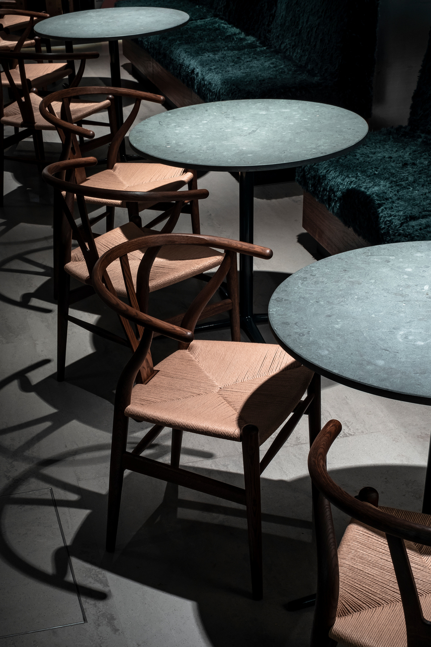
There is also a stark contrast between the loud outdoor space on an extremely busy main road and the low volume of noise inside the shop. I also find the contrasting materials that you have used fascinating – soft textiles teamed up with steel or wood such as the “Wishbone Chairs” by Carl Hansen & Søn. How did you manage to achieve a balance in this dark yet warm atmosphere?
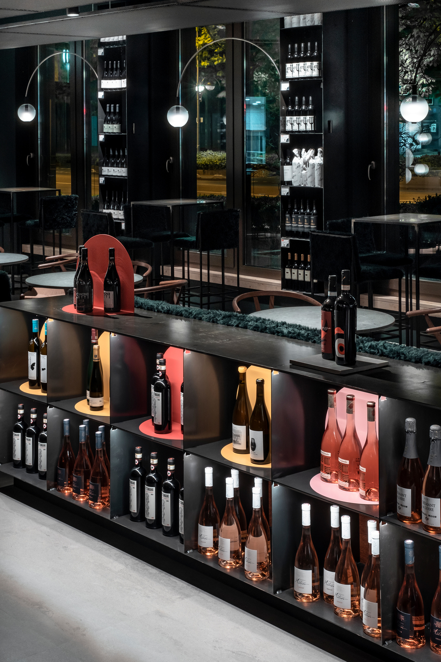
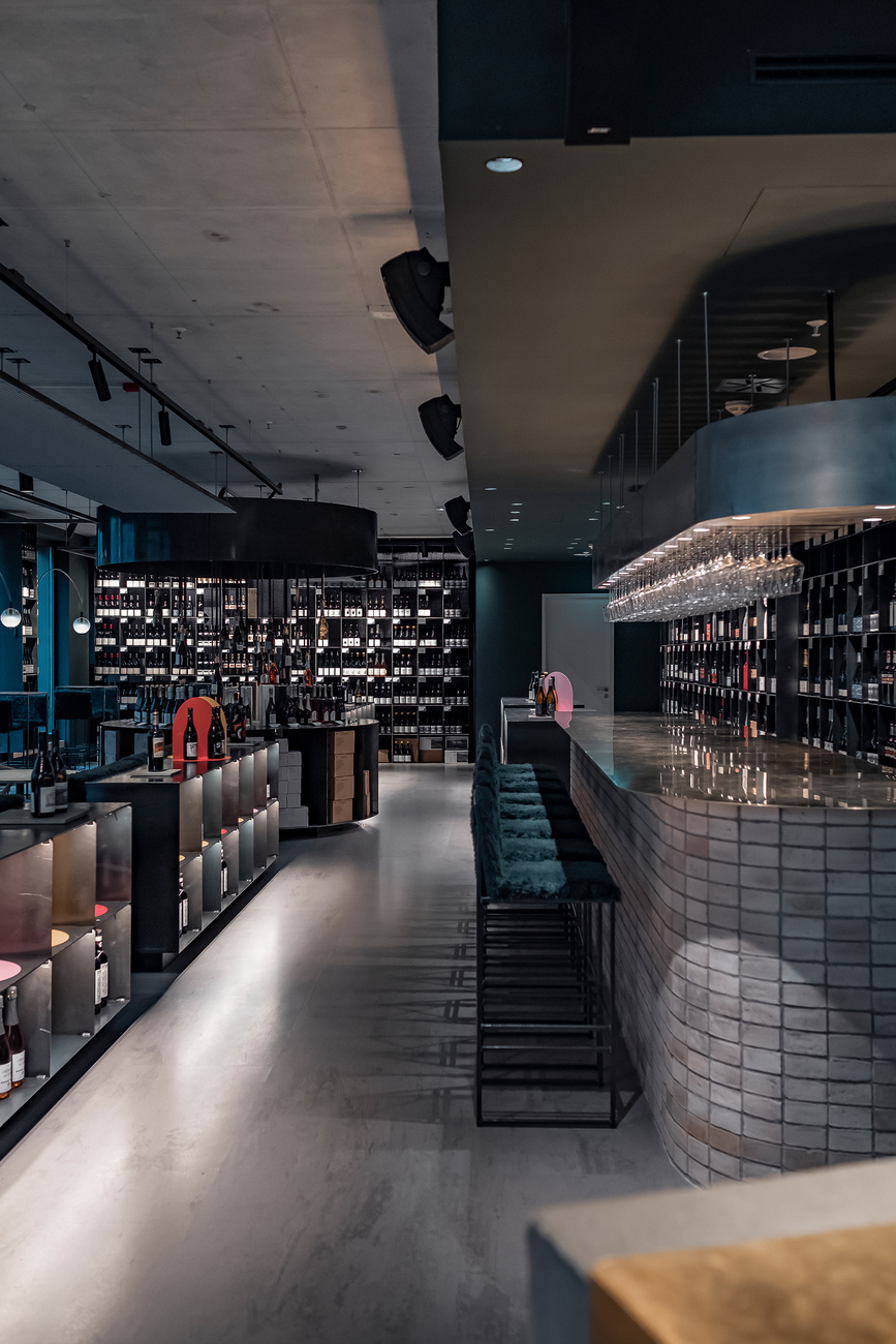
Joshua Lux: We started by thinking about how to best communicate the wine as a material as part of the interior design. Steel, wood and natural stone as materials are all associated with the wine’s ripening and manufacturing processes. Accordingly, we have opted for lighting with different degrees of brightness and have used spotlights to focus on individual bottles. None of the materials we chose are homogeneous, a prime instance being the black steel, which is basically very lively and varies in tone. With the seating it is important for it to feel comfortable. For the covers, we tried to achieve the same degree of fluffiness as with a Steiff cuddly toy and did in the end manage just that – we rang Steiff and asked whether we could buy some Steiff fabric from them to cover our sofa elements with. The fabric for the toys is made to the highest imaginable standards, has been tested many times, and is completely untreated. Moreover, we tested to what extent the interplay of contrasts still results in a uniform appearance. A very dark smoked oak formed our starting point, together with natural materials, then there is a colorful graphic design concept in the form of displays that draw on the round formal elements of the logo and also serve to guide you round the large range of wines. The use of colors such as rosé or Bordeaux red enables visitors to know intuitively what kind of wine is on the rack in front of them.
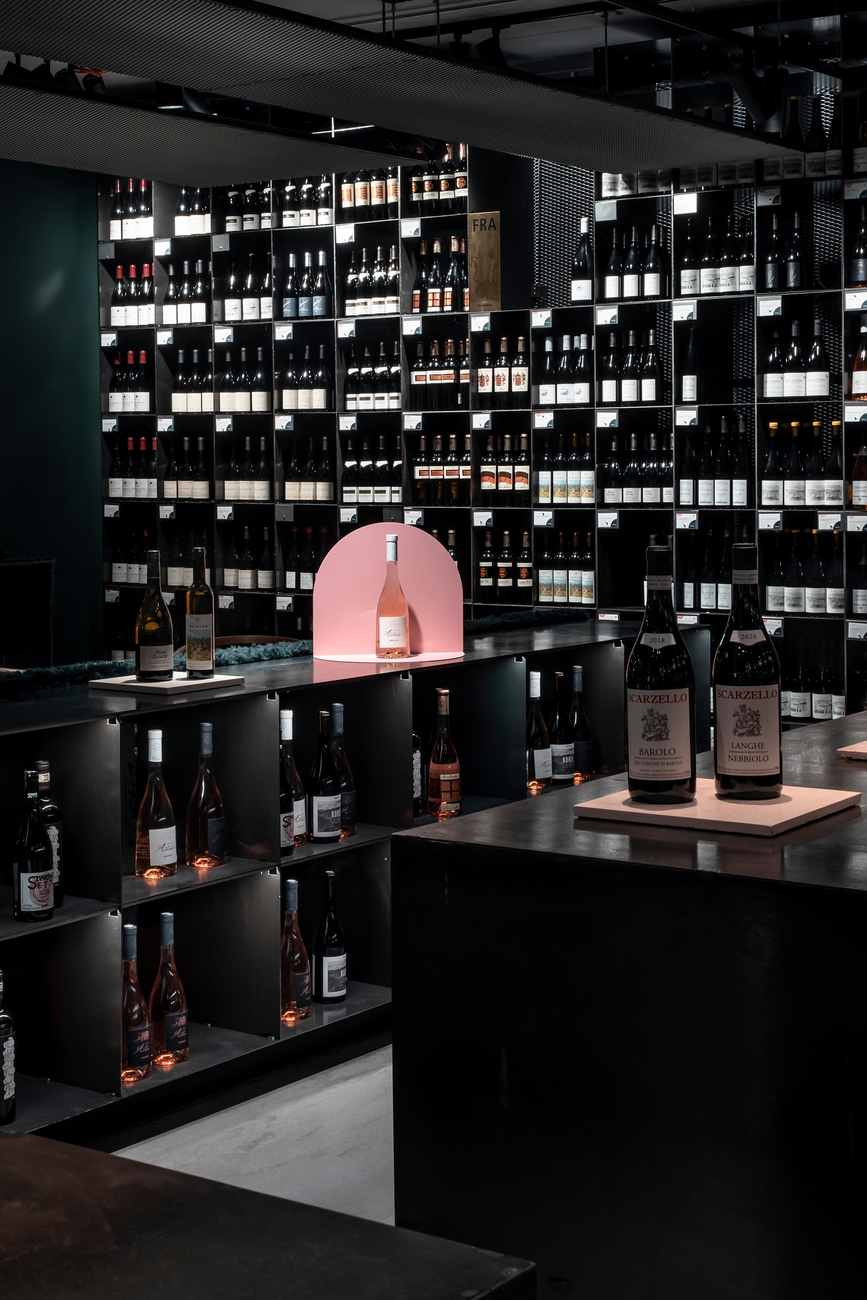
I find it interesting how the graphic design does not rely on any cliches at all, such as curved fonts, wine-crates as storage elements, decoration, etc. Instead, you have opted for orientation based on a system of symbols that are readily comprehensible the world over.
Joshua Lux: The key issue was how to categorize the wine without having tasted it first. We took up this basic idea in the interior design, too. The graphic concept is strongly defined by Studio acth and centers on Gregor's main emphasis, the terroir wines. To this end, they created a set of symbols that visualizes and thus represents the different terroir parameters, the types of soil, and the tastes of the wines. During the development work together with Gregor Bernd we selected three key symbols that are of especial importance for orientation when it comes to taste: a vine (in the form of a grape), a nose (representing the bouquet) and a mouth (stands for the taste). In this way, we developed a concept that not only captures the essence of terroir wines but also offers a clear visual route to testing, tasting, and enjoying these unique wines.
Was there an aspect of the design that you had to fine tune more than you would have thought?
Joshua Lux: Actually, it was about not having the space appear too large. We didn’t want to create something with the feel of a station concourse, so we worked with elements that divide up the space and make it seem inviting without having it appear smaller say, like by including a ceiling sail or a champagne counter.
What’s also interesting is that you have managed to create a small outdoor area, which despite being so close to the street has a protected and pleasant feel to it. I saw on your website that you and your team have realized at least one project a year from hospitality via residential to retail. What does every project need to have for you to want to realize it?
Joshua Lux: The storytelling. For me, that’s the most important thing that we can influence, the individual story which is told in every project. Each time the circumstances are very different depending on the recipient, client, or customer. And with private projects it’s a completely different topic than in hospitality. Should I feel, a project would better suit someone else’s portfolio rather than ours then I’m happy to recommend colleagues. We would like to contribute to ensuring each individual story is best communicated.
How do you address the topic of sustainability in your projects?
Joshua Lux: For one thing in private projects and above all when modernizing or in commercial projects we use what is already there. Of course, the cities of Wiesbaden and Frankfurt/Main are predestined for such treatment as you find a lot of beautiful old buildings there. Take the “D7” project in Mainz: a residential building. There were two sections, a building from the 1960s and one from the 19th century. For me the beauty of the projects lies in the special features of what already exists. Gregor's is another example, because we re-used almost all of the furniture from the present store for the new store. That was only possible because we had designed the furniture so it could be dismantled at any time. Objects that are already there have a right to continue existing. Naturally, you have to make compromises when adapting to the new floor plan; for one thing, the shelves could not all be the same height anymore, but it works. You don’t have to use wooden pallets for it to be sustainable. We need to strike a balance. For example, you needn’t glue the panels of a counter but with a bit more work you can fix them with screws instead.
Are there currently any projects you can give us a hint about?
Joshua Lux: We have just designed a private dining area for the Robert Weil winery. The building is a manor house that has undergone repeated alterations over the last centuries. We designed four consecutive rooms, which are the most intimate area where guests are invited – what was once the family’s living room, a breakfast room with precious tapestries and a dining room following on from that. It will shortly be followed by a wine boutique, which was designed in the 1990s, the first such boutique ever in the Rheingau region. Translating the brand experience into the space will also be exciting. On top of that we are realizing two projects for Antiquitäten Suppes: Finishing a private apartment in collaboration with Caparol Icons and remodeling the new company site. The building in question was once a dance school and has a floor space of a good 160 square meters. In this instance our job will be to ensure customers feel secure there despite the room’s size; after all, they are bringing valuable things there and often items they’ve inherited to which they have a strong emotional attachment. As with the other projects it’s a matter of developing the best possible result for the space and the clients. We realize the interior design that is best suited to each project.
Contact
Gregor's Boutique Vinothek
Bockenheimer Landstrasse 47
60325 Frankfurt am Main
Opening hours:
Mon to Fri: 4 – 11 p.m.
Sat: 11 a.m. – 11 p.m.
Phone: +49 69 509 274 55
Architecture & Design