When the sofa is dressed in pink
Many probably exclaimed on moving from one booth to the next in the trade-fair halls in Cologne that it was all so incredibly colorful. Everything spoke of color, of all manner of customary colors. It’s not exactly a new phenomenon, but continues in fits and starts. Chairs, armchairs, sofas, and accessories were all offered in a wide range of color tones, as were even tables and luminaires. And the modern classics, be it by Cassina, Tecta or Thonet, are all taking the limelight again thanks to updated colors. Which was often the talk of the fair. In fact many asked: Why does furniture design at present get clad in so much color? What does this spell for the actual design of the rooms? And above all, what colors and color combinations should one pick?
One thing is for sure: Interior design is becoming ever more fashionable. This became most apparent when back in 2014 celebrated fashion designer Raf Simons presented an upholstery fabric for Kvadrat – whereupon many manufacturers, among them renowned names such as Vitra and Walter Knoll, selected the refined fabrics as covers for their most successful models. Fashion paves the way for furniture design when it comes to color. Indeed, what started in 2012 with strong primary colors on the catwalks popped up a couple of seasons later in furniture design. In the latter domain, the colors are especially appealing for standalone items – after all, home worlds have since Modernism and leading lights such as the Eames and Le Corbusier often been defined by the accent created by a single colored piece. Parallel to this palette, pastel girlie room colors became the rage, as propagated in particular by young Danish furniture brands such as Hay and Muuto.
In Cologne, it is now bright yellow that is often used as a strong sole color – for example at Vitra, where the “Panton Chair” gleamed in a sunny yellow, or at Richard Lampert, where Herbert Hirche’s “Frog Chair” was resplendent in lemon yellow. Strong colors for strong pieces, a well-known ploy. But less customary when shelves or sideboards are the ones catching the eye with their colors; no longer playing the role of extras, they are now the protagonists. Not one but two designs by Werner Aisslinger vividly showed this: Piure exhibited his new shelf system called “Mesh” in a burnt reddish-orange, and Conmoto showcased “Pad Board” in a lush grass green. Speaking of green, the color stands like no other for a “new green lifestyle” and was to be seen in any number of different hues, for example in “Greenery,” a fresh and zesty yellow-green that Pantone has made its color of the year.
Today, it no longer suffices to simply exhibit strong individual colors or a particular color palette. Because as one could see clearly in Cologne, there are very different color concepts afoot. The one successful, the other less so. The fact that you can’t simply dip a piece of furniture in some paint pot or other or offer it in a polychrome version is something that above all Hella Jongerius proves. She was commissioned years ago by Vitra to compile a “Colour & Materials Library” for the entire collection, which then went on show in an installation at the last Salone del Mobile. Cassina also brought on board a freelance Art Director for the same reason: For about the last 18 months Patricia Urquiola has been in charge of mixing the color palette for the entire collection and in Cologne presented the “In-store philosophy 3” – a color and style concept for stores.
It’s no mean feat to combine colors such that they accord with the zeitgeist. In Cologne, Jaime Hayon definitely succeeded – with his new collection for Wittmann, where pine green, mustard yellow, royal blue and Bordeaux red allied to form an interior style inspired by the Vienna salons of the turn of the 20th century. Fittingly, there were also highlights in satin gold, created by brushed brass, a worthy successor to the copper so omnipresent in recent years. Cubic shapes were given an appealing gleam by Philipp Mainzer, too, with his new “Jorel” sideboard for Interlübke, which boasts fronts made of gold-anodized aluminum in combination with elements in night blue and dull rose. Both clearly show that there’s no getting by color in rooms now.
The experts at Rohi have also been thinking hard about how best to use color, and not only because in the form of “13rugs” a finished product is now being brought to market, but also as they want to offer manufacturers and interior designers assistance. The upholstery fabric maker thus commissioned Munich design studio Formstelle to undertake color research to identify the strongest currents and concepts. The key finding: The broad palette of greens will now also include an exotic shot of peach. Moreover, Formstelle champions a denim blue in all manner of hues, collaged with a burnt rust tone. There is a persistent trend toward more restrained tones, such as cream, beige, gray and white in all manner of shades.
As with the example set by Raf Simons, Rohi’s upholstery fabrics have highly refined details. For instance, what seemed from a distance to be turquoise turns out on closer inspection to have many layers, as the blue weft sometimes meets an ocher warp, undermining the dominance of blue. In combination with the weave textures that are currently preferred, the fabrics thus become very “lively,” as the specialists would say. It’s simply a shame that not more armchairs and sofas have detachable covers. Then you could change their apparel depending on the occasion and season, just as fashion does. And then you might now and again go for patterned covers, such as one of those exotic floral variants seemingly indispensable in Cologne, admirable versions of which were on show at the Christian Fischbacher booth.
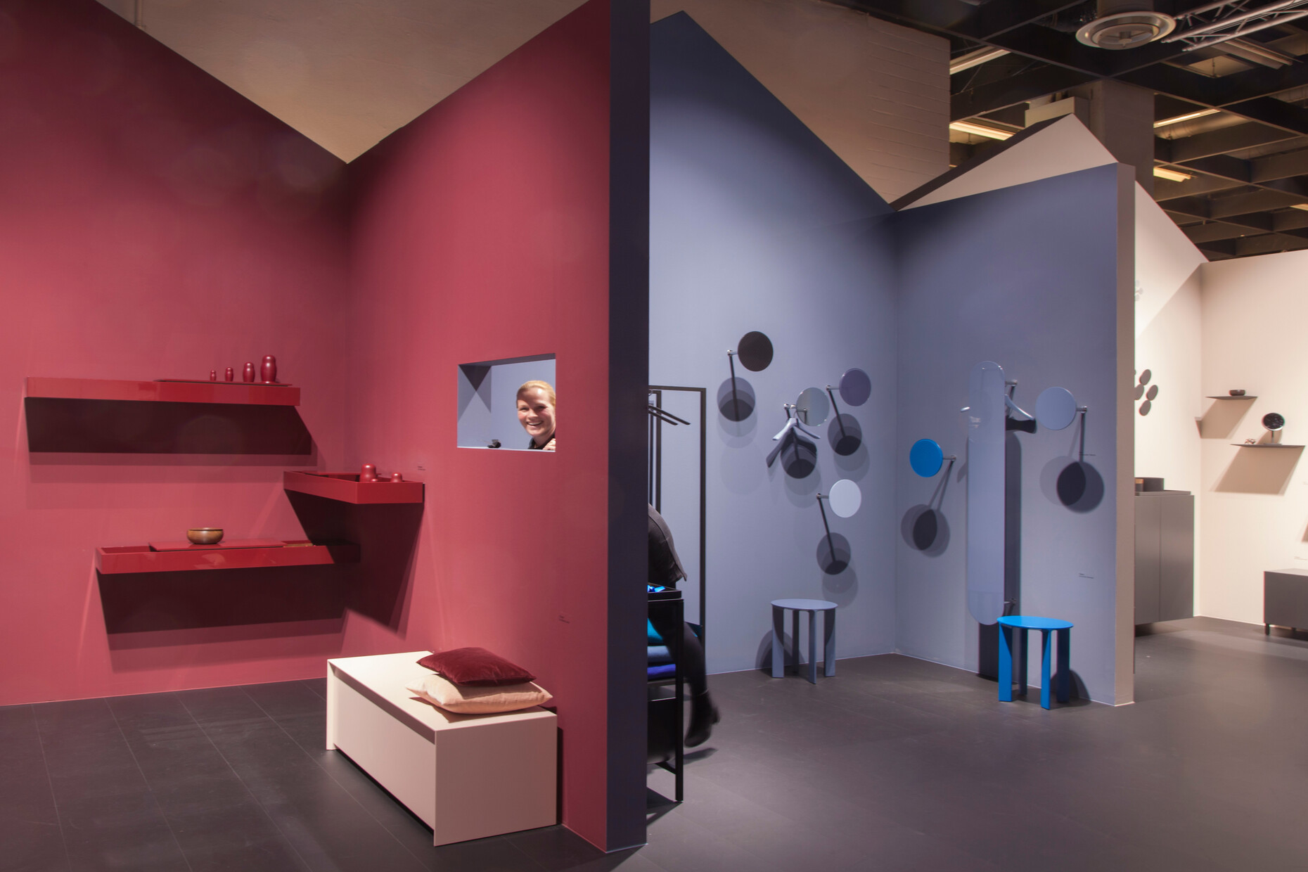
It is evidently well worth addressing the topic of “color in the room” carefully, and to make sure you have a coherent concept. In order not to risk a brush with the wrong paint pot, it seems best to take a tonal approach to color, such as Schönbuch does. The stand presented a blue, a red, a green and a gray room, and in each the color was present in different tones.
As regards tender rose, which everyone is simply always delighted to encounter, suffice it to ask: An armchair in Barbie’s favorite color – now is that really necessary? What initially may seem like a matter of taste actually hinges on a complex set of criteria, for the major fashion and furniture brands don’t just sell their products in Europe. And since the Asian market is huge and Asian women just love a girlie pink, fashion brand Céline’s 2013 fall collection boasted the first pink coat, emulated since countless times, and now long since a fixed feature of street views throughout Asia’s metropolises. So of course the sofa, that “coat” of any living room, should likewise be available in the same shocking color.


